 Afrikaans
 Azərbaycan
 Bosanski
 Čeština
 Dansk
Dansk Deutsch
 English
 Español
 Filipino
 Français
 Hrvatski
 Indonesia
 Italiano
 Magyar
 Melayu
 Nederlands
 Norsk
Norsk Oʻzbek
 Polski
 Português
 Română
 Slovenčina
 Slovenščina
 Suomi
Suomi Svenska
 Tiếng Việt
 Türkçe
 Ελληνικά
 Беларуская
 Български
 Русский
 Српски
 Українська
 עברית
עברית اردو
اردو العربية
 پښتو
پښتو فارسی
فارسی አማርኛ
አማርኛ मराठी
मराठी বাংলা
বাংলা தமிழ்
தமிழ் ไทย
ไทย မြန်မာ
 한국어
한국어 中文
中文 日本語
日本語

વેબસાઇટ માટે સ્ટાઇલ બનાવવું એ બ્રાન્ડની ઓળખ મજબૂત કરવાની અને ડિઝાઇનમાં સુસંગતતા (Consistency) જાળવવાની ચાવી છે. આ બ્લૉગ લેખમાં એક સફળ વેબસાઇટ માટે સ્ટાઇલ માર્ગદર્શિકા અને ડિઝાઇન સિસ્ટમ તૈયાર કરવાની મહત્વતા પર ભાર મુકવામાં આવ્યો છે. ડિઝાઇન સિસ્ટમ શું છે, આધારભૂત ડિઝાઇન ઘટકો અને ટાર્ગેટ ઓડિયન્સ ઓળખવાની રીતોની એવી વિશદ સમજ આપવામાં આવી છે. વપરાશકર્તા અનુભવ, રંગપટ્ટી પસંદગી અને વેબસાઈટ માટે સ્ટાઇલ ઉત્પન્ન કરવાની વિવિધ રીતોની ઉદાહરણ સાથે ચર્ચા છે. સફળ ડિઝાઇન માટે ટીપ્સ તથા અમલના પગલાં — વિગતવાર ઉભા કરવામાં આવ્યા છે. આ માર્ગદર્શિકા તમારું બ્રાન્ડ જાણીતું બનવામાં અને સુસંગત ડિઝાઇન ભાષા સ્થાપવામાં તમારું માર્ગદર્શન કરશે.
વેબસાઇટ સ્ટાઇલ માર્ગદર્શિકા ની મહત્વતા
સ્ટાઇલ માર્ગદર્શિકા એ તમારાં બ્રાન્ડ અથવા પ્રોજેક્ટના વિઝ્યુઅલ અને લખાણ સંવાદમાં એકસરસતા માટે અગત્યનો સાધન છે. લોગો, ટાઇપોગ્રાફી, રંગપટ્ટી, લખાણના ટોન — બધાં ડિટેલ્સ સ્ટાઇલ માર્ગદર્શિકામાં સ્પષ્ટ કરીને દરેક પ્લેટફોર્મ પર સમાન અસર ઉત્પન્ન કરી શકો છો. વેબસાઇટ માટે સ્ટાઇલ બનાવવી માત્ર સુંદરતા માટે નહીં, પણ બ્રાન્ડ ઓળખ અને વ્યાવસાયિક ઈમેજ માટે જરુરિયાત છે.
- વેબસાઇટ સ્ટાઇલ માર્ગદર્શિકા ના ફાયદા
- બ્રાન્ડ સુસંગતતા જાળવે છે.
- ડિઝાઇન અને વિકાસ પ્રક્રિયાઓ ઝડપી થાય છે.
- ટીમમાં એકરૂપ સમજી માટે આધાર.
- બ્રાન્ડ ઓળખ વધારે છે.
- વ્યાવસાયિક છાપ બનાવે છે.
- વધારાની ખર્ચ ઘટે છે (પુનરાવર્તન ભૂલ ટાળી શકાય).
Consistency — બ્રાન્ડનું વિશ્વાસ વધારવાનું સૌથી મજબૂત ઈલાજ છે. એક સ્ટાઇલ માર્ગદર્શિકા દ્વારા, તમારી વેબસાઇટ, સોશિયલ મિડીયા, માર્કેટિંગ મટિરિયલ અને ગ્રાહક સંવાદ — બધાંમાં સમાન વિઝ્યુઅલ અને લખાણ ભાષાથી સ્પષ્ટ બ્રાન્ડ ઇમેજ થાય છે. તેથી ગ્રાહક loyalty અને સંતુષ્ટિ બંને વધે છે.
| તત્વ | વિગત | ઉદાહરણ |
|---|---|---|
| લોગો ઉપયોગ | લોગોનું કદ, રંગ અને સ્થાન — નિયમો | લોગો ઓછામાં ઓછી 50px; સદા સફેદ પૃષ્ઠભૂમિ પર જ. |
| ટાઇપોગ્રાફી | શીર્ષક, શરીર લખાણ, caption માટે કયાં font? | શીર્ષક: Roboto Bold, લખાણ: Open Sans Regular |
| રંગપટ્ટી | મુખ્ય અને સહાયક બ્રાન્ડ રંગો, ક્યાં વાપરવું? | મુખ્ય: #007bff (નીલું), સહાયક: #6c757d (ધૂંવાળું) |
| વિઝ્યુઅલ સ્ટાઇલ | ફોટો/ઇલસ્ટ્રેશનનો એકરૂપ ટેમ્પો/ટોન | ફોટો નિજ કૃત્રિમ પ્રકાશમાં — ગરમ શેડ |
નબી ડિઝાઇનર્સ અને કન્ટેન્ટ ક્રિએટર્સ માટે સ્ટાઇલ જોઈન્ટ guideline — brand rules સમજવામાં રાહત આપે છે. સમય-પાઇસા બચાવે છે, ભૂલ ઓછી કરે છે.
સ્ટાઇલ માર્ગદર્શિકાઓ dynamic દસ્તાવેજ છે. target audience તથા બ્રાન્ડ જરૂરિયાત બદલાય, એટલે સ્ટાઇલ નિયત INTERVAL પ્રત્યે અપડેટ કરવાની જરુર. નિયમિત રિવ્યુ — REPRESENTATION always best રહે છે.
સ્ટાઇલ માર્ગદર્શિકા અને ડિઝાઇન સિસ્ટમ બનાવવી
ડિઝાઇન સિસ્ટમ — project/team માટે સ્વરૂપે consistent અને scalable design solution રૂપી બનતી, reuse લાયક components, style guide અને design principles નું United tool છે. સાદામાં, Brandનો visual language અને user experience standardized કરવા comprehensive framework છે. Designers - developers બધા same goal પૂર્વક, process ઝડપે, budget છૂટ.
Design system એ visual સાથે interaction patterns, accessibility standards, અને content strategy પણ cover કરે છે. holistic approach — user કોઈ platform/device પરથી samaan experience મેળવી શકે છે. સરસ design system — brand identity મજબૂત, user satisfaction multi-platform, development process તદ્દન ઝડપી બને છે.
| ફીચર | વિગત | ફાયદા |
|---|---|---|
| Component library | Reuse કરવા લાયક design elements (Button, Form બ્રેક) | Consistent design, Fast development |
| Style guide | Colors, Typography, Logo — visual standards | Brand protect, visual harmony |
| Design principles | Guiding rules for decision-making | Consistent UX, strategic design |
| Documentation | Use-guide for system | Team share, quick adaptation |
વેબસાઇટ માટે સ્ટાઇલ તૈયાર કરતાં, Design system વાપરવું — તમારાં brand માટે professional, consistent look તેમજ budget efficiency આપે છે. Design system evolutionary છે — update, improve કરવી જરુર છે. એમ થકી brand always current, competitive રહી શકે છે.
Design System બનાવીવાની સ્ટેપ્સ
- Requirement analysis: Project/team ભૂસ્તર અને સિદ્ધિઓ ચિંતન કરો.
- Style Guide Creation: Brands reflect કરતી colors, typography, logo rules.
- Component Library: Reusable UI/UX elements.
- Documentation: How-to guide.
- Testing & Improvement: Real feedback લઈને refine.
- Training & Adaptation: Team introduction, encourage use.
Remember: Design system માત્ર tool નથી — culture છે. Creative, continuous improvement attitude લાવવો એ લક્ષ્ય.
ડિઝાઇનના મૂળ તત્વો
Design — aesthetics પડે ને user experience નું balance રાખે. સારા designમાં વેબસાઇટ માટે સ્ટાઇલ માટે required various fundamental factors છે. Line, shape, color, texture, typography, space, balance — બધાં crucial છે. હિચકિશીઓથી assess કરો, harmony આવે.
Color — brand personality reflect કરે, Typography readability-psychology. Space — design ને સાંસ આપે છે. દરેક ઘટક મુંબઈ, professional તથા યાદગાર વેબસાઇટ સ્ટાઇલ નિર્માણ માટે રંગભૂમિ છે.
| ઘટક | વિગત | મહત્વ |
|---|---|---|
| લાઇન | બે પોઈન્ટ જોડતી રેખા | Guide, Separate, highlight |
| આકાર | 2D એરીયા | Define, symbolic |
| રંગ | Light wavelength | Emotion, Brand identity |
| સપાટી | Surface feel | Depth, Realism |
Balance, contrast, hierarchy, rhythm — એમ rules પણ મોટાં છે. Balance — visual harmony; Contrast — difference; Hierarchy — importance order; Rhythm — flow. All અપને જોડીને — impactful વેબસાઇટ માટે સ્ટાઇલ બને છે.
મૂળ ડિઝાઇન તત્વો
- લાઇન
- આકાર
- રંગ
- સપાટી
- ટાઇપોગ્રાફી
- સ્પેસ
- બેલેન્સ
Not just visuals — but solution-provider, value-added experience. Target audience ની demand catch કરો. Function + Form = real value.
રંગ અને સપાટી
રંગ અને સપાટી — designની emotional effect અને perception શેપ કરે છે. Colors — emotional response, brand personality, user attention; Texture — depth, realism. Proper Color theory અને texture use — effectiveness વધારે.
આકાર અને કાર્ય
Form (visual look) and Function (purpose/operation). Good design — visually attractive અને practical, balanced. Function-first — user-centric, brand loyalty enhancer.
ટાર્ગેટ ઓડિયન્સ ઓળખવાની રીતો
Style guide, design system બનતી વેબસાઇટ સ્ટાઇલ માટે સૌથી અગત્ય — audience નો choice. Audience — પ્રકાર, age, interest, education, income — આ વીડવિચાર.
Audience research: Surveys, interviews, social listening, market analysis. કેટલી audience, જે કયા design પસંદ કરે, કેટલી colour પસંદ કરે, શું message work કરે, social platform ક્યાં favorite — મળી રાખવું. Effective design = responsive to real need.
Audience નિર્ધારણ Step-by-Step
- Market study: Demographics/psychographics.
- Survey & feedback: Actual need, expectation.
- Social media analysis: Platform/activity pattern.
- Competitor study: Rival audience/type.
- Persona build: Example user profile.
- Continuous feedback: Regular response from audience.
Audience analysis — design, marketing & communication — everywhere guide. Young, tech-oriented audience = social/digital preferred; Older = print/direct. Who & how = message reaches and resonates.
| Audience segment | Demographics | Need and expectation |
|---|---|---|
| Young adults (18-25) | Student, graduates, tech oriented | Modern, innovative, affordable designs, social media focus |
| Professionals (26-40) | Employees, career, urban | Elegant, functional, premium, time-saving features |
| Families (35-55) | Homeowners, kids, family focus | Safe, durable, practical, kid-safe |
| Seniors (60+) | Retired, experienced, comfort seeker | Easy, accessible, comfortable, health & safety |
Audience taste/trends/interest can change. Market research, feedback, design adaptability — key for success. વેબસાઇટ માટે સ્ટાઇલ — always up-to-date with audience pulse.
ડિઝાઇનમાં વપરાશકર્તા અનુભવ
UX — Design success એ વપરાશકર્તા satisfy થવા પર આધાર રાખે છે. વેબસાઈટ માટે સ્ટાઇલ બનાવતી UX, usability, accessibility, UI, IA — બધાં factors include કરો.
Design decisions — user demand research, surveys, usability testing — આ પૂર્વક shaped. જનરલ રીતે: user-friendly, easy navigation, speed, reliability, feedback અને personalization.
| Factor | વિગત | સુધારા નો પગલો |
|---|---|---|
| Usability | Ease-of-use | Simple UI, clear instruction |
| Accessibility | All-ability access | Alt texts, colour contrast, keyboard nav support |
| Satisfaction | Pleasure of usage | Visual aesthetics, positive feedback, personalization |
| Efficiency | Speed to goal | Optimized search, fast load, less steps |
User Experience Factors
- Usability: Simplified, intuitive UI.
- Accessibility: Inclusive for all abilities.
- Performance: Speed & stability.
- Information Architecture: Well-organized content.
- Visual Design: Appealing & friendly.
- Reliability: Always working as expected.
User research (survey, interview, usability test) — design decisions shaped by real need.
નેવિગેશન
Website/app navigation — essential for easy access. Clear, consistent, simple navigation — user stays oriented.
વિઝ્યુઅલ્સ
Visuals — user attraction, info communication, emotional connect. Relevant, quality visuals per style guide — better UX.
સામગ્રી
Content — user visit reason. Clear, accurate, engaging content per style guide — effective brand-voice. Use headings, subheadings, paragraphs, lists — readable, accessible.
Good design = Looks good + Makes life easy.
સ્ટાઇલ બનાવવાના રસ્તાઓ
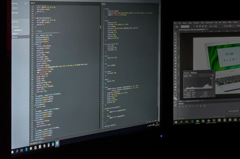
વેબસાઇટ માટે સ્ટાઇલ — brand/project identity માટે attractively-consistent visual language. Not just aesthetics — UX, brand recall, strategic messaging. Style — color palette, typography, visuals, layout — each is a branding opportunity.
Style guide — standardize process, ensure consistency. Reference for designers/developers — speed up, reduce error, keep brand visual intact.
| ઘટક | વિગત | મહત્વ |
|---|---|---|
| Color palette | Core+support colors | Visual brand definition & emotional connect |
| Typeface | Font for heading/body/elements | Readability, tone |
| Visuals | Logo/icon/photo/illustration | Visual messaging, memorability |
| Layout | Grid/space/content flow | Enhance UX, easy info |
Style making — accessibility mindfulness: Colour contrast, font size, alt text — wider audience, inclusive UX. Below are common style-creation methods:
- Color palette selection: Brand personality reflected, harmonious palette.
- Typography setting: Legible, branded fonts.
- Visual language: Uniform icons, photos, illustrations.
- Layout standards: Structured grids/spaces for readability.
- Accessibility principles: Colour contrast, font size, alt text.
- Brand voice: Consistent tone in written-visual content.
Remember: વેબસાઇટ માટે સ્ટાઇલ — always evolving. Trends, audience expectation, brand need — all shift. Regular review & update — stay fresh, competitive. Feedback & testing — optimize for long-term success.
સ્ટાઇલ પસંદગી અને ડિઝાઇન
Colors — web designની emotional+perceptual effect માટે એ સૌથી મોટો પાસો. વેબસાઇટ માટે સ્ટાઇલ — brand personality reflect, audience taste fulfill કરવું. Colour theory/psychology — right palette. Brand value, product features, audience preference — combine કરી, conscious color choices.
Palette making — just look-good નહીં, usability-essential. Siteમાં readable contrast, cultural meaning — global audience, સુલભતાનો વિચાર કરો. Right colors — Brand message strengthen કરે, memorability enhance કરે.
| Color | Psychological effect | Use-case |
|---|---|---|
| Red | Energy, passion, urgency | Food, sports, warning |
| Blue | Trust, calmness, professionalism | Finance, tech, health |
| Green | Nature, health, renewal | Environment, food, wellness |
| Yellow | Happiness, optimism, vitality | Kids, entertainment, food |
Color harmony — visual appeal enhancer. Complimentary colors — balance; Contrast — dynamic effect. વેબસાઇટ માટે સ્ટાઇલ — limited, focused palette; Too many — cluttered/confusing.
Palette type & effect
- Monochrome: Same color shades — calm, harmony.
- Analog: Neighboring colors — natural, balanced.
- Complimentary: Opposites — vibrant, dramatic.
- Triad: Three equidistant colors — lively, balance.
- Tetrad: Two color pairs — rich, complex.
Color use — emotional impact, brand identity, differentiation enhancer. Question: Does palette suit mood, brand, audience?
ઉષ્મા રંગો
Warm colors — energy, passion, excitement. Red, orange, yellow — attention-grabbing. Use moderately, else overwhelming/aggressive. Balance with suitable supports.
ઠંડા રંગો
Cool colors — calmness, trust, professionalism. Blue, green, purple — relaxed atmosphere. Trusted for finance/tech/health. Colors profoundly influence mood/behavior — a key for effective brand messaging.
સ્ટાઇલ અમલના ઉદાહરણો
વેબસાઈટ માટે સ્ટાઇલ માટે, inspiration અને approachesવ ચકાસવું જરૂરી. અહીં વિવિધ પ્લેટફોર્મ/sectory ની successful website style case studies. Remember: Each brand/product is unique — adapt for need.
Compare brand style: palette, typography, visuals, UX. Winner brands — recognizable identity, user-friendly, recall value. Not just look — clear messaging, connection.
Successful Website Styles
- Nike: Bold colors/dynamic fonts — energy for athletes.
- Apple: Minimal design/UX — tech with elegance.
- Coca-Cola: Retro, vibrant color — nostalgic vibe.
- Starbucks: Natural tones, inviting visuals — warm ambiance.
- Airbnb: Friendly photos, inviting text — trustworthiness.
Table: Sector-wise brand style features
| Brand | Sector | Core Style Features | Target Audience |
|---|---|---|---|
| Nike | Sportswear | Energetic, bold, dynamic | Athletes, active life people |
| Apple | Tech | Minimalist, stylish, user-centric | Tech lovers, design-focused |
| Coca-Cola | Beverage | Nostalgic, cheerful, friendly | Youth, families, all ages |
| IKEA | Furniture | Functional, modern, simple | Homeowners, budget-seekers |
Keep experimenting, learn from case studies, but adjust per your brand. Audience taste & need — must in focus.
સ્ટાઇલ માર્ગદર્શિકા: સફળ ડિઝાઇન માટે ટીપ્સ
Successful design — more than just aesthetics. વેબસાઈટ માટે સ્ટાઇલ effectiveness = communication, brand reflection, improved UX. Hence: Audience analysis, accessibility, testing all must-go.
Audience insights — market research, survey, feedback. The closer you are — the more your design fits. Accessibility — all user able to use.
| Element | Detail | Importance |
|---|---|---|
| Audience analysis | Needs/expectation study | High |
| Brand identity | Reflect value/personality | High |
| UX | Interaction ease | High |
| Accessibility | Universal usage | મધ્યમ |
Visual appeal + Functionality + User-friendliness = perfect design. Easy navigation, clear content, intuitive UI — all must follow style guide’s principles.
Tips for Success
- Know your audience: Tailor design for their needs.
- Reflect brand identity: Match values/personality.
- Focus on UX: User-centric, intuitive, accessible.
- Choose color/type wisely: Readable, brand-matching.
- Visual hierarchy: Highlight essentials.
- Test & adapt: Regular user feedback/tests.
Stay flexible; regularly update per audience/trends.
પરિણામ અને અમલના પગલાં
અહીં વેબસાઇટ માટે સ્ટાઇલ માર્ગદર્શિકા તથા ડિઝાઇન સિસ્ટમ successful બનાવવાની મુખ્ય સ્ટેપ્સ આવરી લેવાય છે — Audience research, fundaments definition, color choice, UX. Now apply: Create your style guide!
| Step | Detail | Importance |
|---|---|---|
| Audience analysis | Identify need/expectation | High |
| Design element definition | Color palette, typography, visuals | High |
| Style guide making | Document design rules | High |
| Testing/feedback | User review, improvement | મધ્યમ |
Style guide = more than aesthetics — brand strength, UX, consistency. Each step — plan, execute with focus!
Implementation Steps
- Audience in-depth analysis — real needs.
- Personality-reflecting color palette build.
- Readable, brand-fit typography pick.
- Standardize use of icons/images/video.
- Share style guide with team.
- Schedule regular update cycles.
Successful વેબસાઈટ માટે સ્ટાઈલ — perpetual improvement. Feedback, new trends, update. Brand identity fresh, effective.
Remember: Good design = attractive + functional + accessible. All decisions grounded in these principles.
વારંવાર પૂછાતાં પ્રશ્નો
વેબસાઈટ માટે સ્ટાઈલ ગાઈડ બનવવાથી brand image કઈ રીતે લાભદાયી થાય?
Consistency-professional look દેશે, brand visibility/recognition/believability વધારે છે — thus customer easily remembers you.
Design system શું છે,તેના ભાગો કયાં છે, અને આ પુર્ણાંમાં કેવી રીતે interlinked?
Design system = style guides, reusable pieces, patterns, code modules. All together, process standardization, speed, consistency. Change in any — ripple in all — so holistic vision is crucial.
Good designમાં UX ક્યાં મહત્વનું છે, ભારથી UX કેવી રીતે વધારી શકાય?
UX — success anchor. Improve by: user research, testing, feedback, user-centric principles. Aim — user easily understand/install/use.
Target audience research — શું ધ્યાનમાં રાખવું, કેવી રીતે design impactful થાય?
Demographics, interest, need: Find, cater. Youth — modern/dynamic; old — simple/clear. Accurate research = design that works.
Color selection: Psychology & brand match — કેમ મહત્વનું, કેટલા પસંદ કરો?
Color psychology: Blue = trust, Red = energy. Brand value, personality, audience fit, competitor analysis — combine and pick.
Website style બનાવતાં શું ધ્યાનમાં રાખવું — કયાં tools મદદરૂપ?
Focus — brand-reflecting consistency. Tools: Adobe Creative Suite (Photoshop, Illustrator, InDesign), Sketch, Figma; Canva — quick prototyping.
Good design — base qualities શું, success metrics કઈ રીતે?
User-friendly, aesthetic, functional, purpose-fit. Measure: User testing, A/B test, conversion, feedback, brand lift, sales.
Style guide/design system હોવા પછી update કેમ જરૂરી — management કઈ રીતે?
Update: Brand evolves, trends change. Schedule reviews, listen feedback, follow tech — document, share, implement updates.