 Afrikaans
 Azərbaycan
 Bosanski
 Čeština
 Dansk
Dansk Deutsch
 English
 Español
 Filipino
 Français
 Hrvatski
 Indonesia
 Italiano
 Magyar
 Melayu
 Nederlands
 Norsk
Norsk Oʻzbek
 Polski
 Português
 Română
 Slovenčina
 Slovenščina
 Suomi
Suomi Svenska
 Tiếng Việt
 Türkçe
 Ελληνικά
 Беларуская
 Български
 Русский
 Српски
 Українська
 עברית
עברית اردو
اردو العربية
 پښتو
پښتو فارسی
فارسی አማርኛ
አማርኛ मराठी
मराठी বাংলা
বাংলা தமிழ்
தமிழ் ไทย
ไทย မြန်မာ
 한국어
한국어 中文
中文 日本語
日本語

വെബ് സൈറ്റുകൾക്കും ഓൺലൈൻ ബ്രാൻഡുകൾക്കും ഏകദേശമായ സ്റ്റൈൽ രൂപീകരിക്കുക എന്നത്, ബ്രാൻഡിന്റെ ഐഡന്റിറ്റിയും തമ്മിലുള്ള ഉറച്ചതയും, വിശ്വാസവും വർദ്ധിപ്പിക്കാൻ ഏറ്റവും പ്രധാനപ്പെട്ട മാർഗമാണ്. ഈ ബ്ലോഗ്, വിജയകരമായ സ്റ്റൈൽ ഗൈഡ് (Style Guide) & ഡിസൈൻ സിസ്റ്റം (Design System) ഉണ്ടാക്കുന്നതിന്റെ പ്രാധാന്യം, നിർവചനങ്ങളുടെയും ഘടകങ്ങളുടെയും ഹൃദ്യമായ പ്രസ്താവനകളോടെ വിശദീകരിക്കുന്നു. ഡിസൈൻ സിസ്റ്റം എന്താണ്, അതിന്റെ അടിസ്ഥാന ഘടകങ്ങൾ, ലക്ഷ്യ ചേർക്കേണ്ട യൂസർ വിഭാഗം നിർവചിക്കേണ്ട സമയങ്ങളിൽ സ്വീകരിക്കേണ്ട മാർഗങ്ങൾ തുടങ്ങി, യൂസർ എക്സ്പീരിയൻസ് (UX) എന്നത് എങ്ങനെ നിർണായകമാകുന്നു, കളർ (Color) തിരഞ്ഞെടുപ്പും ആസ്വാദ്യമായ ഇവരെ പറഞ്ഞ്, ഉദാഹരണങ്ങളോടെ നിരവധി മാർഗങ്ങൾ അവതരിപ്പിക്കുന്നു. വിജയകരമായ ഡിസൈൻ ഗൈഡ് നിർവചിക്കാനുള്ള ടിപ്സ്, പിന്നെ ആ ഗൈഡ് എങ്ങനെ പ്രാവർത്തികമാക്കാം എന്നതിന്റെ ചുവടു ചുവടു ഘട്ടങ്ങളും ചർച്ച ചെയ്യുന്നു. ഒടുവിൽ ഈ ഗൈഡ്, നിങ്ങളുടെ ബ്രാൻഡിന്റെ പ്രതിച്ഛായ സുതാര്യമാക്കാനും ഏകദേശമായ ഡിസൈൻ ഭാഷ രൂപപ്പെടുത്തുകയും ചെയ്യുന്നതിനോടൊപ്പം, നിങ്ങൾക്കൊരു മുഷ്ടിക്ക് വലിയ നേട്ടം നൽകും.
സ്റ്റൈൽ ഗൈഡ്റെ പ്രാധാന്യം
ഒരു web style guide എന്നത്, നിങ്ങളുടെ ബ്രാൻഡിന്റെ അഥവാ പ്രോജക്ടിന്റെ ദൃശ്യലക്ഷ്യങ്ങളിലും എഴുത്തിൽ ഒരു തുല്യതയും അമൃതിയുമുള്ള അനുഭവമൊരുക്കാൻ വേണ്ട അപരന്ദിയും ആധികാരികമായ ഒരു ബുക്ക് ആണ്. ഇതിലൂടെ, logo പ്രയോഗം, typografi, കാസ്പര്സം coloring palette, content tone എന്നിവയിലും ഒരേ രീതിയിലാണ് പ്രവർത്തിക്കേണ്ടത്. Web style guide എടുക്കുന്നത് വെറും glamorous പോസ് അല്ല; ഇത്, ക്ലയന്റ് മൈൻഡ് ബിൽപ്പിണത്തിന്റെ ശക്തി വർദ്ധിപ്പിച്ച്, pro image തരത്തിൽ ഇൻപുട്ട് നൽകുന്ന strategy തന്നെയാണ്.
- Web Style Guide ന്റെ ഫലപ്രാപ്തികൾ
- Brand consistency ഉറപ്പാക്കുന്നു.
- Design & development process എളുപ്പ്ടയ്ക്കുന്നു.
- ആർഭാടങ്ങൾക്കിടയിൽ ഉണർത്തലും clarity ഉം വന്നു ചേർന്നു.
- Brand awareness വർദ്ധിപ്പിക്കുന്നു.
- പ്രൊഫഷണൽ image പുറത്ത് എടുക്കുന്നു.
- Repeating design mistakes കുറച്ചു, ആര്ബുധം ചെലവുകൾ ലളിതമാണു.
Consistency, ഒരു ബ്രാൻഡിന്റെ വിശ്വാസം എടുക്കാൻ അടുത്തൊന്നാണ്. Style guide ഉം web-ഇൽ social-ൽ, posters-ൽ, support-ൽ, marketing-ൽ, എല്ലായിടങ്ങളിലും ഈ uniform visual & verbal language ഉപയോഗിച്ച്, customer മൈൻഡിൽ ഒരൊറ്റ brand image ചേർന്നു പോയി. ഇതാണ് brand loyalty, satisfaction കൂടുതലാക്കാനുള്ള shortcut.
| Item | വിവരണം | ഉദാഹരണം |
|---|---|---|
| Logo Usage | Logo ലേക്ക് size, color, location വാങ്ങാൻ വ്യവസ്ഥകൾ. | Logo's min size 50px, uses only on white background. |
| Typography | Headlines, body text, caption font choice. | Headlines: Roboto Bold, body: Open Sans Regular. |
| Color Palette | Primary, secondary color, usage context. | Primary: #007bff (blue), secondary: #6c757d (gray). |
| Visual Style | Photos/Illustrations, general tone/character. | Photos in natural light, warm tone preferred. |
ഈ style guide content makers, designers, team members ഇവർക്കും reference source ആണ്. Brand principles, rules ഹൃദ്യമായി faster design/content production നൽകും, mistakes reduce ചെയ്യും, അതുപോലെ വായ്പിന് വേർപാട്. Brand needs, audience interests, market changing-ൽ Regular update/ review ചെയ്യുന്ന guide ഒരു living document ആണു.
സ്റ്റൈൽ ഗൈഡ് & ഡിസൈൻ സിസ്റ്റം എങ്ങനെ ഉണ്ടാക്കാം
Design system, თქვენს ഡെവലപ്പ്മെന്റ് കൊല്ലിയ ഒരു project/brand-ന് reuseable components, visual guides, design principles ഏകദേശമായി unite ചെയ്യുന്ന toolbox ആണ്. In short, visual language-ഉം user experience-ഉം standardize ചെയ്യാനുള്ള യന്ത്രം തന്നെ. Designers/developers unified direction-ൽ faster output, brand identity strengthen ചെയ്യുന്നു.
Design system, visuals മാത്രം അല്ല. Interaction patterns, accessibility standards, content strategy ആകുന്നു. Multiplatform/Multidevice consistent experience തന്നെയാണ് real output. Good system-ൽ brand power, user satisfaction, speedy development രൂക്ഷം തീരുന്നതാണ്.
| Feature | വിവരണം | ഫലപ്രാപ്തി |
|---|---|---|
| Component Library | Reusable design elements (buttons, form fields ...) | Consistency, fast development |
| Style Guide | Color palette, typography, logo rules etc visual standards | Branded visual consistency |
| Design Principles | Decision guiding principles in design | Consistent user experience, smart design choice |
| Documentation | How to use design system: guide/manual | Team knowledge share, easy onboarding |
A web style guide will help you maintain professionalism, reduce costs, and keep your brand agile. Design system need regular updates/improvement for market relevance/advantage.
ഡിസൈൻ സിസ്റ്റം നിർവചിക്കുന്ന ഘട്ടങ്ങൾ
- Needs Analysis: Project/brand needs, analyse
- Build Style Guide: Define color, typografi, logo usage branding
- Develop Components: Create modular/reusable design parts
- Documentation: Manual/writeup for easy use in team
- Test, Refine: Test design system, improve as feedback
- Educate & Onboard: Train team for usage/adoption
Design system, tool ആയതിലും, culture-ഉം ഒട്ടും. Team concepts refine - continuous improvement mind-set & feedback cycle adopt ചെയ്യേണ്ടതാണ്.
ഡിസൈന്റെ അടിസ്ഥാന ഘടകങ്ങൾ
Design-ൽ, aesthetic+function+rhythem+user experience - ഇവയൊക്കെ ഒന്നിച്ചു. Good design web style guide വരുത്തുമ്പോൾ, ഗ്രൂപ്പിൽ നിന്ന് color, shape, line, texture, type, spacing, balance ഒക്കെས് അടിയന്തിരവും നിർണായകവുമാണ്.
Careful planning each element: color=brand personality, typography=readability, spacing=visual breathing, etc. Harmony of these delivers lasting web style.
| ഘടകം | വിവരണം | പ്രധാന്യം |
|---|---|---|
| Line | Point to point connection | Direction, separation, emphasis |
| Shape | 2D area | Definition, symbol creation |
| Color | Light wavelengths | Emotion, brand identity |
| Texture | Surface feel | Depth, realism |
Balance, contrast, hierarchy, rhythm are equally vital in design. Balanced design gives visual harmony, contrast highlights, hierarchy guides information, rhythm builds flow. Together, these support web style guide formation.
Design-ലെ അടിസ്ഥാനം
- Line
- Shape
- Color
- Texture
- Typography
- Spacing
- Balance
മൂല്യം: Good design means not just visual appeal, but user solutions. Understand your audience, craft design that meets their needs, and blend function with form for best results.
ക്യാലറും ഡോകൂട
Color & texture massively impact design’s emotional pull & perception. Color evokes reaction, forms brand personality & captures eyes. Texture adds depth, realism, makes design tactile. Knowing color theory & texture types makes your web style more engaging.
കലയും ഫങ്ഷൻതന്നെ
Form+function—inseparable in design. Form: visual appeal; Function: usability, purpose. Good web design must balance both: enticing look, practical usage. A functional design improves user experience, earns loyalty.
ലക്ഷ്യയ്യുസർ ഗ്രൂപ്പ് നിർവചനം
Web style guide അല്ലെങ്കിൽ design system-ൽ, correct audience definition is pivotal. Who is your audience—age, gender, interest, education, income—consider both demographic/psychographic markers.
After defining, learn their needs via survey, interview, social tracking, market research. Which designs appeal, color taste, message response, platform activity—know all, shape your design accordingly. Effective design answers audience needs.
Audience വിശകലനത്തിന്റെ ഘട്ടങ്ങൾ
- Market Research: Demographics, psychographics
- User Surveys: Direct audience needs/expectations
- Social Analysis: Platform activity, likes/dislikes
- Competitor Analysis: Learn rivals’ strategy & audience
- Persona Creation: Typical user profile
- Feedback Gathering: Regular response from real users
Audience awareness guides not just design, but marketing as well: youth & tech crowd? Digital—social, ads. Traditional? Printed, direct mail. Know how your audience communicates, target accordingly.
| Audience Segment | Demographics | Needs/Expectations |
|---|---|---|
| Young Adults (18-25) | Students, grads, tech lovers | Modern, innovative, affordable, social integration |
| Professionals (26-40) | Working, career-focused, urban | Smart, functional, premium, time-saving |
| Families (35-55) | Parents, home-owners, family-centric | Safe, durable, practical, child-friendly |
| Seniors (60+) | Retired, experienced, comfort-seeking | Simple use, accessible, comfortable, health & safety |
Remember, your target group may shift over time via trends/social/tech changes. So do regular research, feedback, update design strategies. Staying synced with audience pulse assures sustained brand relevance.
ഡിസൈനിൽ യൂസർ എക്സ്പീര്യൻസ്
User Experience (UX): Responses & perceptions on product/service. Web style guide-ൽ, UX is core for success. Good UX delivers easy, satisfying, effective usage.
Factors: usability, accessibility, interface, info architecture. Understand what users expect, adapt designs so.
Below, some main UX factors, tips for improvement:
| Factor | Description | Tips |
|---|---|---|
| Usability | How easy to use | Simple interface, clear directions |
| Accessibility | Usable for all abilities | Alt text, high contrast, keyboard navigation |
| Satisfaction | User enjoyment | Visual beauty, positive feedback, personalization |
| Efficiency | Speed of achieving goal | Optimized search, fast loading, avoid unnecessary steps |
ക്യാലർ കണക്കുകൾ
- Usability: Easy to use/interface
- Accessibility: Usable for all, disabled
- Performance: Site/app fast, reliable
- Info Architecture: Content organized, easy to find
- Visual Design: Pleasant, user-friendly
- Trustworthiness: Works reliably, always
User research/testing is vital. Surveys, interviews, usability tests—let this guide your design decisions and user-centric improvements.
നാവിഗേഷൻ
Navigation helps users easily reach info on website/app. Clean, consistent navigation prevents confusion, improves journey. Build simple, clear menus for best results.
ചിത്രങ്ങൾ
Images captivate, transfer information visually, creates emotional bond. Choose visuals which synchronize with web style guide, provide high quality, meaningful context. Good visuals enrich user experience.
അന്തരീക്ഷം
Content is why users visit websites/apps. Clear, readable, accurate, relevant content boosts experience. Style guide-based content reflects brand identity, communicates right. Use headings, paragraphs, lists for readable, accessible design.
Good design is not just visually pleasing, but user-focused utility too.
സ്റ്റൈൽ ക്രിയാത്മകമാക്കുന്ന മാർഗങ്ങൾ
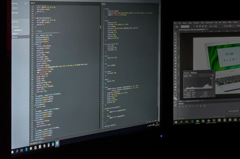
വൈജ്ഞാനികമായ web style guide നിർവചിക്കുമ്പോൾ, brand/project identity, message, UX—all come together. Choices: color palette, typography, visuals, page layout—each tells your brand story and connects to your audience.
Style guide is the anchor, standardizes process, speeds up workflow and reduces errors. Below’s summary of the essentials:
| Component | Description | Importance |
|---|---|---|
| Color Palette | Key/additional brand colors | Defines brand visually, builds emotional bond |
| Typography | Fonts for headings/text | Enhances readability, echoes brand tone |
| Visual Assets | Logo, icon, photo, illustration | Conveys message visually, cementing recall |
| Page Layout | Grid systems, spacing, content arrangement | Improves UX, easy info access |
Accessibility is equally essential. Design must be usable for all audiences—contrast, font size, alt texts matter. Methods below:
- Color Palette Selection: Choose colors reflecting brand personality, emotionally cohesive
- Typography Policy: Readable, brand-supportive fonts
- Visual Language: Consistent icons/photos/illustrations
- Layout Standards: Grids/spacings for accessible content
- Accessibility Principles: Color contrast, font scale, alt texts
- Brand Tone: Uniform written/visual content
Remember, style guides are dynamic—trends change, audiences evolve. Review/refresh regularly for relevance. Test, adopt feedback for lasting success.
ക്യാലർ സെക്ഷനിൽ ഡിസൈൻ
Color choices, vital to emotion/perception. Web style guide-ൽ color selection should resonate with brand personality & audience expectations. Learn color theory/psychology for right palette. Weigh brand values, product features, audience’s taste.
A color palette must also consider functionality. Good contrast between text/background is needed for usability. Consider color’s cultural meaning for different regions. Correct colors multiply recall & fortify your brand.
| Color | Psychology | Contexts |
|---|---|---|
| Red | Energy, passion, excitement | Food, sports, emergency |
| Blue | Trust, calm, professionalism | Finance, tech, healthcare |
| Green | Nature, health, renewal | Eco, food, health |
| Yellow | Joy, optimism, energy | Entertainment, kids, food |
Color harmony increases appeal: complementary colors give balance, opposing colors create energy. Limit palette size; too many colors confuse the visual story.
പല color palette മാർഗങ്ങൾ
- Monochromatic: Variants of a single color—calm, unity
- Analogous: Close colors—natural balance
- Complementary: Opposites—dynamic, vivid
- Triadic: Three equally spaced—balanced, lively
- Tetradic: Double pairs—rich, complex
Right colors shape your audience’s emotive reaction. Learn color psychology, align palette with brand values, create unique brand identity.
ശക്ത കളർ
Warm colors: red, orange, yellow—them evoke energy, excitement, passion. Use for attention, dynamism. Excess may be overbearing, so balance with neutral or cooler tones.
നൈസ്ചർ കളർ
Cool colors: blue, green, purple—represent calm, trust, professionalism. Widely used in finance, tech, healthcare for reliability. Colors impact moods & choices, wield them wisely.
സ്റ്റൈൽ പ്രയോഗം: ഉദാഹരണങ്ങൾ
When creating web style guide, study competitor examples. Review diverse platforms/industries, see how style guides shape recognizable brands. Each brand is unique; adapt examples to your needs.
Look at design strategies: color, typografi, visuals, user interaction. Best examples blend brand identity, user-friendliness, memorability—convey message & foster bonds.
Success stories: style application
- Nike: Bold colors, dynamic type for energetic sports vibe
- Apple: Minimalist, sleek interfaces for tech style
- Coca-Cola: Retro, vibrant colors for nostalgia
- Starbucks: Natural tones, comfy visuals
- Airbnb: Relatable photos, inviting texts for trust
Below: a table of style approaches by major brands
| Brand | Sector | Style Highlights | Audience |
|---|---|---|---|
| Nike | Sports Apparel | Dynamic, bold, energetic | Active, sporty |
| Apple | Tech | Minimal, elegant, user-centric | Tech-minded, design lovers |
| Coca-Cola | Beverages | Nostalgic, fun, welcoming | Families, youth, all ages |
| IKEA | Furniture | Functional, modern, plain | Homeowners, budget buyers |
Style creation is continuous learning/trial. Draw inspiration from best, but ensure your unique brand voice, meet your audience’s needs, and deliver optimal UX.
വൈക്കൂൺ ടിപ്സുകൾ
Good design is about communication, identity & UX, beyond visuals alone. Guide effectiveness is measured by: clear audience reach, true brand reflection, improved user experience. Plan every step carefully for best outcome.
First, audience understanding via market research & feedback are key. Reliable design is accessible for all backgrounds; ensure usability to disabled & elderly. Review below core aspects:
| Unsur | വിവരണം | Priority |
|---|---|---|
| Audience Analysis | Identify needs & expectations | High |
| Brand Identity | Reflect values & personality | High |
| User Experience (UX) | Smooth, intuitive interaction | High |
| Accessibility | Ensure universal usability | ഇടത്തരം |
Ensure design is both attractive & functional. Visuals should have purpose; navigation must be clear; information easy to find. Check that your style guide embodies these.
Success checklist
- Know your audience: Chart out tastes/needs
- Reflect brand identity: Stay true to values/personality
- Prioritize UX: Provide ease, clarity, intuition
- Color & type: Choose readable, branded options
- Visual hierarchy: Use layout to focus attention
- Test & feedback: Refine with real user feedback
Stay flexible, update regularly, and always adapt to new trends/needs. Your guide is living—review/update for lasting relevance.
സമാപനം & പ്രാവർത്തികാമികം
This guide explained every step—audience analysis, design basics, color choices, UX—for creating your own web style guide. Now, time to put this into practice for your brand.
| Step | വിവരണം | Priority |
|---|---|---|
| Audience Analysis | Pinpoint needs/expectations | High |
| Define Elements | Build palette, typography, visuals | High |
| Guide Creation | Compile elements into detailed guide | High |
| Testing | Check, collect feedback, refine | ഇടത്തരം |
Remember, web style guide shapes identity, boosts experience, and ensures consistency. Plan each stage mindfully.
പ്രവർത്തന ഘട്ടങ്ങൾ
- Analyse your audience deeply, list needs
- Create a color palette mapping brand values
- Choose readable, brand-friendly typography
- Standardize usage of icons, images, videos
- Build & share your guide with all designers
- Review/update your guide periodically
Successful guides require ongoing improvement. Listen to feedback, follow trends, refresh your guide so your brand stays energetic.
Never forget: good design is always beautiful, functional, accessible. Base every decision on those principles.
പതിവ് ചോദ്യങ്ങൾ
Web style guide ഉണ്ടാക്കുമ്പോൾ, brand image എങ്ങനെ ഉപകാരപ്പെടുന്നു?
Style guide keeps your brand image consistent/professional—making your brand easy to recognize & trust by users.
Design system-ന്റെ components & interaction-െന്താണ്?
Design system includes guides, reusable parts, patterns, code. Together they streamline design/dev workflow. Change in one component, affects whole system; so attention to integration matters.
Good design-ൽ UX-ന്റെ role, improve ചെയ്യാൻ methods?
UX is critical for design success. Improve via user research, testing, integrate feedback. Aim for easy, intuitive user experience.
Target audience-ൽ ശ്രദ്ധിക്കേണ്ട കാര്യങ്ങൾ, design നു ബാധിക്കുന്ന വഴി?
Consider demographic/interest/need. This assures your design suits audience. Youth = modern/dynamic; seniors = simple/clear.
Color psychology & brand-അനുസരിച്ച് color selection tips?
Colors evoke emotion. Blue = trust, red = energy. Align values, personality, audience taste. Rival research helps choosing colors.
Style guide ഒരുക്കുമ്പോൾ ശ്രദ്ധിക്കേണ്ട കാര്യങ്ങൾ, helpful tools?
Focus on consistent look/feel reflecting brand. Use tools: Adobe Creative Suite, Sketch, Figma, Canva for fast prototyping.
Success metrics for design, measure performance?
Good design = user-friendly, beautiful, useful. Measure by tests, conversion rate, feedback. Track impact on brand awareness & sales.
Style guide/design system update relevance & management?
Regular updates keep brand current/competitive. Review meetings, feedback, tech adoption. Always document changes, circulate among team.