 Afrikaans
 Azərbaycan
 Bosanski
 Čeština
 Dansk
Dansk Deutsch
 English
 Español
 Filipino
 Français
 Hrvatski
 Indonesia
 Italiano
 Magyar
 Melayu
 Nederlands
 Norsk
Norsk Oʻzbek
 Polski
 Português
 Română
 Slovenčina
 Slovenščina
 Suomi
Suomi Svenska
 Tiếng Việt
 Türkçe
 Ελληνικά
 Беларуская
 Български
 Русский
 Српски
 Українська
 עברית
עברית اردو
اردو العربية
 پښتو
پښتو فارسی
فارسی አማርኛ
አማርኛ मराठी
मराठी বাংলা
বাংলা தமிழ்
தமிழ் ไทย
ไทย မြန်မာ
 한국어
한국어 中文
中文 日本語
日本語

ਇਹ ਬਲੌਗ ਲੇਖ ਵੈਬਸਾਈਟਾਂ ਅਤੇ ਐਪਲੀਕੇਸ਼ਨਾਂ ਵਿੱਚ ਵਰਤੋਂਕਾਰ ਅਨੁਭਵ ਨਿੱਜੀ ਤੌਰ ’ਤੇ ਸੁਧਾਰਨ ਦੀ ਦਿਸ਼ਾ ਵੱਲ ਕੇਂਦਰਿਤ ਹੈ, ਨੈਵੀਗੇਸ਼ਨ: ਵਧੀਆ ਵਰਤੋਂਕਾਰ-ਮੇਲ ਖੁਲ੍ਹਾ ਮੀਨੂ ਡਿਜ਼ਾਇਨ ਦੇ ਮੁੱਢਲੇ ਨਿਯਮ ਅਤੇ ਲਕੜਾਂ ਦੀ ਪੂਰੀ ਸੋਧ ਪੇਸ਼ ਕਰਦਾ ਹੈ। ਪ੍ਰਭਾਵਸ਼ਾਲੀ ਨੈਵੀਗੇਸ਼ਨ ਦੀਆਂ ਮੁੱਖ ਖਾਸੀਤਾਂ, ਮੀਨੂ ਸਕੀਮਾ ਬਣਾਉਣ ਵੇਲੇ ਦੀਆਂ ਬਾਰੇ ਸੁਰਖੀਆਂ, ਅਤੇ ਵਰਤੋਂਕਾਰ ਟੈਸਟਾਂ ਵਿੱਚ ਆਉਣ ਵਾਲੀਆਂ ਮੁਲਾਕਾਤਾਂ ਦੀ ਵੀ ਵਿਆਖਿਆ ਕੀਤੀ ਜਾ ਰਹੀ ਹੈ। ਕਈ ਸਫਲ ਮੀਨੂ ਡਿਜ਼ਾਇਨ ਦੇ ਉਦਾਹਰਨਾਂ ਦੇ ਨਾਲ ਵਰਤੋਂਕਾਰ ਫੀਡਬੈਕ ਦੀ ਮਹੱਤਤਾ ਨੂੰ ਰੂਪ-ਦੱਸਿਆ ਗਿਆ ਹੈ। ਅਲਾਵਾ, ਡਿਜ਼ੀਟਲ ਮੀਨੂ ਡਿਜ਼ਾਇਨ ਵਿੱਚ ਆ ਕਰਨ ਵਾਲੀਆਂ ਵੱਡੀਆਂ ਗਲਤੀਆਂ ਵਖਾਈਆਂ ਗਈਆਂ ਹਨ, ਅਤੇ ਪ੍ਰਭਾਵੀ ਮੀਨੂ ਡਿਜ਼ਾਇਨ ਲਈ ਚਲਣਯੋਗ ਸੁਝਾਅ ਵੀ ਦਿੱਤੇ ਗਏ ਹਨ। ਉਦੇਸ਼ ਹੈ—ਵਰਤੋਂਕਾਰੀ ਆਪਣੇ ਸਾਈਟ ਵਿੱਚ ਆਸਾਨੀ ਨਾਲ ਗਸ਼ਤ ਕਰ ਸਕਣ ਅਤੇ ਵੀਰਲੇ ਅਨੁਭਵ ਦਾ ਬਣਾਉਣ।
ਨੈਵੀਗੇਸ਼ਨ ਦੇ ਮੁੱਢਲੇ ਤੱਤਾਂ ਨਾਲ ਜਾਣੂ ਹੋਵੋ
ਵੈਬਸਾਈਟਾਂ ਅਤੇ ਐਪਸ ਵਿੱਚ ਨੈਵੀਗੇਸ਼ਨ: ਵਰਤੋਂਕਾਰ ਅਨੁਭਵ ਨੂੰ ਭਾਵੇਂ-ਅਸਰਤਾ ਵਾਲਾ, ਸਭ ਤੋਂ ਸਰਵਣਸ਼ੀਲ ਤੱਤ ਹੈ। ਵਧੀਆ ਡਿਜ਼ਾਇਨ ਕੀਤੇ ਨੈਵੀਗੇਸ਼ਨ ਨਾਲ ਵਰਤੋਂਕਾਰੀ ਚਾਹੀਦੀ ਸਮੱਗਰੀ ਆਸਾਨੀ ਨਾਲ ਲੱਭ ਲੈਂਦੇ ਹਨ, ਸਾਈਟ ਤੇ ਵਧੇਰੇ ਸਮਾਂ ਰਹਿੰਦੇ ਹਨ ਅਤੇ ਸਾਈਟ ਦੀ ਬਦਲੀ-ਅਦਿਕ ਸੰਭਾਵਨਾ ਵਧਦੀ ਹੈ। ਇਸ ਲਈ, ਨੈਵੀਗੇਸ਼ਨ ਦੇ ਮੁੱਢਲੇ ਨਿਯਮਾਂ ਨੂੰ ਸਮਝਣਾ ਤੇ ਲਾਗੂ ਕਰਨਾ ਹਰ ਕਿਸੇ ਲਈ ਜ਼ਰੂਰੀ ਹੈ, ਜੋ ਡਿਜ਼ੀਟਲ ਉਤਪਾਦ ਦੀ ਸਫਲਤਾ ਲੈਂਦੇ ਹਨ।
ਨੈਵੀਗੇਸ਼ਨ ਡਿਜ਼ਾਇਨ ਦਾ ਪਹਿਲਾ ਕਦਮ ਵਰਤੋਂਕਾਰ-ਕੇਂਦਰੀਤਾ ਹੈ। ਇਹ ਡਿਜ਼ਾਇਨ ਤਾਂ ਉਹਨਾਂ ਦੀਆਂ ਲੋੜਾਂ ਤੇ ਉਮੀਦਾਂ ਅਨੁਸਾਰ ਬਣਾਈ ਜਾਂਦੀ ਹੈ। ਵਰਤੋਂਕਾਰਾਂ ਦੀ ਸੋਚ-ਸਮਝ ਅਤੇ ਵਰਤੇ ਜਾਣ ਵਾਲੇ ਸ਼ਬਦਾਂ ਨੂੰ ਸਮਝਣ ਲਈ ਸਰਵੇ/ਇੰਟਰਵਿਊ ਕਰਕੇ ਹੀ ਨੈਵੀਗੇਸ਼ਨ ਦੀ ਬਣਤਰ ਬਣਾਈ ਜਾਂਦੀ ਹੈ।
ਮੁੱਢਲੇ ਨਿਯਮ
- ਸਾਦਗੀ: ਨੈਵੀਗੇਸ਼ਨ ਸਧਾਰਣ ਤੇ ਪਰਦਾਰਸ਼ੀ ਹੋਵੇ, ਗੂੜ੍ਹੀ ਵੀਹ ਦੇ ਢਾਂਚੇ ਤੋਂ ਬਚੋ।
- ਇਕਰੂਪਤਾ: ਸਾਈਟ ਦੇ ਹਰ ਪੇਜ ਤੇ ਨੈਵੀਗੇਸ਼ਨ ਇੱਕੋ-ਜਿਹੀ ਹੋਣੀ ਚਾਹੀਦੀ ਹੈ।
- ਸਪਸ਼ਟਤਾ: ਮੀਨੂ ਆਈਟਮਾਂ ਨੂੰ ਖੁਲ੍ਹਾ ਤੇ ਸਪਸ਼ਟ ਲੈਬਲ ਮਿਲਣ।
- ਐਕਸੈਸਬਿਲਿਟੀ: ਹਰ ਕਿਸੇ ਲਈ ਪੁਹੁੰਚ ਯੋਗ (ਬਲਾਈਂਡ ਯੂਜ਼ਰ ਆਦਿ) ਬਣੋ।
- ਫੀਡਬੈਕ: ਵਰਤੋਂਕਾਰ ਨੂੰ ਪਤਾ ਲੱਗਝੇ ਕਿ ਉਹ ਕਿੱਥੇ ਹਨ ਤੇ ਕਿਵੇਂ ਅਗਲੇ ਜਾ ਰਹੇ ਹਨ।
ਨੈਵੀਗੇਸ਼ਨ ਦੀ ਦੂਜੀ ਉਲਹਣੀ ਖਾਸੀਤ ਫੰਕਸ਼ਨਅਲਿਟੀ ਹੈ। ਇਹ ਵਰਤੋਂਕਾਰਾਂ ਲਈ ਮਕਸਦ ਪੂਰਾ ਕਰਨਾ, ਤੇ ਚਾਹੀਦੇ ਜਾਣਕਾਰੀ ਜਲਦੀ ਮੁਹੱਈਆ ਕਰਵਾ ਸਕਦੀ ਹੈ। ਜਿਵੇਂ ਕਿ e-commerce ਸਾਈਟ ਤੇ, ਉਤਪਾਦ-ਕੇਟੇਗਰੀਆਂ ਤੇ search feature, ਲੋੜੀਂਦੇ ਉਤਪਾਦ ਪਉਣ ਲਈ ਹੋਣੀ ਚਾਹੀਦੀ ਹੈ।
ਨੈਵੀਗੇਸ਼ਨ ਡਿਜ਼ਾਇਨ ਵਿੱਚ ਮੁੱਢਲੇ ਤੱਤ
| ਤੱਤ | ਵਿਆਖਿਆ | ਵਕਤ |
|---|---|---|
| ਵਰਤੋਂਕਾਰ-ਕੇਂਦਰੀਤਾ | ਵਰਤੋਂਕਾਰ ਦੀ ਲੋੜ ਅਨੁਸਾਰ ਨੈਵੀਗੇਸ਼ਨ | ਵਰਤੋਂਕਾਰ ਖੁਸ਼ੀ ਵਧਦੀ |
| ਸੋਖੀਤਾ | ਨੈਵੀਗੇਸ਼ਨ ਸਧਾਰਣ ਤੇ ਆਸਾਨ | ਇਸਤਮਾਲ ਸੌਖਾ ਹੁੰਦਾ |
| ਇਕਰੂਪਤਾ | ਸਾਈਟ ਦੇ ਹਰ ਪਾਸੇ ਨੈਵੀਗੇਸ਼ਨ ਇਕਸਿਰ | ਕੰਫਿਊਜ਼ਨ ਘੱਟ ਹੁੰਦੀ |
| ਐਕਸੈਸਬਿਲਿਟੀ | ਹਰ ਵਰਤੋਂਕਾਰੀ ਲਈ ਪੁਹੁੰਚਯੋਗ | Engelli/ਸਭ ਲਈ usable |
ਡਿਜ਼ਾਈਨ ਦੀ ਦਿੱਬੀ ਵੀ ਮਹੱਤਤਾ ਹੈ: ਨੈਵੀਗੇਸ਼ਨ ਵੈਬਸਾਈਟ ਦੇ ਕਲ-ਡਿਜ਼ਾਇਨ ਨਾਲ ਟੜੀ ਹੋਵੇ ਅਤੇ ਲੁਭਾਊ ਵੀ। ਪਰ ਦਿੱਬੀ ਤੇ ਵਧੀਆ ਅਸਲ ਲੋੜਾਂ, ਐਕਸੈਸ ਅਤੇ ਵਰਤੋਂਕਾਰ ਹਲ-ਕਹਿਣਾ ਹੀ ਟੱਬਾ ਹੈ। ਵਰਤੋਂਕਾਰ-ਕੇਂਦਰਿਤ ਨੈਵੀਗੇਸ਼ਨ, ਕਿਸੇ ਵੀ ਵੈਬਸਾਈਟ ਜਾਂ ਐਪ ਦਾ ਪੱਠਦਾ ਪੱਥਰ ਹੈ।
ਵਰਤੋਂਕਾਰ-ਮੇਲ ਮੀਨੂ ਡਿਜ਼ਾਇਨ ਦੇ ਮੂਲ ਲਕੜਾਂ
ਵਰਤੋਂਕਾਰ-ਮੇਲ ਮੀਨੂ ਦਾ ਸੁਚੱਜਾ ਉਦੇਸ਼ ਹੈ, ਤੇਰੇ ਸਾਈਟ ਉੱਤੇ ਜਾਂ ਐਪ ਵਿੱਚ ਨੈਵੀਗੇਸ਼ਨ ਆਸਾਨੀ ਨਾਲ ਹੋ ਸਕੇ। ਇਹ ਵਰਤੋਂਕਾਰੀ ਨੂੰ info/solution ਨੂੰ ਹੁਣੀਂ ਤੇ ਸ਼ਿਨਾਖਤੀ ਤਰੀਕੇ ਨਾਲ ਲੱਭਣ ਲਈ ਵਧਾ ਦਿੰਦਾ। ਵਧੀਆ ਮੀਨੂ ਡਿਜ਼ਾਇਨ UX ਲਈ ਸੁਧਾਰ ਲਿਆਉਂਦੀ ਅਤੇ ਉਪਯੋਗਤਾ ਤੇ ਦੇਹ ਪੱਕੀ ਕਰ ਆਉਂਦੀ ਹੈ।
ਅਸਰਦਾਰ ਮੀਨੂ ਵਰਤੋਂਕਾਰ ਨੂੰ ਤੁਹਾਡੀ ਵੈਬਸਾਈਟ ਦਾ structure ਮੱਤਾਂ ਸਮਝਾਉਣੀ ਚਾਹੀਦੀ। ਹਿਰਾਰਕੀ, consistent label ਅਤੇ ਸ਼ਿਨਾਖਤੀ ਢਾਂਚਾ ਸਹੀ ਦੁਰੀ ਉੱਤੇ ਸਭਲ ਹੈ। ਵਰਤੋਂਕਾਰੀ, ਮੀਨੂ ਦੀ ਵਰਤੋਂ ਕਰਦੇ ਹੋਏ, ਕਿੱਥੇ ਜਾਂਦੇ ਹਨ ਤੇ ਕੀ ਲੱਭ ਸਕਦੇ ਹਨ, ਇਹ ਸਮਝਣਯੋਗ ਹੋਵੋ। ਇਹ ਵੱਡੀਆਂ ਜਾਂ ਵਧੀਆਂ ਵੈਬਸਾਈਟਾਂ ਲਈ ਜ਼ਿਆਦਾ ਅਹੰਤਾ ਹੈ।
ਹੇਠਾਂ ਦਿੱਤੀ ਟੇਬਲ, ਵਰਤੋਂਕਾਰ-ਮੇਲ ਮੀਨੂ ਡਿਜ਼ਾਇਨ ਦੇ focus points summarise ਕਰਦੀ:
| ਆਈਟਮ | ਵਿਆਖਿਆ | ਵਕਤ |
|---|---|---|
| ਸਪਸ਼ਟ ਲੈਬਲ | ਮੀਨੂ ਆਈਟਮ ਖੁਲ੍ਹਾ ਅਤੇ ਟ੍ਰਾਂਸਪੈਰੈਂਟ | ਵਰਤੋਂਕਾਰ ਬੇਝਕ ਸਮਝ ਲੈਂਦੇ ਹਨ |
| ਇਕਰੂਪ ਡਿਜ਼ਾਇਨ | ਸਭ ਪੇਜ ਤੇ ਇੱਕੋ-ਜਿਹੀ ਡਿਜ਼ਾਇਨ ਵੀਹ | ਵਰਤੋਂਕਾਰੀ ਦੇ ਸਮਝ ਪਰ ਸੌਖੀ ਪਹੁੰਚ |
| ਹਿਰਾਰਕਿਕ ਸਚ | ਆਈਟਮਾਂ ਲੋੜ ਅਨੁਸਾਰ ਕਡੜੀਆਂ | Structure samajhਣ ਵਿਚ ਵੱਧ |
| ਮੋਬਾਈਲ-ਅਨੂਕੂਲਤਾ | ਹਰ device ਤੇ usable menu | Mobile ਵਰਤੋਂਕਾਰ ਲਈ friction-free |
ਵਧੀਆ ਮੀਨੂ ਸਿਰਫ਼ ਦਿੱਬੀ ਹੀ ਨਹੀਂ, ਫੰਕਸ਼ਨਲ ਅਤੇ ਵਰਤੋਂਕਾਰ-ਕੇਂਦਰਿਤ ਹੋਣੀ ਚਾਹੀਦੀ। ਜਿਵੇਂ ਕਿ, menu structure ਵਰਤੋਂਕਾਰ ਦੀ ਉਮੀਦ ਅਤੇ ਲੋੜ ਤੇ ਹੈ। ਨੈਵੀਗੇਸ਼ਨ ਆਸਾਨ ਕਰਨ ਵਾਲਾ menu, overall satisfaction ਅਤੇ success ਵਿੱਚ direct affect ਕਰਦੇ।
ਵਧੀਆ ਮੀਨੂ ਡਿਜ਼ਾਇਨ ਲਈ ਮੁੱਖ ਲਕੜਾਂ
- ਵਰਤੋਂਕਾਰ ਨੂੰ info ਤੇ ਵਜੀ ਵਾਧਾ ਦੇਣਾ
- ਸਾਈਟ structure ਦੀ ਸਮਝ ਚਾਹੀਦੀ
- Complete mobile compatibility
- ਆਈਟਮ ਸਪਸ਼ਟ ਤੇ ਪਰਦਾਰਸ਼ੀ ਹੋਣ
- Consistent UX
ਰਖੋ, menu design static ਨਹੀਂ, ਹਰ ਵੇਲੇ iterate/feedback ਨਾਲ evolve ਹੁੰਦੀ। Testing/watching/feedback ਵਰਤੋਂਕਾਰ interaction ਸਮਝਣ ਲਈ ਵਧੀਆ ਹੈ।
ਪ੍ਰਭਾਵਸ਼ਾਲੀ ਨੈਵੀਗੇਸ਼ਨ ਦੀਆਂ ਮੁੱਖ ਖਾਸੀਤਾਂ
ਪ੍ਰਭਾਵਸ਼ਾਲੀ ਨੈਵੀਗੇਸ਼ਨ: ਵਰਤੋਂਕਾਰ-ਮੇਲ ਵੈਬਸਾਈਟ ਜਾਂ ਐਪ ਦਾ ਰੂਹ ਹੈ। ਐਸ ਨਾਲ ਵਰਤੋਂਕਾਰੀ info ਲੱਭ ਕੇ, sitede time/dependency/deal ਹੋ ਜਾਂਦਾ। ਚੰਗੀ ਨੈਵੀਗੇਸ਼ਨ, complex info ਨੂੰ ਮੁੰਡ-ਸੋਧਿਆ ਬਣਾਉਂਦੀ ਤੇ conversion rate ਹੁਣਦਾ।
ਅਸਰਦਾਰ ਨੈਵੀਗੇਸ਼ਨ structure/depth/deisability/flexibility ਦੇ combines ਨਾਲ ਵਿਅਪਣੀ ਹੋਵੋ। Mobile compatibility/deep responsive design/deep feedback to user, consistent menu and placement, all are keys.ੋ
ਹੇਠਾਂ ਅਸਰਦਾਰ ਨੈਵੀਗੇਸ਼ਨ ਦੀਆਂ ਮੁੱਖ ਖਾਸੀਤਾਂ ਦਿੱਤੀਆਂ ਹਨ:
| ਘਟਕ | ਵਿਆਖਿਆ | ਵਰਤੋਂਕਾਰ ਅਨੁਭਵ ਉੱਤੇ ਪ੍ਰਭਾਵ |
|---|---|---|
| ਸਪਸ਼ਟ ਲੈਬਲ | ਮੀਨੂ ਤੇ ਲਿੰਕ, ਖੁਲ੍ਹੇ ਤੇ ਆਸਾਨ ਆਖੇ | ਵਰਤੋਂਕਾਰੀ ਤੇ ਕੌਂਫਿਊਜ਼ਨ ਤੋਂ ਬਚੇ |
| Consistent Placement | Menu Item ਹਰ page ਤੇ ਇੱਕੋ location ’ਤੇ | ਕੋਈ confusion ਨਹੀਂ, learning curve ਘੱਟ |
| Search box | Keywords ਦੇ ਨਾਲ content ਲੱਭਣ ਲਈ search | Quick access/smooth navigation |
| Mobile Compatibility | Har modality ਤੇ flawless menu | Mobile user frictionless navigation |
ਇਹningi ਲਈ, breadcrumbs (route indication) ਅਤੇ Sitemap-Page ਵਿਅਪਣ ਲਈ ਵਰਤੋਂਕਾਰੀ ਦੀ location/sense/feedback show ਕਰਦੇ ਹਨ। ਨੈਵੀਗੇਸ਼ਨ tool ਨਹੀਂ, ਇਹ ਇਕ direct UX-Driver ਹੈ।
ਵਰਤੋਂਕਾਰ ਅਨੁਭਵ
UX, ਆਪਣੇ ਵੈਬ ਸੰਪੁਰਨ ਲਈ ਚੁੱਕੀ ਹੈ। ਵਧੀਆ ਨੈਵੀਗੇਸ਼ਨ, info ਬਿਲਕੁਲ ਸੌਖਾ ਲੱਭਣ ਤੇ frictionless path ਦੇਣ ਲਈ ਮੁਲ ਮੁਣਦਾ। ਖਰਾਬ structure/frustration/site abandonment/confidence-loss outcome ਹੋ ਜਾਂਦੇ।
ਸੌਖਾ ਪਹੁੰਚ
Accessibility - har kisਮ ਦੇ user ਲਈ usable. E.g., keyboard navigation, screen reader compatibility, contrast, label — ਇਨ੍ਹਾਂ ਨੂੰ optimise ਕਰਨ ਨਾਲ user range/depth ਵੱਧ ਜਾਂਦੀ।
ਨੈਵੀਗੇਸ਼ਨ ਖਾਸੀਤਾਂ
- ਸਪਸ਼ਟ ਲੈਬਲ
- Consistent structure
- Mobile compatibility
- Search function
- Breadcrumbs navigation
- Site map
ਦਿੱਬੀ ਡਿਜ਼ਾਇਨ
Menu/links visually appealing ਤੇ intuitive ਹੋਣ, color/typography/icons - usability ਤੇ intuitiveness ਲਈ optimize ਕਰਦੇ ਹਨ। Layout/contrast/visual guides simplify navigation, attract/retain –ਵਰਤੋਂਕਾਰ-ਕੇਂਦਰਿਤ approach ਅਸਰਦਾਰ menu ਡਿਜ਼ਾਇਨ ਦੇ ਪ੍ਰਿਂਸੀਪ ਹੈ।
ਨੈਵੀਗੇਸ਼ਨ: ਵਰਤੋਂਕਾਰ-ਮੇਲ ਮੀਨੂ ਡਿਜ਼ਾਇਨ
ਤੁਹਾਡੀ ਵੈਬਸਾਈਟ ਜਾਂ ਐਪ ਦੀ ਵਰਤੋਂਕਾਰ-ਮੇਲੀਅਤ ਜਾਂ usability, menu structure ਤੋਂ ਆਉਂਦੀ ਹੈ। ਵਧੀਆ menu ਨਾਲ ਵਰਤੋਂਕਾਰੀ frictionless navigation ਕਰਦੇ, exit reduction/information access/deeper engagement ਹੋ ਜਾਂਦਾ।
Menu ਬਣਾਉਣ time ਤੇ, ਵਰਤੋਂਕਾਰੀ angle ਤੇ ਲੋੜਾਂ ਸਮਝਣਾ keys ਹੈ। Layout, clarity, labels, menu’s look — all affect journey. Complex/confusing menu frustrate, simple menu empower/discover/inspire.
ਵਰਤੋਂਕਾਰ ਪੱਖ
- ਸੌਖੀ ਸਕੈਲ
- Quick access
- Confusion ਘੱਟ
- ਵੇਹਲ settled user
- Conversion rate enhancement
- Better brand image
Mobile menu ਨੂੰ optimize ਕਰਨਾ keys ਹੈ—Hamburger menu/Touch friendly buttons/Varnish caching/deep mobile testing. ਹੇਠਾਂ menu formats ਦੇ ਫਾਇਦੇ:
| Menu Format | ਵਿਆਖਿਆ | ਫਾਇਦੇ |
|---|---|---|
| Top Menu | Page ਦੇ top, horizontal | Common, instantly visible |
| Side Menu | Left/Right, vertical | More space/categories/depth |
| Dropdown Menu | Hover/click, submenu | Organised, space saving |
| Hamburger Menu | Mobile, three lines icon | Better content focus, Deep mobile compatibility |
Menu consistency, structure, labels, design across site is critical—for UX/branded image/satisfaction.
ਮੀਨੂ ਸਕੀਮਾ ਬਣਾਉਣ ਸਮੇਂ ਕੀ ਧਿਆਨ ਬਣੀ?
Menu scheme (structure/layout/labels) ਲਈ user orientation keys ਹੈ। Menu, navigation friction/remove/information access speed/high satisfaction/deep site achievement possible ਕਰਦਾ।
Menu planning: audience ਪਰ focus — info, behaviour, needs, search, task—segment/analyse/deploy structure accordingly. Youth-targeted e-commerce (trend visual menu), Corporate (minimal/business focus menu)।
Menu Scheme ਬਣਾਉਣ ਦਾ ਰਸਤਾ
- Audience research: needs/expectations define
- Content inventory: all content/topics listed
- Category structures: logical breakdown
- Main/Sub menus: primary/secondary nav
- Clear labels: user-friendly wording
- Usability tests: deep user feedback/iteration
Menu scheme effectiveness, real user testing/feedback with iterative changes; steps/tasks/feedback/analytics.
Menu constantly updated, scalable, flexible—site/apps grow, content changes/user needs shift. Regular review & evolution is vital.
ਵਰਤੋਂਕਾਰ ਟੈਸਟਾਂ ਵਿੱਚ ਕਿਹੜੇ ਤੱਤ ਢਾਵਣੀ?
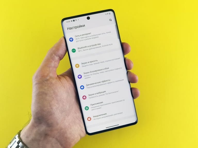
ਨੈਵੀਗੇਸ਼ਨ ਨੂੰ really user-friendly ਬਣਾਉਣ ਦਾ ਢਾਂਚਾ – Deep usability testing. Menu structure usability/quick findability/confidence – watch/record/analyse. Testing only tech bugs remove ਨਹੀਂ; behavioral/expectations/deep needs ਨੂੰ highlight ਕਰਦਾ ਹੈ।
Testing: ਦਮਾਗ ਰਖੋ—audience diversity (age, tech skills, use case)। Youth/tech-savvy menus faster learn/use; Older/low-tech group may struggle—So sample chosen right ਹੋਣਾ ਚਾਹੀਦਾ।
Testing keys
- Completion Rate: ਕਿੰਨੇ user ਕੰਮ ਪੁੰਚਦੇ
- Error Rate: Mistake count/type
- Time Used: Task completion speed
- Satisfaction Level: Overall menu feeling
- Learnability: Speed/ease menu absorption
- Navigation Ease: Frictionless traversal
Testing factors/measurement:
| Factor | Definition | Measurement |
|---|---|---|
| Usability | Menu easy use | Completion/error/time |
| Clarity | Items clear | User feedback/surveys/observation |
| Effectiveness | Menu helps goal attainment | Completion rate, satisfaction |
| Satisfaction | User menu happiness | Surveys/ratings/feedback |
Testing data — analyse/focus menu improvement accordingly. Iterative testing/continuous feedback, menu hamesha expect exceed/meet ਕਰਦਾ।
ਸਫਲ ਮੀਨੂ ਡਿਜ਼ਾਇਨ: ਉਦਾਹਰਨਾਂ ਤੇ ਨਤੀਜੇ
ਨੈਵੀਗੇਸ਼ਨ ਨੈਚਰਲ ਬਣਾਉਣ ਦਾ arts/principles/exemplars — Successful menu case-studies, analysis, real outcomes. Every design unique; target needs, behaviour/depth/feedback.
Successful menus, functions, UX impact:
| Design Example | Sector | Key Features | UX Benefit |
|---|---|---|---|
| Restaurant Website | Food/Drink | Visual menu, fast reservation | Quick browse/order |
| E-Commerce | Retail | Filtering/Sorting/Search | Quick product find/compare |
| Blog Website | Content | Category/Tag-based | Relevant topic search, discovery |
| Corporate Website | Services | Clear headings/content | Quick information find, trust |
ਬੇਹਤਰੀਨ ਡਿਜ਼ਾਇਨ ਦੀਆਂ ਮੁੱਖ ਖਾਸੀਤਾਂ
- Clear wording
- Visual hierarchy
- Mobile compatibility
- ਐਸਈਓ
- User feedback value
- Fast loading
ਹੇਠਾਂ, ਵੱਡੇ menu strategy ਮੋਢਾ ਕਰਕੇ—2 different exemplars explain—user tailored approaches yield deep results।
ਉਦਾਹਰਨ 1
Travel agency site menu: Visual categorization, mobile frictionless, deep UX, speedy reservation, location awareness, emergency responsive.
ਉਦਾਹਰਨ 2
Online education platform: Menu extensive, filters/search/adaptive/discovery; vast choices easy navigation—major satisfaction.
ਸਫਲ ਡਿਜ਼ਾਇਨ strategy always user-centric iterative, never settle.
ਵਰਤੋਂਕਾਰ ਫੀਡਬੈਕ ਦੀ ਵਕਤ
ਵਰਤੋਂਕਾਰ feedback - ਕੇਵਲ ਅਨੁਭਵ/ਸਫਲਤਾ ਦੀ ਪੁਸ਼ਟੀ ਨਹੀਂ, ਮੂਲ ਸਮਝਦੇ/optimized/innovative points identify ਕਰਦਾ। Direct feedback used for tagging, placement/menu structure updates—deep UX improvement.
Positive feedback—motivation/validation; negative—problem-solving; constructive criticism—new ideas/innovation; suggestions—future plan/deployment
| Feedback Type | Importance | Action |
|---|---|---|
| Positive | Strength assurance/motivation | Sustain/amplify best |
| Negative | Weak point highlight | Analyse/solve |
| Constructive | New perspectives, innovation | Evaluate/implement if viable |
| Suggestion | User need, future path | Evaluate/deploy if practical |
Feedback collection: Surveys, tests, heatmaps, analytics, integrated feedback forms, social listening, focus groups—real input/deep improvement.
User feedback iterative improvement loop: menu constant update/optimise/user-centric/deep success/full satisfaction guaranteed.
Feedback ਯੋਗਤਾਵਾਂ
- User tests: Direct experience, deepest feedback
- Surveys: Trends/needs
- Heatmaps/Analytics: Visual navigation, behaviour
- Forms: Instant input
- Social tracking: Comments, brand feedback
- Focus groups: Deep qualitative dialogue
ਡਿਜ਼ੀਟਲ ਮੀਨੂ ਡਿਜ਼ਾਇਨ ਵਿੱਚ ਪਾੜੀਆਂ ਗਲਤੀਆਂ
Digital menu—direct UX driver; frequent mistakes - usability destroyed/bounce increase/business loss. Avoiding pitfalls—deep improvement.
Successful menu: easy findability/intuitive structure/aesthetically strong or lost user/confusion/bad exit/business loss.
Common mistakes
- Complex/confusing structure
- Poor search
- Mobile incompatibility
- Excessive categories
- Poor visuals
- Slow loading
Improvement: User-centric approach/Deep testing/Iterative feedback/Evolution/Business protection/deep UX success.
| Mistake | Definition | Potential outcome |
|---|---|---|
| Complex menu | Difficult navigation | Exit/loss conversion |
| Poor search | Difficult product info access | Satisfaction drop/loss sale |
| Mobile incompatibility | Menu fails on phone/tablet | Mobile user lost/potential loss |
| Slow load | Menu slow | Exit/anger/bounce |
Menu redesign/invest in usability/testing/analytics/feedback—consistent user-centred improvement/business success long-term
ਨਤੀਜਾ: ਵਧੀਆ ਮੇਲ ਮੀਨੂ ਲਈ ਅਮਲਯੋਗ ਸੁਝਾਅ
ਅਸਰਦਾਰ menu design — ਨੈਵੀਗੇਸ਼ਨ frictionless/UX boosted/deep satisfaction। Principles/examples show that menu usability is not only visual, but deep functional requirement। User needs/deep accessibility/intuitive interface—increase trust, engagement, business success.
Menu consistency, placement, language, visual style—always same across site/apps. Confusion avoided/secure exploration enabled. Mobile adaptation—responsive design, touch compatibility, fast load.
Menu optimization steps
- User research: Survey/testing for needs/expectations
- Clear language: Simple wording/item labels
- Visual hierarchy: Colour/size/contrast guides important items
- Mobile compatibility: Responsive across all devices/screens
- Consistency: Menu language/placement/theme fixed site/app-wide
- User feedback: Continuous improvement via feedback/testing
Menu improvement constant, feedback-driven iteration, deep satisfaction/business success sustained. Mistakes avoided via careful design/testing:
| Mistake | Definition | Solution |
|---|---|---|
| Complex navigation | Difficult access | Simplify/clear categorization |
| Mobile incompatibility | Poor mobile render | Responsive/mobile-friendly design |
| Poor visual hierarchy | Important items not highlighted | Colour/contrast/size hierarchy |
| Inconsistent structure | Different menu style per page | Consistent sitewide design |
Menu personalization/testing/feedback continuous—project unique, menu structure always fit audience/deep satisfaction guaranteed.
ਮੁਰਕਦੇ ਸਵਾਲ
ਵਰਤੋਂਕਾਰ-ਮੇਲ menu/site performance influence ਕਰਦਾ?
Menu usability—info quick findability, bounce reduction, engagement increase, SEO rank improvement
Mobile menu design optimization keys?
Touch-friendly big buttons, easy scroll, hamburger/menu, fast load, one-handed usability, simple structure
Menu item ordering strategy?
Most frequent/important items top, logical flow, popular categories (e.g. New Products, Discounts) prominent
Colours/fonts menu design best?
Brand visual identity reflect, readability up, contrast (dark/light), font—Arial/Helvetica/Open Sans, brand palette fit
Menu testing integration?
Prototype stage, feedback collection (structure/usability/access), A/B test design comparison, select best performer
Menu design tools/resources?
Figma/Adobe XD/Sketch, UserTesting.com, Dribbble/Behance—design/test/inspiration
Common menu mistakes/avoidance?
Complex design, poor search, mobile incompatibility, slow load, misleading labels; Keep simple, optimize search, mobile-friendly, reduce image, correct labels
Menu accessibility—importance/ensuring?
Disability-friendly ease: Keyboard navigation, screen reader/code compatibility, colour contrast, alt text, WCAG compliance