 Afrikaans
 Azərbaycan
 Bosanski
 Čeština
 Dansk
Dansk Deutsch
 English
 Español
 Filipino
 Français
 Hrvatski
 Indonesia
 Italiano
 Magyar
 Melayu
 Nederlands
 Norsk
Norsk Oʻzbek
 Polski
 Português
 Română
 Slovenčina
 Slovenščina
 Suomi
Suomi Svenska
 Tiếng Việt
 Türkçe
 Ελληνικά
 Беларуская
 Български
 Русский
 Српски
 Українська
 עברית
עברית اردو
اردو العربية
 پښتو
پښتو فارسی
فارسی አማርኛ
አማርኛ मराठी
मराठी বাংলা
বাংলা தமிழ்
தமிழ் ไทย
ไทย မြန်မာ
 한국어
한국어 中文
中文 日本語
日本語

ఈ బ్లాగ్లో మీరు రిస్పాన్సివ్ బ్రేక్పాయింట్ గురించి లోతుగా తెలుసుకుంటారు. "Responsive Breakpoint" అంటే ఏమిటి? దీనిలో వాడే వ్యూహాలు, వాటి ప్రయోజనాలు, తిన్నతైన డిజైన్ ప్రిప్లస్, విజయవంతమైన డిజైన్కి అవసరాలు అన్నీ విశ్లేషించబడతాయి. అలాగే, వాడే టూల్స్, తరచుగా జరిగే తప్పులు, ఉత్తమ సెట్టింగులు, పనితీరు పెంచే చిట్కాలు వంటి అనుభవజ్ఞాన వివరాలు ఇక్కడ పొందుపర్చాం. సమగ్రమైన ఈ గైడ్, రిస్పాన్సివ్ బ్రేక్పాయింట్ డిజైన్లో నైపుణ్యం పెరగాలనుకుంటే మీకు నాణమైన Telugu వనరుగా ఉంటుంది.
Responsive Breakpoint అంటే ఏమిటి?
Responsive breakpoint అంటే - వెబ్ పేజీ layout, వివిధ డివైస్లలో (మొబైల్, టాబ్లెట్, ల్యాప్టాప్, డెస్క్టాప్) ఎలా మార్చాలి అన్నదాన్ని డిఫైన్ చేసే పాయింట్లు. ఇవి pixel (px) కంటే ఫ్రేమ్ చేయబడతాయి, CSS media queries ద్వారా అమలు చేస్తారు. ప్రధాన ఉద్దేశ్యం: ఏ వ్యవస్థానికైనా - వాడుకు (user) ఉత్తమ అనుభవాన్ని ఇవ్వడం!
Responsive breakpoint స్ట్రాటజీలు, వెబ్ దృష్టిలో కొలమానం. డిజైనర్, డెవలపర్లకు: ఏ స్క్రీన్ పరిమాణంలో ఏ విధమైన layout, menu, content changes అవసరమో ఐతే ఈ వ్యూహాలు ద్వారా ప్లాన్ చేయవచ్చు. ఉదాహరణకి, చిన్న ఫోన్లలో మెనూలను కనపడకుండా చేసేవారు లేదా కంటెంట్ను వరుసగా (vertical) మరలించడాన్ని ప్లాన్ చేస్తారు.
Responsive Breakpoint ముఖ్య లక్షణాలు
- వివిధ డివైస్లకి జోడించడంలో సహాయపడేలా
- యూజర్ అనుభవాన్ని గరిష్ఠం చేసేలా
- CSS media queries ద్వారా సెటప్ చేయబడేలా
- Flexibility & fluidity layoutకి బలాన్ని
- కంటెంట్ readability పెంచడం
ఇక ఈ కింది టేబుల్ చూస్తే, సాధారణంగా వాడే responsive breakpoint values, ఆ డివైస్ల సహాయంగా వాడే layout వివరాలు:
| Breakpoint Value (px) | Target Device | Typical Usage |
|---|---|---|
| 320-480 | మొబైల్ ఫోన్లు (పార్టికల్) | Menus hide, single column layout |
| 481-768 | మొబైల్ landscape, చిన్న టాబ్లెట్లు | Two column layout, larger font |
| 769-1024 | టాబ్లెట్లు | Three-column layout, advanced navigation |
| 1025+ | ల్యాప్టాప్, డెస్క్టాప్ | Full-width content, detailed info display |
Responsive breakpoint ఎంపిక - ప్రాజెక్ట్ టార్గెట్, కంటెంట్ కంప్లక్స్, డిజైన్ అవసరాలపై ఆధారపడి ఉంటుంది. సరైన breakpoints ప్లాన్ చేస్తే, మీ వెబ్సైట్ అన్ని డివైస్ల్లో గరిష్ఠంగా చూడబడుతుంది, యూజర్లకి navigation సులభంగా ఉంటుంది. ఇది overall user satisfaction, site engagementను కచ్చితంగా పెంచుతుంది.
responsive breakpointను మాత్రమే pixel ఫోకస్ కాకుండా, డివైస్ resolution (DPI), orientation (portrait/landscape) ప్రభావాన్ని కలపాలిసిన అవసరం ఉంది. ఇది కొంత complex media queries, advanced design approach అవసరం. అయితే ఆతితీయౖన (rich) యూజర్ experience కోసం ఈ కష్టం అవసరం!
Responsive Breakpoint స్ట్రాటజీల ప్రాధాన్యత
Responsive breakpoint వ్యూహాలు, మీ సైట్ ని అన్ని స్క్రీన్ పరిమాణలకు, డివైస్లకి సమర్థంగా అనుసంధానం చేస్తాయి. ఈ వ్యూహాలు, user experience పెంచి, conversions rate & SEO performanceలో మెరుగుదల చేస్తాయి. సరైనంగా ప్లాన్ చేసిన breakpoint strategy వల్ల, అధ్యయనం, నావిగేషన్ సులువుగా ఉంటుంది, యూజర్ సైట్లో ఎక్కువ కాలం ఉంటాడు. దీనిని Google, Bing వంటి సెర్చ్ ఇన్జిన్లు కూడా positive గా గమనిస్తాయి.
ఏ breakpoint వ్యూహాన్ని ఎంచుకోవాలి అని వెచ్చించేటప్పుడు, technical కాదు, user-centric approach ప్రధానంగా అవసరం. మీ user base ఏ devices, screen sizes ఎక్కువగా వాడుతున్నారు అన్న data ఆధారంగా ఆకట్టే breakpointsా వ్యూహం రూపుదిద్దాలి. ఎలా optimize చేయాలో ఆ డేటా ద్వారా తెలుసుకొని, అనర్ధానికి ముందే మీ సైట్ను design చేయవచ్చు.
| Breakpoint Range | Device | Suggested Adjustments |
|---|---|---|
| 320px – 480px | మొబైల్ (portrait) | Single-column, large fonts, simplified navigation |
| 481px – 768px | మొబైల్ (landscape) | Two-columns, optimized images |
| 769px – 1024px | టాబ్లెట్లు | Three-columns, UI for touch screens |
| 1025px+ | డెస్క్టాప్ | Multi-columns, wide-screen layout |
Breakpointsను స్పష్టంగా డిఫైన్ చేస్తే వెబ్సైట్ ఫ్లెక్సిబిలిటీ, adaptability పెరుగుతుంది. దీనితో, development ఎఫ్ఫోర్చ్ తగ్గుతుంది, code repetitions తగ్గిస్తారు, maintenance లో క్లుప్తంగా ఉంటారు, loading speed భారీగా పెరుగుతుంది. ప్రత్యేకంగా ప్రతి డివైస్ కోసం పూర్తి layout necessity లేదు, ఒక design ద్వారా అన్ని variations హ్యాండిల్ చేయవచ్చు, సమయం, ఖర్చు తగ్గుతుంది.
ఏ strategy follow చేయాలి? ఇవి అని, responsive breakpoint strategyకు stepwise approach:
- Target audience analysis: ఏ డివైస్లు-ఇక స్క్రీన్ sizes యూజర్లు ఎక్కువగా తిరుగుతున్నారు.
- Content priority: ముఖ్యమైన content అన్ని స్క్రీన్ పరిమాణాల్లో అందించాలి.
- Breakpoint selection: Contextనుబట్టి best breakpoint intervals ప్లాన్ చేయాలి.
- Flexible grid use: Contentకు fluid rearrangement ఇవ్వాలి.
- Optimize media queries: CSS media queries యక్షంగా, క్లీన్గా వాడాలి.
- Testing & improvement: తరచుగా devices, browsersపై పరీక్ష & iterate చేయాలి.
సారాంశంగా, మంచిగా responsive breakpoint planning, సాంకేతిక పరంగా కాకుండా, యూజర్ experience prime కాకుండా design philosophyగా మెలిక పెట్టాలి. సరైన వ్యూహాలు అమలు చేస్తే, మీరు మీ వెబ్సైట్కి మంచి గుర్తింపు, సంతృప్తి ఇస్తారు.
Responsive డిజైన్ లో మెయిన్ సూత్రాలు
Responsive breakpoint planning, రిస్పాన్సివ్ వెబ్ డిజైన్ preliminary మార్చే పాయింట్. సమర్థవంతమైన responsive design అంటే, అన్ని డివైస్లపై (డెస్క్టాప్ నుంచి మొబైల్ వరకు) consistent & user-friendly experience ఇవ్వడం. విజయవంతమైన responsive డిజైన్కు వైరాగ్యం, adaptability, user-focus తప్పనిసరి. Pixel-widths మీద ఆధారపడకుండా, fluid grids & flexible images వాడతే content ప్రతి స్క్రీన్కు సరిగా adapt అవుతుంది. Media queries ద్వారా అన్ని responsive breakpoint valuesకి customized styles ఇవ్వవచ్చు, ప్రతి deviceకి best దృశ్యం అందించవచ్చు.
ప్రాథమిక సూత్రాలు
- Fluid grids: Pixel values బదులు percentage values వాడి, layout auto-resize అయ్యేలా చూడాలి.
- Flexible images: Images కూడా screen size/html container పరిమాణం బట్టి auto scale అవాలి.
- Media queries: CSS media queriesతో పరిస్థితిని బట్టి styles handle చేయాలి.
- Mobile-first: Design మొబైల్పై ముందు, తరువాత desktop కోసం scale చేయాలి.
- Touch-friendly UI: Mobile డివైస్లలో వినియోగదారులకు కొలే friendly elements వాడాలి.
- Performance optimization: చిన్న images, lean code, caching వంటి ప్రాక్టీస్లు వాడాలి.
| Breakpoint Name | Screen Width (px) | Target Device |
|---|---|---|
| Extra Small | <576 | Mobile portrait |
| Small | ≥576 | Mobile landscape, small tablets |
| మధ్యస్థం | ≥768 | Tablets |
| Large | ≥992 | Laptops |
| Extra Large | ≥1200 | Wide desktop screens |
Responsive డిజైన్, technical implementation మాత్రమే కాదు, కానీ user experience కేంద్రంగా ఉండాలి. User needs గుర్తించండి, స్వతంత్రంగా user interactivityను పరీక్షించండి, design accordingly. User feedback తీసుకుని, designను iterate చేయడమే responsive breakpoint masteryకి మార్గం.
విజయవంతమైన Responsive డిజైన్ కీ అవశ్యకాలు
సక్రమమైన responsive breakpoint strategy వేయాలంటే, user experience గరిష్ఠంగా, web site అన్ని డివైస్లపై flawlessగా పనిచేయాలంటే, తర్వాతి అవసరాలు తప్పనిసరి. మొదట, target audience ఎవరు? ఏ screen sizes, devices ఎక్కువగా వాడుతున్నారు? ఇది breakpoint strategy route నిర్ణయిస్తుంది. రెండవది, flexible grid system వాడండి - content orderly, readable గా పేర్చేలా. Images మరియు media విషయాలు కూడా responsiveగా ఉండాలి – విడిగా resolution అందాలి (srcset), scale మారాక distortion లేకుండా చూడాలి. Optimization లేని images loading speed తగ్గిస్తాయి, user experience down చేస్తారు.
Design Essentials
- Target audience data ఆధారంగా breakpoints చేర్చడం
- Flexible grid systems
- Optimized & responsive images
- Readable, consistent typography
- Touch-friendly UI elements
- Correct media query usage
Typography కూడా responsiveగా ఉండాలి: font size, line-height, screen size పై ఆధారపడి readability intact ఉండేలా. Mobile devicesకి UI elements (buttons/links) పెద్దగా, easy-to-tapగా ఉండాలి. కింది టేబుల్లో ఆయా devices కోసం recommended touch area sizes చూడండి:
| Device Type | Screen Size | Touch Area Min Size | Explanation |
|---|---|---|---|
| Mobile | 320-480px | 44x44 px | Easy finger tap zones |
| Tablet | 768-1024px | 48x48 px | Bigger display for easier touch |
| Laptop | 1280px+ | 48x48 px | Mouse & touchpad usability |
| Desktop | 1920px+ | 48x48 px | High-res screens optimal |
Performance testing & optimization: devices, browsersపై repeated tests mandatory. Google PageSpeed Insights & similar tools వాడండి, performance issues పట్టించండి, suggestions ఇంప్లిమెంట్ చేయండి. వేగంగా load అయ్యే site user satisfaction, search rankingకు మంచిది.
Responsive Breakpoint డిజైన్ లో వాడే టూల్స్
Responsive breakpoint డిజైన్లో, అనేక tools & technologies వాడతారు. Prototype, testing, development స్టేజీలకు efficient tools అవసరం. Toolsతో, design/UXకు పరిమితి లేదు – ఏ deviceలో ఐతే మంచిగా show అవుతుందో previsualization, testing, code optimization చేయవచ్చు.
| Tool Name | Description | Usage |
|---|---|---|
| Google Chrome DevTools | Browser built-in developer tools | Debugging, performance, responsive tests |
| Firefox Developer Tools | Advanced dev tools in Firefox | CSS adjustments, JS debugging, network analysis |
| Adobe XD | Vector-based prototyping tool | UI designing, interactive prototype, UX design |
| BrowserStack | Cloud-based browser/device test platform | Multi-browser & device testing |
Tools - consistency, user experience కోసం, developer workload చాలా తగ్గిస్తాయి. Responsive breakpoint planningలో, efficient tools వాడి, web developer/web designer productivity పెంచవచ్చు.
టూల్స్ వల్ల ప్రయోజనాలు
Tools వల్ల response design చాలా వేగంగా, ఖర్చులో, యూజర్ సంతృప్తి జరగుతుంది. టాప్ టూల్స్ ఇవే:
- Google Chrome DevTools: Comprehensive, free debugging suite
- Firefox Developer Tools: Open-source, customizable dev platform
- Adobe XD: Fast prototyping UI
- BrowserStack: Wide device/browser base for testing
- Responsively App: One-click multi-screen testing
టూల్స్ వల్ల లోపాలు
Tools వల్ల కొన్ని విషయాల్లో limitations కూడా ఉన్నాయి. Advanced toolsలో అధిక ఖర్చు (తక్కువ బడ్జెట్ బ్రాండ్/individuals కొరకు ఉత్తిర)
నిరుదాక్షినిగ్గా కొత్తవారికి steep learning curve ఉంటే productivity down అవుతుంది. ఇంకా కొన్ని tools కోసం పెద్ద RAM, CPU అవసరం - అందుకే basic devicesలో ఇది చిన్న minus point.
Responsive డిజైన్ లో తరచుగా చేసే తప్పులు
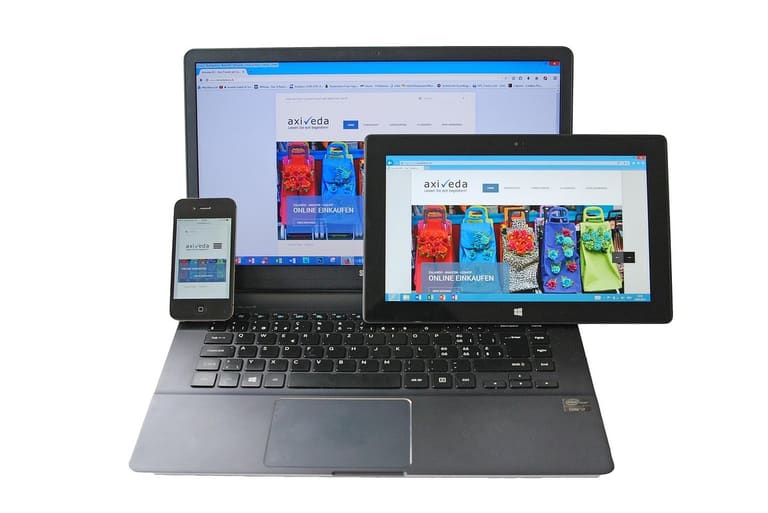
Responsive డిజైన్ - web site అన్ని devicesలో adapt కావాలి, కానీ అనేక common mistakes వల్ల user experience down, site performance దెబ్బతింటుంది. ముఖ్యంగా responsive breakpoint strategy సరిగా అమలు చేయకపోతే layout inconsistency, functionality issues వస్తాయి. కొంచెం జాగ్రత్తతో చేసుకుంటే ఇటువంటి ప్రతిదీ handle చేయవచ్చు.
తరచుగా వాడే breakpoints కోసం ఈ table లో చూసుకోండి:
| Device | Screen Width (px) | Suggested Breakpoint | Description |
|---|---|---|---|
| Mobile (Portrait) | 320-480 | 480px | Small screens adjustments |
| Mobile (Landscape) | 481-767 | 768px | Wider view, open content |
| Tablet | 768-1023 | 1024px | Tablet optimized layout |
| Desktop | 1024+ | 1200px | Full-res desktop design |
Responsive design లో ఉపాధి/overlook చేసిన mistakes user retentionను తగ్గిస్తాయి.
Common Mistakes
- Insufficient testing: Devices, browsers మీద అందుబాటులో టెస్ట్ చేయటం లేదు
- Non-flexible images: Images scale అవ్వటం లేదు, overflow అవుతుంది
- Poor readability: Font size, line height screen size బట్టి adjust చేయటం లేదు
- Ignoring mobile-first: Mobile layout plan లేకుండా desktop priority
- Improper breakpoints: Breakpoints target device resolutionకి ముదాం
- Ignoring touch areas: Mobile finger taps zones చిన్నగా ఉండటం
ఇటువంటి తప్పులను దూరంగా ఉంచి, సరైన responsive breakpoint strategy వాడితే web site user base/engagement grow అవుతుంది.
Responsive Breakpoint వాడే ఉత్తమ సెట్టింగులు
Breakpointsను క్యాలిబ్రేట్ చేయటం, consistency & user friendlinessకి కీ. Optimal settingsఎంపిక కోసం target users devices, prevalent resolutions, content priority, UX interactionsన్నీ జాగ్రత్తగా విచారించాలి.
Fluid layoutsతో, auto resizingకి ప్రాధాన్యం ఇచ్చి, fewer breakpointsకి manage చేస్తే codebase lean & maintenance easy. Fluid design is not always enough; some circumstances require explicit breakpoints for granular control.
| Breakpoint Range | Device Type | Scenario |
|---|---|---|
| 320px – 480px | Mobile portrait | Basic mobile navigation, single column |
| 481px – 768px | Mobile landscape/small tablet | Advanced navigation, two-column |
| 769px – 1024px | Tablet | Tablet menu, three-column |
| 1025px+ | Desktop/large screens | Full desktop, multi-column, wide nav |
Content readability, UXను అంతా ముందు ఉంచండి. Text sizes కలపండి, buttons tap-friendlyగా, images proper scalingగా ఉండేలా చూడండి. Breakpoint planningకు ఇక్కడ steps:
- Screen size analytics: Users వాడే devices major sizes కనిపెట్టండి
- Content priority: Mobile దృష్టికి content ముందుగా చూపండి
- Limit breakpoints: Too many breakpoints గురించి దూరంగా ఉండాలి (3-5 సరి)
- Flexible grids: Fluid grids usability కోసం వాడండి
- Clean media queries: Redundant code lines మానండి
- Continuous testing: Devices & browsers పై repeated validation చేస్తూ optimize చేయండి
Responsive design iterativ process: User feedback థిస్కిన్తి, performance analysis ద్వారా మీ breakpoints త్రేడా optimize చేయండి. Result: better site performance, user satisfaction.
Responsive డిజైన్ లో పనితీరును పెంచే చిట్కాలు
Responsive breakpoint planningతో web site అన్ని స్క్రీన్లపై work చేస్తుంది, కార్యక్రమములో performance కూడా ప్రశంసించదగినది. Site speed, user satisfaction, search ranking grow చేయటానికి performance optimizations తప్పక చేయాలి.
| Optimization Area | Description | Recommended Techniques |
|---|---|---|
| Image Optimization | Compress images, correct format | WebP, compression tools, responsive sizing |
| CSS/JS Optimization | Minify, merge files | Minification, merging, critical CSS prioritization |
| కాషింగ్ | Enable browser/server caching | Browser cache, CDN, server-side caching |
| Breakpoint Optimization | Correct breakpoints to avoid unnecessary loading | Clean media queries, device-based content serving |
Performance పెంచే బేసిక్ టిప్స్: Images సర్దబెట్టండి, WebP వాడండి, CSS/JS files minify/merge చేయండి, browser caching enable చేయండి, contentను CDN ద్వారా serve చేయండి.
- Images compress చేయండి (WebP)
- CSS/JS files మించహుచై & combine చేయండి
- Browser caching తో వేగంగా serve చేయండి
- CDN ద్వారా content push చేయండి
- Redundant HTTP requests avoid చేయండి
- Lazy loading images/videosకి enable చేయండి
- Breakpoints cleanly set చేసి regular testing చేయండి
Caching enabled అయితే, repeat visits మరింత వేగంగా అవుతాయి. CDN తో global speed పెరుగుతుంది. Unused content mobile devicesపై avoid చేయండి (heavy images/animations), mobile-specific content మాత్రమే load చేయండి. Site speed & UX grow అవుతుంది, conversion rate మీద direct effect ఉంటుంది.
విజయవంతమైన Responsive Breakpoint డిజైన్ ప్రయోజనాలు
Good responsive design తో, website/appలో అన్ని డివైస్లపై flawless కంటెంట్ సాంకేతికంగా క్రియాత్మకంగా show చేస్తుంది. User experience పెరుగుతుంది, SEO performance grow అవుతుంది.
Responsive design విదంగా organic search visibility improve చేస్తుంది. Google mobile-first mentality ఎంచుకుంటుంది; mobile-optimized site అంటే search results స్థానాల్లో upgrade. అన్ని devicesకి ఒక URL ఉంటే, SEO authority grow అవుతుంది.
| Benefit | Description | Impact |
|---|---|---|
| User Experience | Flawless view across devices | User satisfaction up |
| SEO Upgrade | Google prefers mobile-ready sites | Organic traffic up |
| Cost Saving | No need for separate mobile site | Development, maintenance cost down |
| Higher Conversion | User-friendly design boosts sales | Revenue up |
Responsive design ద్వారా cost save అవుతుంది - mobile app/site alag separate develop చేయాల్సిన అవసరం లేదు. Content changes single-point నుంచి మేనేజ్ చేసుకోవచ్చు.
Conversion rate grow అవుతుంది: users navigate easily, desired actions perform చేయడానికి motivation ఉంటుంది (purchase, form submission etc). అభివృద్ధి చెందుతున్న responsive design, brand image grow చేసేలా, management easy.
- Improved user experience
- Better SEO
- Cost savings
- Higher conversions
- Single URL convenient management
- Brand reputation boost
Responsive డిజైన్ లో జాగ్రత్తలు
ప్రతి స్క్రీన్కు flawless experience ఇవ్వాలంటే, responsive breakpoint strategy నిర్ధారించాలి. Content readability - usability అన్ని devicesలో intact ఉండాలి.
Grid systems లో elasticity prime. Fixed width badulu percent, viewport based widths ఉపయోగించవచ్చు. Media elements (images, videos) కూడా responsive ఉంటే site speed, user experience grow అవుతుంది.
| Element | Description | Suggested Approach |
|---|---|---|
| Grid system | Flexible layout | % or viewport width |
| Media | Optimized images/videos | srcset, compression |
| Typography | Readability/scaling | em/rem units |
| Navigation | Easy access | Mobile menu (hamburger icon) |
Typography: Font size, spacing - em/rem units ద్వారా screen size అప్పటికి adapt చేయాలి.
Navigation: Mobile menus hamburger-style ఒక చిన్న screenకి పనికొచ్చేలా చాలనిది. అన్ని అనుభవాలకు తిరుగుబాటు; check-list:
- Flexible grid use
- Media optimization
- Typography adaptation
- Mobile-navigation-friendly menus
- Responsive breakpoint vigorously plan చేయండి
తరచుగా అడిగే ప్రశ్నలు
Responsive designలో breakpointలు ఏ పని చేయాలి, ఎందుకు అవసరం?
Breakpointలు ప్రకటించిన screen sizesపై website layout/contentను adapt చేయడంలో సహాయపడతాయి. ఇది user device ఆధారంగా optimal experience ఇవ్వడంలో సహాయపడుతుంది (mobile నుంచి TV వరకు).
ఎప్పుడు - ప్రత్యేక responsive breakpoint strategy వాడాలి?
Your site user base లో ఎక్కువగా mobile అయితే, mobile-first strategy ప్లస్. Content complexity పెరిగితే, finer breakpoints అవసరం - site variation grow చేస్తుంది.
Responsive designలో flexible grid systems ఎందుకు అవసరం?
Content సోగా orderly wayలో, screen sizesకు fluidly adapt అయ్యేలా flexible grids ఉపయోగించవచ్చు. ఇది readability & usability maintain చేయడంలో prime.
Media queries ఉపయోగించేప్పుడు ఏమి సంద దృష్టిలో?
Breakpoints నిర్ధారించాలి, user devices ఏ screen sizes utilize అవుతున్నాయో విచారించి, media queries క్లీన్గా CSS లో organize చేయాలి. పరిశోధన ద్వారా unnecessary queries avoid చేయాలి.
Common responsive breakpoint design mistakes ఏవి? వాటి solution?
Breakpoints not enough, overcomplicated layouts, performance issues. Simple approach తో ప్రారంబించండి, need బట్టి breakpoints add చేయండి, lean CSS వాడండి, images optimize చేయండి.
Breakpoints రాజకీయంలో ఏమి దృష్టి? User behaviour ఎలా ప్రభావితం చేస్తుంది?
Content flow, UX intact ఉండాలని. Content distorted/readability lost అయితే breakpoint అక్కడ సెట్ చేయండి. User analytics తో, most-used screens గుర్తించి, తదనుగుణంగా breakpoints optimize చేయండి.
మీ site responsive అని ఎలా పరీక్షించాలి?
Developer tools (Chrome/Firefox)లో screen simulations try చేయండి. Online responsive test tools కూడా వాడండి. అందులో మీరు site ఎలా show అవుతుంది తెలియజేస్తుంది.
Performance optimization కోసం ఏ techniques వాడాలి?
Images optimize చేయండి, CSS/JS minify చేయండి, caching enable చేయండి, lazy loading images/videos కు అమలు చేయండి, responsive images (srcset), critical CSS prioritize చేయండి.