 Afrikaans
 Azərbaycan
 Bosanski
 Čeština
 Dansk
Dansk Deutsch
 English
 Español
 Filipino
 Français
 Hrvatski
 Indonesia
 Italiano
 Magyar
 Melayu
 Nederlands
 Norsk
Norsk Oʻzbek
 Polski
 Português
 Română
 Slovenčina
 Slovenščina
 Suomi
Suomi Svenska
 Tiếng Việt
 Türkçe
 Ελληνικά
 Беларуская
 Български
 Русский
 Српски
 Українська
 עברית
עברית اردو
اردو العربية
 پښتو
پښتو فارسی
فارسی አማርኛ
አማርኛ मराठी
मराठी বাংলা
বাংলা தமிழ்
தமிழ் ไทย
ไทย မြန်မာ
 한국어
한국어 中文
中文 日本語
日本語

ഈ ബ്ലോഗ് ലേഖനം, റീസ്പോൺസീവ് ബ്രേക്ക്പോയിന്റ് സ്ട്രാറ്റജികൾ ആഴത്തിൽ അവലോകനം ചെയ്യുന്നു. "responsive breakpoint" എന്നതിന് എന്താണ് അർത്ഥം, ഈ സ്ട്രാറ്റജികളുടെ തുടക്കവും, ഈ മാർഗങ്ങൾ Web Hosting വെബ് ഡിസൈനിൽ ഫലപ്രദമായി ഉപയോഗിക്കേണ്ടതിന്റെ മുഖ്യപ്രാധാന്യവും വിശദീകരിക്കുന്നു. റീസ്പോൺസീവ് ഡിസൈനിന്റെ അടിസ്ഥാന തത്വങ്ങൾ, വിജയകരമായ ഡിസൈനിനുള്ള ആവശ്യങ്ങൾ, ഉപയോക്തൃങ്ങൾ പ്രയോഗിക്കേണ്ട ഉപകരണങ്ങൾ, സാധാരണ തെറ്റുകൾ, മികച്ച ക്രമീകരണങ്ങൾ, പ്രകടനമുയർത്താനുള്ള സൂചനകൾ തുടങ്ങിയ പ്രായോഗിക വിവരങ്ങൾ ആണ് ഇവിടെ ഉൾപ്പെടുത്തിയിരിക്കുന്നത്. റീസ്പോൺസീവ് ഡിസൈനിന്റെ പ്രധാന ആനുകൂല്യങ്ങൾ റീപ്സ്പോൺസീവ് ബ്രേക്ക്പോയിന്റ് വിവേചനത്തിൽ ഇഷ്ടകരമായി ടെക്നിക്കലായി കൊള്ളാനാകും.
Responsive Breakpoint എവിടെയാണ്?
Responsive breakpoint വെബ് ഡിസൈനിൽ വ്യക്തിഗത ഭാഗമായി വിവിധ ഗ്യാജറ്റുകൾ (മൊബൈൽ, ടാബ്ലറ്റ്, ലാപ്ടോപ്, ഡെസ്ക്ടോപ്പ്) എന്നിവയുടെ സ്ക്രീൻവലുപ്പം അനുസരിച്ചു പേജിന്റെ ലേഔട്ടും ഉള്ളടക്കവും എങ്ങനെ മാറണം എന്നത് നിർവചിക്കുന്ന ട്ടെക്നിക്കൽ പോയിന്റ് ആണ്. ഇവ പോമെന്നസിൾ അപ്പരായ px ഉപയോഗിച്ചാണ് നിർധാരണം ചെയ്യുന്നത്, മഴി CSS media queries വഴി. ലക്ഷ്യം – ഉപയോക്താക്കൾക്ക് അവരുടെ ഗ്യാജറ്റിന്റെ സ്വഭാവം അനുസരിച്ച് മികച്ച വെബ് അനുഭവം നൽകുക.
Responsive breakpoint സ്ട്രാറ്റജികൾ, സ്വന്തം വെബ്സൈറ്റിനുള്ള രൂപകോലവും അനുഭവം വിനിയോഗിക്കാൻ മികച്ച മാർഗ്ഗം നൽകുന്ന പ്രാധാന്യമാണ്. ഓരോ ഉപയോക്താവിനും ഏത് ഡിവൈസിൽ മോസ്ട് കംഫർട്ടബിള് അനുഭവം വാഗ്ദാനം ചെയ്യുന്നതിനും, സ്ക്രീൻവലുപ്പം അനുസരിച്ചു സൈറ്റിന്റെ മാറ്റങ്ങൾ എങ്ങനെയാണ് എന്നത് വർഷിക്കുന്നത് വെബ്ഡിസൈനർമാർക്കും ഡെവലപ്പർമാർക്കും സഹായകമാണ്. ഉദാഹരണത്തിന്, ചെറിയ മൊബൈൽ സ്ക്രീനുകളിൽ meni hidden ചെയ്യുക, സ്ട്രയ്റ്റ് ഓൾവേർ കണ്ടന്റ് കൊടുക്കുക മുതലായവ.
Responsive Breakpoint – പ്രധാന സവിശേഷതകൾ
- വിവിധ ഗ്യാജറ്റുകൾക്ക് അനുസരണം
- ഉപയോക്തൃ അനുഭവം ഒപ്റ്റിമൈസ് ചെയ്യൽ
- CSS media queries ഉപയോഗിച്ച് സെറ്റപ്പർ
- ഫ്ലുവിഡ് ലേഔട്ടുകൾ രൂപപ്പെടുത്തുന്ന സാധുത
- ഉള്ളടക്ക വായനാ സൗകര്യം വർദ്ധിപ്പിക്കൽ
താഴെയുള്ള ടേബിളിൽ, പ്രചാരത്തിലുള്ള responsive breakpoint examples ഒപ്പം ഏത് ഡിവൈസിൽ ആണ്[target], ഏത് അനുഭവം ആണ് ദിവസാവശ്യമായനു – എന്നതിന്റെ കാഴ്ചയാണ്. ഇതു ഒരു റെഫറൻസ് തന്നെയാണ്, ബട്ടു നിങ്ങൾക്ക് തങ്ങളുടെ സൈറ്റിനുള്ളിൽ കസ്റ്റം ചെയ്ത് ക്രമീകരിക്കാം.
| Breakpoint Value (px) | Target Devices | Typical Scenario |
|---|---|---|
| 320-480 | സ്മാർട്ട്ഫോൺ (Portrait) | മെനു ഷോ-ഹൈഡ്, single column layout |
| 481-768 | സ്മാർട്ട്ഫോൺ (Landscape), Small Tablet | 2-column, ലൊയ ലേഔട്ട് |
| 769-1024 | Tablet | 3-column, advanced navigation |
| 1025+ | Laptop, Desktop | Full-width layout, detailed content |
Breakpoints നിർവചിക്കുമ്പോൾ, സൈറ്റിന്റെ ലക്ഷ്യക്കുടുംബം, ഉള്ളടക്ക ഘടന, ഡിസൈൻ ആവശ്യങ്ങൾ മുതലായ കണ്ടിത്രകൾ മനസ്സിലാക്കുക അവശ്യമാണ്. ശരിയായ breakpoints ചേർത്താൽ, സൈറ്റ് എല്ലാ ഉപകരണങ്ങളിലും optimum look & usability നൽകും. അതു ഉപയോഗനക്ഷത്രവും engagement ഉം വർദ്ധിപ്പിക്കും.
responsive breakpoint സ്ക്രീൻ size-നെ മാത്രമല്ല DPI & orientation (portrait/landscape) എന്നിവയും പരിഗണിക്കണം. അതിനാൽ, മറ്റെക്കുറിച്ച media queries ഉപയോഗിച്ചാലും, കൂടുതൽ വര്ഷമായ ഡിസൈനു സമയം ആവശ്യമായിരിക്കും – എന്നാൽ യൂസർ വിശിഷ്ടിയിലേക്കാണു അതു!
Responsive Breakpoint സ്ട്രാറ്റജികളുടെ പ്രാധാന്യം
Responsive breakpoint സ്ട്രാറ്റജികൾ, സൈറ്റ് എല്ലാ സ്ക്രീൻ വലുപ്പങ്ങളിലും optimum ആയി പ്രവർത്തിക്കുക എന്നതു ഉറപ്പാക്കുന്ന അസൽവാർ ആണ്. ഉപയോക്തൃ അനുഭവം മെച്ചപ്പെടുത്തി, conversion rates വർദ്ധിപ്പിച്ചും, SEO performance കൈവരിക്കുകയും ചെയ്യുന്നു. ശ്രദ്ധാപൂർവം breakpoints പ്ലാൻ ചെയ്യുന്നത്, content readability, ജനം എളുപ്പത്തിൽ navegate ചെയ്യുന്നതും, website-ൽ കൂടുതൽ സമയം ചെലവിടുന്നതും ഇൻറൊക്കുന്നു – ഇത് Google-ലും അനുകൂലമായ സിഗ്നൽ ആയിരിക്കും.
Breakpoints സിതമാകും സെറ്റുചെയ്യുന്നത് വെറും ടെക്നിക്കൽ ജോലി മാത്രമല്ല, user-centric ഡിസൈൻ philosophy ആണ്. User-കൾ ഏത് device അനുപയോഗിക്കുന്നു, ഏത് size അവർക്കു പോപ്പുലർ ആണു എന്നതു analytics വഴി കണ്ടെത്തി, എന്നാറാട്, website-ൽ optimal flexibility/experience നൽകാം.
| Breakpoint Range | Device Type | Recommended Adjustments |
|---|---|---|
| 320px – 480px | സ്മാർട്ട്ഫോൺ (Portrait) | Single-column, Large Font, simplified navigation |
| 481px – 768px | സ്മാർട്ട്ഫോൺ (Landscape) | 2-columns, optimized visuals |
| 769px – 1024px | Tablet | 3-columns, touch-friendly UI |
| 1025px+ | Desktop/Laptop | Multi-columns, Wide-screen design |
Breakpoints സ്ക്രീൻ size adaptability, development process efficiency, code repeatability കഴിയെഴുതി, maintenance cost കുറച്ചു, website load speed വർദ്ധിപ്പിക്കും. പ്രത്യേക സെറ്റപ്പുകൾ ആവശ്യമില്ലാതെ single design-ലൂടെ ഒട്ടുനു പേരും time-ഉം നിലനിർത്താം.
Successful responsive breakpoint സ്ട്രാറ്റജിക്ക് ഈ ചുവടുവെക്കേണ്ട നേതൃത്വം ഉണ്ട്:
- Target Audience Research:വിനിയോഗവാസികൾ ഏത് device/skreen size-ഉം/analyz ചെയ്യുക.
- Content Prioritization:പ്രധാനപ്രാധാന്യ content എല്ലാ size-ൽ easy access-ഉം നൽകുക.
- Breakpoint Selection:Suitable breakpoint range-ൽ site-ന്റെ display പ്ലാൻ ചെയ്യുക.
- Fluid Grid Usage:Content rearrange- ചെയ്യാനുള്ള grid system ഉപയോഗിക്കുക.
- Media Query Optimization:CSS media queries clean & efficient- ആയി എഴുതുക.
- Test & Iterate:കൂടുതൽ device/browser ല് ഉപയോക്തൃ പരീക്ഷയിൽ continue ചെയ്യുക.
responsive breakpoint സ്ട്രാറ്റജികൾ മാത്രം ടെക്നിക്കൽ അവശ്യം എന്ന് കരുതരുത് – User experience-വലുത്ത് design principle ആണ്. ശരിയായ രീതിയിൽ ഇപ്രകാരമുള്ള സെറ്റപ്പുകൾ ചെയ്താൽ, കഴിവുനേട്ടം & ഉപയോക്തൃ സംതൃപ്തി മെച്ചപ്പെടുത്തി വിന്യോഗ വർദ്ധിപ്പിക്കും.
Responsive ഡിസൈൻ – അടിസ്ഥാന തത്വങ്ങൾ
Responsive breakpoint സ്ട്രാറ്റജികൾ, responsive web രൂപതയ്ക്കു ഉണർത്തുന്നു. ഉയർന്ന നിലവാരം കിട്ടുന്ന ഡിസൈൻ, എല്ലാ device-ൽ consistent user experience നൽകും: desktop മുതൽ smartphone വരെ ഒരു visit user different-ഉം feel ചെയ്യരുത്. കൃത്യമായ responsive design-നു നിർബന്ധമായതത്വങ്ങൾ ഉണ്ട്, ഉപയോക്തൃതൃപ്തി & site performance improve ചെയ്യാൻ.
Flexibility, adaptability, user-centric thinking – responsive design-ൽ ഇനി വേണമെന്നു. Fixed pixel-നു പകരം fluid grid, flexible visuals & CSS media queries – ഓരോ breakpoint-ൽ style customization. അതിനാൽ, ഉപയോക്താവ് എത് device-ൽ ആണ് എന്ന് matter ചെയ്യാതെ, smooth experience കിട്ടുന്നു.
അടിസ്ഥാന തത്വങ്ങൾ
- Fluid Grids:Percent-based resizing – screen size-നു according content auto-fit ചെയ്യുക.
- Flexible Images:Images screen-size-ൽ proportionally resize ചെയ്യുക, overflow-നു തടയുക.
- Media Queries:Different breakpoints-നു custom CSS styles-ഉം optimal appearance-ഉം.
- Mobile-first Approach:Design first for mobile, then progressively enhance for larger screens.
- Touch-Friendly UI:Mobile-ൽ buttons/links വലുതും space-ഉം തെളിയാത്ത് ആവണം.
- Performance Optimization:Image compress, code clean-ഉം cache-ഉം ഉപയോഗിച്ച് page load time improve ചെയ്യണം.
താഴെയുള്ള ടേബിള്, പ്രചാരമായ responsive breakpoint values (സാധാരണ projects) – device-ൽ കാണാനുള്ള reference:
| Breakpoint Name | Screen Width (px) | Target Devices |
|---|---|---|
| Extra Small | < 576 | സ്മാർട്ട്ഫോൺ (portrait) |
| Small | ≥ 576 | സ്മാർട്ട്ഫോൺ (landscape), Small Tablet |
| ഇടത്തരം | ≥ 768 | Tablet |
| Large | ≥ 992 | Laptop |
| Extra Large | ≥ 1200 | Wide-screen desktop |
Responsive design එක් ടെക്നിക്കൽ argument-അല്ല – അതിന്റെ user experience focus-ഉം നിരന്തരം ശ്രദ്ധ കിട്ടേണ്ട principal ആണ്. User needs-വതിയുകയും, device-based interaction-ഉം ഒൺഥൂട്ട് design രൂപകൽപ്പന ചെയ്യാൻ, feedback-ഉം, continous improvement-ഉം അനുവദിക്കാം.
ജീവങ്ങൾ കുട്ടാ Responsive ഡിസൈനിനുള്ള നിർബന്ധങ്ങൾ
വിജയകരമായ responsive breakpoint സ്ട്രാറ്റജിക്ക്, user-നു optimum experience നൽകും, site എല്ലാ device-ൽ flawless-ഉം കണ്ടക്ഷൻ നൽകാനുള്ള പ്രധാന ആവശ്യങ്ങൾ ഉണ്ട്. ഇതിൽ, target users-വേറെ വേറെ device/skreen size-ഉം ഉപയോഗിക്കുന്നതിന്റെ data analysis കാര്യമാകും – ഇത് optimal breakpoint-വിടെ set ചെയ്യാനും content optmize ചെയ്യാനും കളിയും നൽകുന്നു.
Grid system flexible-ഉം user-friendly-ഉം ആയിരിക്കുകയും, images/media responsive-ഉം optimized-ഉം, content easy readable-ഉം consistent-ഉം നിന്നും. Web hosting-ൽ ഉപയോഗിക്കുന്ന images-നു responsive ഉം compressed ഉം, source set use ചെയ്താൽ, loading speed improve ചെയ്യും. Non-optimized images – site load speed മോശമാക്കും എണ്ണക്കും.
Design Requirements
- Audience analysis-ന് ഏത് breakpoints-ഉം വേണം എന്ന് കണ്ടെത്തുക
- Flexible/adaptable grid structure
- Responsively optimized images/media
- Readable and consistent typography
- Touch-friendly UI elements
- Accurate media query use
Responsive typography – different screens-ൽ readability correct-ഉം maintain ചെയ്യണം, font sizes/line heights-ഉം content-നു maximise ചെയ്യണം. Touch target minimum sizes – mobile-ൽ buttons/links എളുപ്പത്തിൽ tap ചെയ്യാൻ ഉണ്ട്:
| Device | Screen Size | Recommended Touch Size | Explanation |
|---|---|---|---|
| Smartphone | 320-480px | 44×44 px | Easy tap finger area |
| Tablet | 768-1024px | 48×48 px | Big screen compatible |
| Laptop | 1280px+ | 48×48 px | Mouse/touchpad |
| Desktop | 1920px+ | 48×48 px | High resolution |
Performance testing & optimization – Google PageSpeed Insights പോലുള്ള tools ഉപയോഗിച്ച്, site performance valuable feedback-ഉം improvements-ഉം ലഭ്യമാണ്. Faster website – better user satisfaction & higher SEO rank!
Responsive Breakpoint ഡിസൈൻ ഉപകരണങ്ങൾ
Responsive breakpoint design-ൽ, different screen sizes support ചെയ്യാൻ പല tools, technologies ഉപയോഗിക്കുന്നു. Design, development, testing – workflow simplify ചെയ്യാനും, optimum output ഉറപ്പാക്കാനും.
Prototyping tools – different breakpoint-ൽ look simulation; Testing tools – cross-device compatibility; Development tools – efficient clean code writing/ optimization.
| Tool Name | Explanation | Field of Use |
|---|---|---|
| Google Chrome DevTools | Browser-embedded developer suite. | Debug, performance test, responsive simulation |
| Firefox Developer Tools | Firefox browser developer suite | CSS editing, JS debugging, network analysis |
| Adobe XD | Vector-based prototyping platform | UI design, interactive prototypes, UX design |
| BrowserStack | Cloud/browser testing platform | Site testing across devices & browsers |
ഈ tools design process accelerate ചെയ്യുന്നു, code quality & consistency improve ചെയ്യുന്നു. Responsive breakpoint design tools – web designers-നും Web Hosting developers-നും productivity-maximise ചെയ്യാൻ സഹായിക്കും.
ഉപകരണങ്ങളുടെ നേട്ടങ്ങൾ
Design tools pixel-perfect workflows, cost/time control, optimum user engagement എന്നിവ മികച്ച രീതിയിൽ നൽകുന്നു:
- Google Chrome DevTools:Free, powerful debugging suite
- Firefox Developer Tools:Open-source, customizable tools
- Adobe XD:Intuitive UI, fast prototyping
- BrowserStack:Multi-device, multi-browser testing
- Responsively App:Simultaneous multi-screen previews
ഉപകരണങ്ങളുടെ പരിമിതികൾ
Tools-ൽ ഏറ്റവും പ്രൊഫഷണൽ സോഫ്റ്റ്വെയർ – വിലയേറിയത് ആണ്. Individual designers/small business-ൽ budget challenge. Usage complexity – high learning curve/initial effort. High system resources – low-spec machines-ൽ software lag/error വ്യവസ്ഥാരാകും.
Responsive ഡിസൈനിൽ പൊതു പിഴവുകൾ
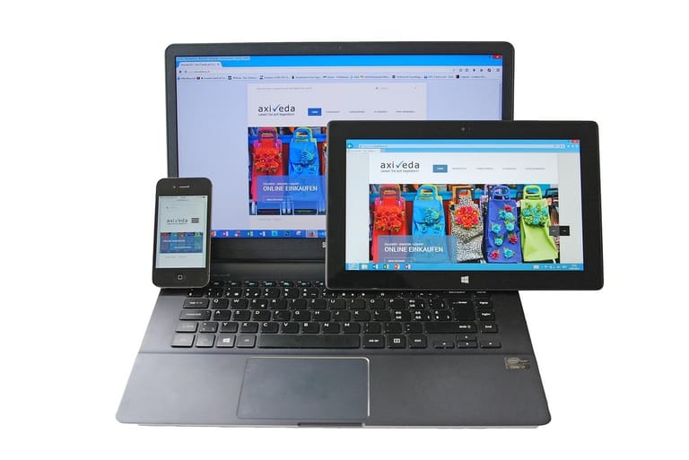
Responsive design-ൽ എല്ലാ screen/device-ൽ flawless adaptability ലക്ഷ്യം – പക്ഷേ ഏറ്റവും സാധാരണ mistakes ഉൾപ്പെടുത്തി, site performance/user experience എത്തിക്ക് കുറവ് വരുത്താം. Responsive breakpoint നിർവചനം ശരിയായ രീതിയിൽ ആവുന്നില്ലെങ്കിൽ, inconsistent look/ functionality.
| Device | Screen Width (px) | Recommended Breakpoint | Explanation |
|---|---|---|---|
| Smartphone Portrait | 320-480 | 480px | Small screens basic adjustments |
| Smartphone Landscape | 481-767 | 768px | Horizontal view expandings |
| Tablet | 768-1023 | 1024px | Tablet optimized layouts |
| Desktop | 1024+ | 1200px | Full-resolution desktop layout |
Design processDetal്സ്ത്യ, most common mistakes avoid ചെയ്യേണ്ടതേയുള്ളൂ. റോഡ് പഠിയ്ക്കാൻ – user retention & engagement improve ചെയ്യാൻ.
- Insufficient Testing:Cross-device/browser testing missing
- Non-flexible Images:Images not resizing to screen
- Readability Issues:Font/line spacing screen-wise inadequate
- Ignoring Mobile-first:Desktop-focused design, missing mobile optimization
- Incorrect Breakpoints:Breakpoints not matching real device resolutions
- Neglected Touch Areas:Mobile buttons/links too small or inconvenient
ഇഹ്നു correct responsive breakpoint strategies, site usability & success improve ചെയ്യാൻ മുഖ്യകിടുന്നു. User-centric site – റീടൻഷൻ & conversion യൂഗ വളര്ത്താൻ കാഴ്ചയും.
Responsive Breakpoint – മികച്ച ക്രമീകരണങ്ങൾ
Breakpoints ചിലപ്പേ.കെ optimum ആയി ക്രമീകരിക്കുക, consistency & user-friendliness എല്ലാ device-ൽ confirm ചെയ്യാനുള്ള വഴിയാണ്. Screen/device popularity, content importance, interactions – breakpoints fine-tune ചെയ്യുന്നതിന് focus ചെയ്യണം.
Fluid layouts-ന്റെ ഉപയോഗം – screens-ൽ content adaptive എങ്കിൽ breakpoints-number കുറയ്ക്കാം, code clean-ഉം, less maintenance. പക്ഷേ, fluid alone sometimes won’t suffice – specific breakpoints for control & refinement.
| Breakpoint Range | Device Type | Typical Usage Scenario |
|---|---|---|
| 320px – 480px | Smartphone Portrait | Primary navigation, single-column |
| 481px – 768px | Smartphone Landscape/Small Tablet | Enhanced navigation, two-column |
| 769px – 1024px | Tablet | Tablet menus, three-column |
| 1025px+ | Desktop/Large Screens | Full desktop experience, multi-column |
Breakpoints set ചെയ്യുമ്പോൾ readability, usability foremost. Text optimum size, buttons tap-friendly, visuals resize-screen conforming. Ideal journey – effortless browsing & info access for all devices.
Optimal Setting Steps
- Analyze Screen Sizes:Target audience’s most-used screens track ചെയ്യുക
- Content Priority:Mobile-ൽ content visibility/priority set ചെയ്യുക
- Limit Number of Breakpoints:3-5 sufficient, too many avoid
- Fluid Grid System:Adaptive content distribution system
- Clean Media Queries:Efficient code, no redundancy
- Regular Testing:Updates/test across devices/browsers
Responsive design continuous improvement. Feedback/analytics-വലുത്ത്, performance study – responsive breakpoint optimum ക്രമീകരണം, user satisfaction & site success guaranty.
Responsive ഡിസൈൻ – പ്രകടനം മെച്ചപ്പെടുത്താനുള്ള ടിപ്പുകൾ
Responsive breakpoint strategy, site-ന്റെ cross-device functionality, performance-improvement equal importance. Site speed – optimal user experience & higher rank. Correct optimization techniques – faster site, increased engagement & conversions.
| Optimization Area | Description | Recommended Techniques |
|---|---|---|
| Image Optimization | Reduce file size, use proper formats | Compression, WebP, responsive sizing |
| CSS & JS Optimization | Minify & combine files | Minification, bundling, prioritize critical CSS |
| കാഷിംഗ് | Enable browser/server caching | Browser caching, CDN, server-side caching |
| Breakpoint Optimization | Load only necessary content | Clean media queries, device-specific content |
Performance-improvement – image compression, WebP formats use, CSS/JS minification/bundling – HTTP requests-ൻ കുറയ്ക്കും. Cached resources – repeat visitors നിലയ്ക്കാം, loading speed ഉയരുന്നു.
- Images compress ചെയ്യുക (WebP support)
- CSS/JS files minify/combine
- Browser caching enable
- Content serve via CDN
- Reduce unnecessary HTTP requests
- Lazy loading for media
- Breakpoint structure regular test/optimize
CDN – content closer to customer, loading time reduce. Lazy loading – images/videos load only visibility. Non-essential media, mobile-ൽ avoid ചെയ്യുന്നത് data save & performance improve. Site speed – more engagement, better conversions.
Breakpoints optimize ചെയ്യുമ്പോൾ, mobile-ൽ loads-നില്ക്കാത്ത big images/animations avoid ചെയ്യുന്നത് latency/dataset utilization കുറഞ്ഞു, user experience uphold ചെയ്യരുത്.
വിജയകരമായ Responsive Breakpoint ഡിസൈനിന്റെ ആനുകൂല്യങ്ങൾ
Successful responsive design – site/app എല്ലാ device-ൽ flawless – user satisfaction increase. Irrespective of device, consistent experience.
SEO performance: Google prefers mobile-first/responsive sites – ranking increase, visibility maximised, single-URL SEO advantage.
| Benefit | Description | Impact |
|---|---|---|
| Enhanced User Experience | Site works flawlessly on all devices | User satisfaction increase |
| SEO Ranking Boost | Google prioritises mobile-friendly sites | Organic traffic increase |
| Cost Saving | No need for separate mobile site | Development, maintenance budget reduce |
| Higher Conversion Rates | User-friendly layouts increase sales/form fills | Revenue growth |
Single site – all devices – easy content updates, maintenance simplified. Brand strengthens – one URL.
- Enhanced User Experience
- SEO Performance Increase
- Lower Cost
- Higher Conversions
- Easy Management (single URL)
- Improved Brand Image
Responsive ഡിസൈനിൽ ശ്രദ്ധിക്കേണ്ടത്
Responsive design – web success-നു അടിസ്ഥാനപരമായി പ്രധാനമാണ്. Different devices-ൽ flawless experience – right breakpoints crucial. Content readable & usable everywhere.
Flexible grid – percentage/viewport-width, not fixed px. Media elements responsive – image/video compressed, srcset. Typography – em/rem units, scalable text.
| Element | Description | Recommended Approach |
|---|---|---|
| Grid System | Flexible layout | Percent/viewport width |
| Media | Image/video optimization | srcset, compression |
| Typography | Readability/scalability | em/rem units |
| Navigation | Easy access | Mobile menu (hamburger) |
Responsive font-size & line-height; em/rem. Navigation – mobile-friendly, intuitive – hamburger menu. All these guarantee user satisfaction & efficient responsive site.
- Use fluid grids
- Optimize media
- Scale typography screen-wise
- Ensure mobile-friendly navigation
- Careful responsive breakpoint strategy planning
പതിവ് ചോദ്യങ്ങൾ
Responsive design-ൽ breakpoints എന്താണ്, പ്രാധാന്യം എന്താണ്?
Breakpoints – site-യുടെ display/mobile-tablet-laptop-desktop തുല്യമായി adapt ചെയ്യാനുള്ള decision nodes. Layout/content user-device-ready – best experience. Every device right rendering.
വിവിധ responsive breakpoint strategies എപ്പോൾ വേണം?
Strategies shift – audience-device diversity/content complexity. Mobile-centric – mobile-user-majority. Complex sites — more breakpoints — granular control.
Flexible grid system എന്തു വേണ്ടിയാണു Responsive design-ൽ?
Flexible grid – content auto-resize/position all screens, readability/professional look uphold. Faster development, less code, more agility.
Media queries optimal use – ശ്രദ്ധിക്കേണ്ടത്?
Correct breakpoints – user-device-analysis. CSS-ൽ clear, ordered media queries; avoid over-complex, redundant code.
Responsive breakpoint design – പൊതു പിഴവുകൾ, പ്രശ്നകൗമുദി?
Common mistake – inadequate breakpoints, unnecessary complexity, performance degradation. Basic breakpoints to start, increase only as needed; keep CSS minimal; optimize images.
Breakpoints തിരഞ്ഞെടുക്കുമ്പോൾ – user behavior ന്റെ പ്രാധാന്യം?
Content flow/readability, breakpoints set. Analytics – device usage/interaction – breakpoints set refinement.
Site Responsive-testing എങ്ങനെ?
Browser developer tools – screen simulation; online responsive test tools – device preview/support.
Performance optimization – employed techniques?
Image optimization, minify CSS/JS, browser caching, lazy loading, responsive images (srcset), critical CSS prioritization.