 Afrikaans
 Azərbaycan
 Bosanski
 Čeština
 Dansk
Dansk Deutsch
 English
 Español
 Filipino
 Français
 Hrvatski
 Indonesia
 Italiano
 Magyar
 Melayu
 Nederlands
 Norsk
Norsk Oʻzbek
 Polski
 Português
 Română
 Slovenčina
 Slovenščina
 Suomi
Suomi Svenska
 Tiếng Việt
 Türkçe
 Ελληνικά
 Беларуская
 Български
 Русский
 Српски
 Українська
 עברית
עברית اردو
اردو العربية
 پښتو
پښتو فارسی
فارسی አማርኛ
አማርኛ मराठी
मराठी বাংলা
বাংলা தமிழ்
தமிழ் ไทย
ไทย မြန်မာ
 한국어
한국어 中文
中文 日本語
日本語

ఈ బ్లాగ్ లోగింపు, వెబ్సైట్లలో మరియు యాప్లలో నావిగేషన్ వాడుకరి అనుభవాన్ని మెరుగుపరచడానికి, వాడుకరి దోస్తు మెను డిజైన్ కు సంబంధించిన ప్రాముఖ్యత, అంతరాలని, లక్ష్యాలను తెలుగులో వివరంగా విశ్లేషిస్తుంది. మొట్టమొదటి లక్ష్యం – వాడుకరి తనకు కావాల్సిన సమాచారాన్ని సులభంగా పొందడం, సరళమైన మెను ద్వారా సైట్ మీద ఆత్మ విశ్వాసం పెరగడం, మన మార్కెట్ లో కొత్త వాడుకులను ఆకర్షించడం. మెను వాడటానికి గల ముఖ్యమైన అంశాలు, వాడుకరి ఫీడ్బ్యాక్, వాడుకరి టెస్టింగ్ మరియు కొరకు కొన్ని వాస్తవిక ప్రాక్టీసులను సూచిస్తుంది. ఎక్కువగా, మెను డిజైన్ లోలాంటి సాధారణ తప్పులు ఎలా నివారించాలో కూడా తెలుపుతుంది. చివరగా, వాడుకరులకి సైట్ లో దారితీస్తూ, సానుకూల అనుభవాన్ని ఇవ్వడమే ముఖ్య ఉద్దేశ్యం.
నావిగేషన్కి ప్రాథమిక ప్రిన్సిపుల్స్
వెబ్సైట్ లేదా యాప్లో నావిగేషన్ అనేది వాడుకరి అనుభవాన్ని ప్రభావిత చేసే కీలక అంశం. బాగా డిజైన్ చేసిన నావిగేషన్ వల్ల వాడుకరి సైట్లో సులభంగా మార్గాన్ని కనుగొనాలని, info వెంట వెంటనే అందుకుంటూదాన్ని, మరింత సమయం సైట్లో గడపడాన్ని, conversion rates పెరిగిపోవడాన్ని కలిగి ఉంటుంది. నావిగేషన్ కథానాయకతగా తీసుకోవడం మంచి డిజిటల్ ఉత్పత్తికి బెయితే అవసరమైన భాగమే.
నావిగేషన్ డిజైన్ లో మొదటి లక్ష్యం వాడుకరి కేంద్రిత భావన. తమ అవసరాలు, అభిప్రాయాలకు అనుగుణంగా నావిగేషన్ రూపొందించాలి. యూజర్ రీసెర్చ్ జరిపి, వారు వాడే టెర్మ్స్ ఏమిటో గ్రహించాలి; అలా నిర్మించిన నావిగేషన్ structure నిజంగా ఆదాయాన్ని రాబడుతుంది.
ప్రధానంగా దృష్టి పెట్టాల్సిన ప్రిన్సిపుల్స్
- సాధ్యత: నావిగేషన్ చాలా సరళంగా, everyone పర్వంగా ఉండాలి.
- Consistency: ప్రతి పేజీలోనూ ఒకే మెనూ చూడాలయిన అవసరం.
- Clear Labels: మెనూ ఫీచర్లకి స్పష్టమైన tag ఇవ్వడం.
- Accessibility: అందరికీ, visually challenged యూజర్స్కి కూడా మంచి నావిగేషన్ ఉండాలి.
- Feedback: వాడుకరి “ఏ పేజీలో ఉన్నారు?” చెప్తే స్పష్టంగా.
ఇంకొక ముఖ్యమైన నాంసం Functionality. నావిగేషన్ అప్పుడప్పుడూ వాడుకరి మెచ్చేలా, info నగదు దారిగా చేరేలా ఉండాలి. ఉదాహరణకు - eCommerce సైట్లలో category structure, search bar, సులభంగా ఫిల్టర్లు వాడేలా menus ఉండాలి.
నావిగేషన్ డిజైన్ కీలక points మరియు విషయాలు అన్నీ ఈ టేబుల్లో:
| అంశం | వర్ణన | ప్రాముఖ్యత |
|---|---|---|
| వాడుకరి కేంద్రితత | నావిగేషన్ యూజర్ అవసరాల ఆధారంగా తయారు చేయడం | వాడుకరి సంతృప్తి పెరుగుతుంది |
| సాధ్యత | మెను structure సుపర్ understandable ఉండడం | వాడుకరి వాడటానికి Easy పార్ట్ |
| Consistency | Menus ని website లో every ఈతే ప్రద్దశి రూపంలో చూపించడం | Confusion లేకుండా నడిపిస్తుంది |
| Accessibility | Menus అన్ని అన్వయించాలే - special needs users వరకు | Website universal reach, ఎక్కువ వాడుకరి base పొందుతుంది |
నావిగేషన్ మరియు మెను డిజైన్లో ఏస్తెట్క్స ఇది కూడా ముఖ్యమైనది. చక్కగా కనిపించాలి కానీ Functionality ముందు priority ఉండాలి. వాడుకరి తేలికగా సాగదీసేలా Menu డిజైన్ చేయడం సర్వసాధారణం. దీనితో – User-Friendly నావిగేషన్ వల్లనే ఒక అంతర్జాల సంస్థ బాగుపడుతుంది!
వాడుకరి దోస్తు మెను లక్ష్యాలు
వాడుకరి దోస్తు Menu డిజైన్ చేసే మక్కాముఖ్య ఉద్దేశ్యం: యూజర్లు సైట్ లేదా యాప్లో నావిగేషన్ సులభంగా చేయటం. దీనివల్ల తమదైన info చాలా త్వరగా,ని పనిట్లో దొరికిపోవడం! అక్కడ UX meaningfully పెరుగుతుంది, తమకొచ్చిన దాన్ని చిరకాలంగా వాడడండి, conversions పెరిగిపోవడం.
ఏ Menu బాగా వాడుకరికి structure clean గా చెప్తే ఆ సైట్ మరింత వాడుకరి దోస్తు అయ్యింది. ఇది spefic hierarchy, clear tagging, logical ordering వల్ల వస్తుంది. ముఖ్యంగా పెద్ద, కాంప్లెక్సుగా ఉండే websites లో ఇది ఇక పొచ్చి మరో కీలకం.
కింది టేబుల్, వాడుకరి-centric మెను డిజైన్ లో చూడాల్సిన విభాగాలు:
| అంశం | వర్ణన | ప్రాముఖ్యత |
|---|---|---|
| Clear labels | Menu items ని స్పష్టమైన పదాలతో వినిపించడం | వాడుకరి ఎక్కడ ఏము ఉందో తేలికగా తెలుసుకుంటారు |
| Consistency | Menu structure every page కి ఆలానే ఉండాలి | Used to becomes the Menu, easy navigation |
| హైరార్కిక structure | కాన్సెప్ట్ అనుసరించి మెను లేఅవుట్ | Site structure బాగా గ్రహించడానికి |
| Mobile Friendly | మెను structure mobile devices కి సరిపడాలి | Mobile యూజర్లకూ seamless experience |
పొంచిన Menu డిజైన్ శాస్త్రంగా decent కనిపించాలి, ఆహ్లాదకరంగా ఉండాలి, ఇంకా practical & user-centric గా ఉండాలి. నిజానికి Menu నావిగేషన్ కొరకు, వాడుకరికి సంతోషాన్ని, conversionను ముఖ్యంగా పెంచుతుంది.
Menu డిజైన్లో లక్ష్యాలు
- వాడుకరికి కావాల్సింది వెంటనే కనిపించటం.
- Website structure తేలికగా గ్రహించటానికి.
- Mobile Friendly Menu structure.
- Clear menu items, simple language.
- Consistency (same menu everywhere).
Menu డిజైన్ స్థిరంగా ఉండదు, ఫీడ్బ్యాక్ ఇస్తూ మెరుగుపరుచాల్సిన ప్రాసెస్. User Testing చేయడం, తప్పుల్ని గుర్తించడం, menu iteratively fine-tune చేయడం, మేము User centricగా design చేయాల్సిందే.
ఎఫెక్టివ్ నావిగేషన్ ప్రధానఫీచర్లు
నావిగేషన్ లో మంచి అర్థవంతమైన Menu structure - website కు main base. User కన్నడలో తేలికగా దారితీసి, స్పష్టంగా structure చూడగలిగితే, ఇతర ఇరవై ఖాతాలా ఆ దాని మీద అంతగా కదలదు. Complexity కంటే clarity, logical structure, Mobile adaptability అనే ఇందులో కీలక రూ.
Effective నావిగేషన్ structure esthetic పరంగా దాన్ని వాడటం కాదు, functions-wise perfect గా ఉండాలి. Different screen sizes, devices మీద, menus perfect గా అసలు కనిపించాలి. Mobile, tablet, desktop - menus responsiveగా ఉండాలి. Menu రెండు aspects లో consistency, user గమనించగల structure ఉండాలి. ఈ టేబుల్లో, ఇంకా ముఖ్యమైన మెను ఫీచర్లను breakdown:
| ఫీచర్ | వర్ణన | వాడుకరి అనుభవం ప్రభావం |
|---|---|---|
| Clear labeling | Menu items, links నిజంగా ఎలా ఉంటాయో స్పష్టత | User confusion నివారించబడి, ఇది తెసుకోని structure |
| Consistency placement | Menus same location every screen/page | User మరింత comfort గా navigation చేయగలుగుతారు |
| Search box | Keyword search facility for easy info lookup | Quick access for specifics, hurdles-కి exit door |
| Mobile Adaptability | Menus different screensలో perfect display | Mobile usage, smart navigation experience |
ఏ Menu structure వల్ల కూడా BreadCrumbs, Site Map, Quick access కల్పించాల్సిందే. BreadCrumbs వల్ల, వాడుకరి “ఈ పేజీకి ఎలా వచ్చారు?” కనుక్కోవడం easy. Site Map అయితే, menus లో “lost” అయినవారికి shortcut. మీరు డిజైన్ చేసిన menu, user experience లో మురుసుకుపోవాలి, తేలికగానే సాగిపోవాలి.
వాడుకరి అనుభవం
UX - అనగా User Experience - వెబ్సైట్ లేదా యాప్ కు ప్రధాన Pillar. మంచిగా ట్యూన్ చేసిన Menu structure, వాడుకరి కావాల్సిన info/finds కు అవుట్ పుట్ కనపడుతుంది; badly tuned menus తీసుకెళ్లిపోతారు. User frustration, abandon, loss of prospects మీ Menu లో తప్పుల వలన కనిపిస్తాయి.
అభిజ్ఞత (Accessibility)
Accessibility అంటే, ప్రతి గమనించగల వాడుకరికి కూడా website menus equal usability. Keyboard navigation, screen reader compatibility, contrast levels - ఇవన్నీ మీ menus లో provide చేస్తే, website reach పెరుగుతుంది. Legal పాటు, practical వైపుగా కూడా user base వృద్ధి అవుతుంది.
Menu పోటీ ఫీచర్లు
- Clear, understandable menu items
- Consistent menu placement/style
- Search facility
- Mobile adaptability
- BreadCrumbs (navigation path)
- Site Map (overall menu diagram)
విజువల్ డిజైన్
విజువల్ పాయింట్లో menus visually attractive ఉండాలి; structure ట్యూన్ చేయండి. Colors, fonts, icons, logical visual hierarchy - menusను readabilty, usabilityలో మార్చేస్తాయి. Menu structure వాడుకరి లోకానికి గ్రహించేలా ఉండాలి.
Effective navigation కి, ultimate goal – user centric focus. ఫీడ్బ్యాక్, user needs, logical flow లో menus structure పెడితే site/business పూర్వలు ముందుకు పోగలుగుతుంది.
నావిగేషన్: వాడుకరి దోస్తు మెను డిజైన్
మీ website/app వాడుకరి దోస్తుగా ఉండాలంటే, menus నావిగేషన్ సులభంగా జరగాలి. మంచిగా డిజైన్ చేసిన menus వల్ల, వాడుకరి సైట్లో “lost” అవ్వకుండా, info కు snapping access, overall User Satisfaction పెరుగుతుంది. Conversion rates, loyalty కూడా ప్రశ్నించదగినంత పెరుగుతుంది.
Menu layout లో వాడుకరి angle/situation ని “పట్టుకోవడం” ముఖ్యమే. Menu arrangements, labelling, visual appearance - ఇవన్నీ వాడుకరి website తో నీటి నడిపిస్తున్నారు. Cluttered menus/frustrating menus వల్ల ప్రముఖ loss of users, simple menus వల్ల retention, new discovery, engagement పెరుగుతుంది.
User Benefits
- Easy Navigation
- Quick access to info
- No confusion
- Improved satisfaction
- Better conversion rate
- Brand positivity
Menu structure mobile devices లో కూడా బాగా function చేయాలి. Mobile menus: hamburger menu (three-bars icon), swipe gestures, clear touch-access (big buttons) structure, small screen ఉన్నా info perfect access. కింది టేబుల్లో menu variants ఇండికేషన్:
| మెను ప్రబంధం | వర్ణన | Advantages |
|---|---|---|
| Top Menu | Horizontal menu at page top | Most common, prominent, immediate access |
| Side Menu | Vertical left/right menu | Space for category, sub-category structure; high capacity |
| Dropdown | Hover/click one item to reveal more sub-items | Organizes many menu items, saves space |
| Hamburger Menu | Mobile icon with three lines, shows menu on tap | Mobile screens, keeps content area open, engagement |
Consistency – ఒక్క structure, style, order, labels - ప్రతీ పేజీలో అయినా menu అదే ఉంటే, user experience, brand image consistency వచ్చేలా ఉంటుంది.
మెను షేమా ప్యాకింగ్ టైరాల
Website లేదా app menu structure లో, main focus: user easy navigation, fast access. Planning-stage లో, మీ target audience స్థాయిని, info structure కి అనుగుణంగా menu layout build చేయడమే బ.est practice. User research, survey, feedback చెయ్యాలి; info groups, categories, logical order నే menu లో పట్టాలంటే అమెరికన్ంగా వైపుగా చూసుకోవాలి.
Menu schema stepwise
- Target audience ని తెలుసుకోండి
- Content mapping– ఏ info exists, what planned
- Categories– logical groups
- Menu structure– main/sub menus
- Labels– understandable, simple words
- User testing– usability validate చేయండి
Menu schema effectiveness ను user testingతో validate చేయాలి. Tasks completion through menu observed, feedback analyzed, iterative improvements చేయాల్సి ఉంటుంది.
Menu structure regular updates, improvements అవసరం. Site grow అవుతుందన్న info change ఉంటే, menu adaptability, regular review చేయాల్సిందే!
వాడుకరి టెస్టింగ్లో పాయింట్లు
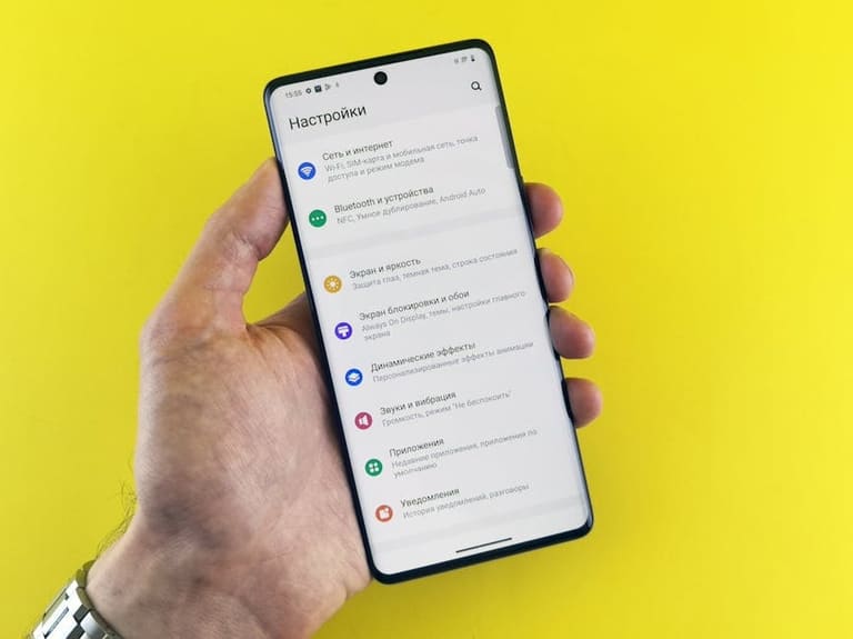
Menu structure effectiveness ను సాధించడానికి, user testing అనేది real behaviour ని తెలుసుకోవడం keys. Menu usability testingలో, user అనుభవాన్ని, navigation logic ని, info access-ని actual pressup చూసుకోవాలి. Feedback మరియు observations నుండి, సాధ్యమైన improvements పై అమలుచేయాలి.
User testing planning, execution, participant diversity – age, tech-experience, needs – variability analysis keys. Younger tech-savvy users vs older non-experts – menu-testing outcomes vary. Right test-group selection, accurate analysis keys!
Testing Metrics
- Task completion – menus ద్వారా info/goal చేసేవారిగా
- Errors – navigation లో mistakes count, analysis
- Time taken – info accessకి spent time
- Satisfaction – menus మీద feedback, rating
- Learnability – menus structure easy adaptation
- Navigation smoothness – menus ద్వారా దోస్తుగా మానవారికి access
నవరూపాల Testing metrics, feedback sources, practical measurement techniques – నెలకొల్పిన టేబుల్:
| అంశం | వివరణ | Measurement |
|---|---|---|
| Usability | Menus ఎంత easy/well usable | Task completion, error rate, average completion time |
| Understandability | Menu items clarity | User surveys, feedback forms, observation |
| Effectiveness | Menus – goals meeting | Task completion, satisfaction |
| Satisfaction | User menu sentiment | Polls, ratings, feedback |
User testing results ను analyze చేయాలి; menu changes implement చేయాలి; process continuous-cycle అయి, best menu structure కు కచ్చితంగా ముందుకు తీసుకెళ్ళాలి.
స్పష్టమైన ప్రతిధ్వనులు - కేస్ స్టడీస్
నావిగేషన్ effectiveness practical examples ఆధారంగా నేర్చుకుంటే, Menu structure improvementకు inspiration keys. Industry-specific menu strategies, best-practices, features – మీ design decisions influence చేయడానికి బ.est path.
Different sector menu best-practices, structure, user-behaviour keys – టేబుల్:
| Sample design | Sector | Highlights | User experience boost |
|---|---|---|---|
| Restaurant website | Food & Drink | Visual-heavy menu, quick booking | Fast menu browse, instant order |
| E-Commerce site | Retail | Filter, Smart search | Product navigation, comparison easy |
| Blog website | Content | Categorized menu, tags | Topic access, discovery |
| Corporate website | Service | Clear headlines, informative menu | Quick info access, trust-building |
ఇక్కడ తెలుగులో కీలక menu features keys:
- Simple language structure
- Visual order (hierarchy)
- Mobile responsive menus
- SEO tuned menus
- User feedback driven changes
- Fast loading, menu light-weight
కింది రెండు practical cases menu strategy explanation:
ఉదాహరణ 1
ట్రావెల్ సైట్ menus: categories, visual support, mobile devices లో perfect usability keys. Reservation, booking simplicity keys.
ఉదాహరణ 2
Online education site: menus structure filters, search, logical content-placement, user profile-based navigation keys. Vast courses, easy discovery keys.
Menu design refinement సంపూర్ణంగా user feedback, practical testing ఆధారంగా జరగాలి!
వాడుకరి ఫీడ్బ్యాక్ ప్రాముఖ్యత
Any website/app menu architecture refinement keys – user feedback is base. Direct menu clarity, usability, defects పైన feedback keys. Menu item misplacement, unclear labeling, navigation flaws – practical observations basisగా menu modify చేయడం keys.
Feedback analysis practical improvements, future menu strategy keys. Menu refinements, item reordering, clarity boost keys. Below table structure feedback analysis:
| ఫీడ్బ్యాక్ Type | Importance | Actions |
|---|---|---|
| Positive | Succesful menu features validation | Best menu practices widering |
| Negative | Menu flaws, improvement areas | Menu item reorder, label change, function tweak |
| Constructive criticism | Fresh perspectives, innovation paths | Test, analyze, validate and possibly implement |
| Suggestions | User-thinking, info desires | Plan changes based on feasibility |
User feedback sources many: polls, testing, analytics, in-site feedback forms, social monitoring, focus-group discussions. Collected feedback practical refinement keys, menu strategy building keys.
Menu refinement process continuous-circle; feedback drive changes, user-centric architecture keys. Menu consistent monitoring, testing, feedback-based update – site/app long term success keys.
Menu feedback methods
- Usability Testing – direct menu demos
- Surveys – general trend collection, mass feedback
- Heatmaps & Analytics – menu behaviour mapping
- Feedback forms – in-site direct comment collection
- Social listening – brand/menu topic watch
- Focus groups – targeted user deep discussion
డిజిటల్ మెను తప్పిదాలు
Menu flaws direct impact user experience. Menu structure clutter, search-function defects, mobile incompatibility, too many categories, poor visuals, sluggish load-time – these are main reasons for dissatisfaction and loss.
Menu refinement – fault-free menus, practical structure, logical flow keys; otherwise menu abandon, conversion collapse. Below menu defects list:
- Complicated menu structure
- Substandard search facility
- Poor mobile adaptation
- Excess categories/subcategories
- Missing quality visuals/icons
- Delayed loading
Menu refinement process – user-centric keys: Testing, feedback driven changes, faults removal, improvements towering.
| Menu flaw | Description | Possible outcome |
|---|---|---|
| Complicated menu | User info access tough | Abandonment, poor conversion |
| Search flaw | Key product/content tough to pinpoint | User dissatisfaction, revenue loss |
| Mobile compatibility flaw | Mobile menus display erroneous | Mobile abandonment, traffic loss |
| Slow loading | Menu load delayed | User impatience, exit rate increase |
Every menu refinement – logical, usable, aesthetic, user-centric structure keys. Menu investment long-term site/business boost keys.
సంపూర్ణంగా: అనుసరించాల్సిన టిప్స్
Menu effectiveness keys – navigation frictionless, user satisfaction. Practical principles, case-studies – esthetic & functional structure keys. User need understanding, logical accessible structure, design consistency keys.
Menu refinement – consistency keys: item placement, wording, visual style uniformity; mobile adaptation – necessary% site-wide success keys.
Quick menu refinement steps
- User research– polls, tests, feedback collection
- Simple, clear language– menu items understandable, jargon-free
- Visual hierarchy– color, size, contrast structure
- Mobile adaptation– menu responsive structure
- Consistency– same menu item/style throughout
- Feedback integration– continuous improvement, feedback-driven changes
Menu design refinement continuous-cycle; feedback-driven improvements, menu success, site loyalty keys. Below table main menu flaws & fixes:
| Flaw | Description | Fixes |
|---|---|---|
| Cluttered Navigation | User info access difficulty | Menu simplify, clear categories structure |
| Mobile incompatibility | Menu visual defects | Responsive menu design adaptation |
| Visual hierarchy poor | Important items not highlighted | Color, size, contrast structure for prominence |
| Design inconsistency | Menu structure/style variance | Uniform menu structure site/app-wide |
Menu design refinement project-specific; target audience needs, site/app context keys. Testing, feedback integration always necessity; success, satisfaction, conversion rate boost keys!
తరచుగా అడిగే ప్రశ్నలు
User-friendly menu design వల్ల website performance ఎలా మారుతుంది?
User-friendly menus వల్ల, వాడుకరి info త్వరగా పొందడం, bounce rate తగ్గిపోవడం, site stay time పెరగడం – SEO, ranking కూడా positive change keys.
Mobile devices కు menu designలో ముఖ్య బెస్ట్ ప్రాక్టీసులు ఏమిటి?
Large tap-target buttons, clear gestures, hamburger menu, fast loading – mobile menus keys. One-handed access, clutter-free – mobile menu refinement keys.
Menu item orderingకు principal strategy keys ఏమిటి?
Frequently used/important items front, categorized grouping, logical flow, context-based prioritization – menu refinement keys. Example: eCommerce లో “New”/“Sale” priority keys.
Menu color scheme & fonts ఎలాంటి structure keys?
Contrast colors (dark text, light background), brand-based palette, readable fonts (Arial, Helvetica, Open Sans) – menu refinement keys. Logo/colors coordination, practical access keys.
User testing integration menu refinement keys ఏమిటి?
Prototype stage నుంచి user testing integration keys: menu usability feedback, navigation ease, info access feedback keys. A/B testing, best menu version select keys.
Menu refinement tools/resources keys ఏమిటి?
Figma, Adobe XD, Sketch – menu refinement tools keys. UserTesting.com – menu usability testing keys. Inspiration – Dribbble, Behance – menu refinement design keys.
Menu design common flaws keys, fixes keys?
Cluttered menu, poor search function, mobile incompatibility, sluggish loading, misleading labels – menu refinement flaws. Simplicity, optimized search/menu, responsive adaptation, correct labeling keys.
Menu accessibility keys, practical tips?
Keyboard navigation, screen reader compatibility, contrast color selection, alt text tags, WCAG standards adherence – menu refinement accessibility keys.