 Afrikaans
 Azərbaycan
 Bosanski
 Čeština
 Dansk
Dansk Deutsch
 English
 Español
 Filipino
 Français
 Hrvatski
 Indonesia
 Italiano
 Magyar
 Melayu
 Nederlands
 Norsk
Norsk Oʻzbek
 Polski
 Português
 Română
 Slovenčina
 Slovenščina
 Suomi
Suomi Svenska
 Tiếng Việt
 Türkçe
 Ελληνικά
 Беларуская
 Български
 Русский
 Српски
 Українська
 עברית
עברית اردو
اردو العربية
 پښتو
پښتو فارسی
فارسی አማርኛ
አማርኛ मराठी
मराठी বাংলা
বাংলা தமிழ்
தமிழ் ไทย
ไทย မြန်မာ
 한국어
한국어 中文
中文 日本語
日本語

இந்த வலைப்பதிவில், responsive breakpoint உத்திகள் பற்றிய விரிவான பார்வை வழங்கப்படுகிறது. Breakpoint என்றால் என்ன, எது அவசியம், responsive design இல் அடிப்படை வாய்புகள், மற்றும் வெற்றிகரமான web design உருவாக்குவதற்கான குறிப்பு, பயன்படுத்தப்படும் கருவிகள், பொதுவாக நிகழும் பிழைகள், சிறந்த அமைப்புகள் மற்றும் செயல்திறனை மேம்படுத்தும் வழிகள் பற்றி கைபடக் கூடிய தகவல்கள் உள்ளன. வெற்றிகரமான responsive breakpoint design-ஆல் கிடைக்கும் பலன்கள் மற்றும் கவனிக்க வேண்டியவை பற்றி பேசப்படுகிறது. Web hosting-இல், responsive breakpoint குறித்து தேர்ச்சி பெற விரும்புவோர்களுக்கான முழுமையான வழிகாட்டி இது.
Responsive Breakpoint என்றால் என்ன?
Responsive breakpoint என்பது web design-ல் பலவகை device-களுக்கும், அவர்களது திரை அளவும் (screen size) முழுவதும் layout மற்றும் உள்ளடக்கம் மாற்றப்படும் நிலையைக் குறிக்கும் ஒரு சிறப்பு புள்ளி. இந்த புள்ளிகள் பொதுவாக px-ல் (pixels) தரப்படுகின்றன; CSS media queries மூலம் உருவாக்கப்படுகின்றன. நோக்கம் — நம் site, smart phone, tablet, laptop, desktop என பல device-களில் சிறந்த user அனுபவம் தர வேண்டும்.
Responsive breakpoint உத்திகள், ஒரு web site-க்கு நாடி எனலாம்; நம்மால் device-க்கு ஏற்ற design மாற்றத்தை திட்டமிட உதவும். உதாரணமாக, சிறுமையான screen-ல் menu ஒளிவைக்க வேண்டும், vertikal வரும் content-ன் layout மாற்ற வேண்டும் என plan செய்ய breakpoints தேவை.
Responsive Breakpoint-இன் அடிப்படை அம்சங்கள்
- பல்வேறு device-களில் நெளிவுணர்வு
- User அனுபவம் (UX) சிறக்க உதவி
- CSS media queries மூலம் வரையறை
- அகில layout-கள், பிரவாபமிக்க grid
- உள்ளடக்க படிப்பதற்கு எளிமை தரம்
பின்வரும் அட்டவணை, பொதுவாகப் பயன்படுத்தப்படும் responsive breakpoint விரிவுகள், மற்றும் அந்த device-களில் target scenario-கள்:
| Breakpoint (px) | Device | பயன்பாட்டு நிகழ்ச்சி |
|---|---|---|
| 320-480 | Smart Phone (Portrait) | Menu compact, Single column layout |
| 481-768 | Smart Phone (Landscape), Small Tablet | Two column layout, Bigger fonts |
| 769-1024 | Tablet | Three column, Advanced navigation |
| 1025+ | Laptop, Desktop | Full width, Rich content arrangement |
Responsive breakpoint தேர்வு, உங்கள் web site user base, content architecture மற்றும் design-னுடைய சிரமத்தை உடைய அம்சங்கள் அனைத்தையும் பார்த்து செய்யவேண்டும். குறைகளை ஆனால், உங்களது site-ன் எல்லா device-ளிலும் சிறந்த UI வழங்க முடியும். இது user வரவேற்பும், site traffic-ையும் அதிகரிக்கும்.
breakpoint-கள், screen size மட்டுமல்ல; device resolution (DPI), orientation (portrait/landscape) ஆகியவற்றிலும் கவனம் தர வேண்டும். இதற்கான media queries-ல் அதிக வேண்டுதல் இருக்கும். ஆனால், user experience-லாகப் பெறும் பலன் உண்மையில் தேவையானதாகும்.
Responsive Breakpoint உத்திகள் ஏன் முக்கியம்?
Responsive breakpoint உத்திகள், உங்கள் web site-விற்கு எந்த type device-யிலும் களைவிப்பு உறுதி செய்யும் முக்கிய திறன்கள். இது UX (user experience) மேம்பாட்டை கொண்டும், SEO-வையும் (search engine optimization) உயர் நிலைக்கு இட்டும், இறுதியில் conversions மற்றும் marketing growth-ல் உதவும். அடிப்படை breakpoint strategy-யினால், content readable-ஆக உள்ளது, easy navigation-வும், ஏற்ற device-ல் site-யில் அதிக நேரம் user செலவிடுவார் — இது SEO-க்கு நல்ல signal.
Breakpoints-ஐ தேர்வு செய்வது merely technical இல்லை; இது முற்றிலும் user-centric orientation. உங்கள் user base-ன் device habits, என்ன screen width-அதிகமா பார்த்து, அதில் அதிக focused breakpoint plan வேண்டும்.
| Breakpoint | Device | செய்ய வேண்டிய மாற்றம் |
|---|---|---|
| 320px − 480px | Smart Phone (vertical) | Single column, Large fonts, simple nav |
| 481px − 768px | Smart Phone (horizontal) | Dual column, optimized images |
| 769px − 1024px | Tablet | Triple column, Touch-friendly UI |
| 1025px and above | Desktop | Multi-column, Wide screen design |
Breakpoint plan-யால் code repeat குறையும், maintenance expense குறையும், loading speed-வும் மேம்படும். Takeaway: உங்கள் responsive breakpoint plan, user-centric பழக்கம், content hierarchy, grid architecture, media query optimization, மற்றும் rigorous test-ல் உருவானது.
- உங்கள் user base ஐ சோதியுங்கள்: user device details, screen size habits, etc.
- Content பங்கு: mobile version-ல், key content reachable ஆக velit.
- Breakpoints-ஐ plan செய்யுங்கள்: Optimal breakpoint selection for site look & feel.
- Fluid grid architecture போடுங்கள்: Content நெளிவதற்கு grid essential.
- Media query-களை optimize செய்யுங்கள்: Clean, logical CSS for faster load & flexibility.
- சோதனை: Many devices/browser-ல் UX check செய்ய test செய்யுங்கள்.
உங்கள் responsive breakpoint plan purely code அளவில் இல்லை, அது user experience-ல் முடிவு காட்ட வேண்டியது. அதற்காக இப்படியொரு strategy கொண்டுள்ளீர்கள் என்றால் உங்கள் site-ன் user satisfaction மற்றும் reach அதிகரிக்கும்.
Responsive Design இலால் அடிப்படைகள்
Responsive breakpoint design என்பது சமவிபத்து orientation—device எல்லாவற்றிலும் சக்தி, நெளிவர, UX-ல் consistent அனுபவம் தருவது முக்கியம். Fixed width-ல் அடிப்படை இல்லாமல், fluid grid, responsive image use, media queries, mobile-first approach என வழிகாட்டி. Responsive breakpoint-ல், எல்லா device-லும் வேற வித layout-ல் UX consistency. இது, user என்ன device-யைப் பயன்படுத்தினாலும் smooth browsing feels தரும்.
Responsive design principles – flexibility, adaptation, UI கருதிய user-centric design main. Fixed width-ஐ தாக்கு; fluid layout/import grid-ஐ வைத்து content-ஐ device வைக்க. Media queries-ஐ breakpoint-ளுக்கு style definitions-ல் use செய்ய device look perfect-ஆக உருவாக்க வேண்டும். User feedback, usability audit, analytics-ல் optimize செய்யலாம்.
அடிப்படை வாய்புகள்
- Fluid Grid: Pixel அல்ல, percentage அளவு content-ஐ கொள்ள layout தின்று, screen size-க்கு படிக.
- Responsive Images: CSS/HTML-ல் images set fluid; overflow & distortion மற்றும் loading issues குறை.
- Media Query: Device/breakpoint-லான style set-up, device specific UI-ல் UX boost.
- Mobile First: Layout design first mobile, then progressive enhancement to tablet & desktop.
- Touch-Friendly UI: Buttons, links large enough, spaced well for finger interaction.
- Performance Optimize: Image compression, code minify, caching – faster UX.
இங்கே, responsive breakpoint device wise அவசியம்:
| Breakpoint Name | Screen Width (pixel) | Device |
|---|---|---|
| Extra Small | < 576 | Smart Phone (portrait) |
| Small | ≥ 576 | Smart Phone (landscape), Small Tablet |
| நடுத்தரம் | ≥ 768 | Tablet |
| Large | ≥ 992 | Laptop |
| Extra Large | ≥ 1200 | Large Screen Desktop |
Responsive design purely "tech"-ஆக இல்லாமல், user-னைமையிலும் — user feedback, behavior, device orientation, friendly design-் என UX audit-ல் வலுவாக போட வேண்டும்.
வெற்றிகரமான Responsive Breakpoint-க்கு என்ன தேவை?
Responsive breakpoint success, UX maximum-இல் culmination. Technical/grid knowledge, device analytics, flexible design, responsive images, readable typography essentials. User device preference, analytics முதல் breakpoint decision–grid architecture–responsive assets—all vital. Responsive images screen size wise load வேண்டும்; images non-optimized loading speed குறைக்கும், UX குறையும்.
Design Essentials
- User research-based breakpoint selection
- Fluid grid structure
- Optimized/responsive images
- Readable, scalable typography
- Touch-friendly buttons/links
- Correct media queries for style
Typography responsive-ஆக வேண்டும்; font size/line-height screen-specific readable. Touch UI-ல், buttons adequately large. (Refer grid below):
| Device | Screen Size | Recommended Touch Target | Notes |
|---|---|---|---|
| Smart Phone | 320-480px | 44×44 pixel | Finger-friendly |
| Tablet | 768-1024px | 48×48 pixel | More screen, bigger touch |
| Laptop | 1280px+ | 48×48 pixel | Mouse/touchpad |
| Desktop | 1920px+ | 48×48 pixel | HD screens |
Performance test, optimize, Google PageSpeed, UX audit—all must. Fast, error-free site — user satisfaction high–SEO boost–conversion increase.
Responsive Breakpoint design-ல் பயன்படும் உபயோக கருவிகள்
Responsive breakpoint design-ல், ஒவ்வொரு device/breakpoint-க்கு மிகத் தரமான experience தர development tools பங்கு மிகப் பெரியது. Prototyping tools, testing suite, coding accelerators UX quality-க்கு backbone. Prototyping-ல் breakpoint simulation, testing-ல் browser/device UX check, coding tools-ல் fast, clean, optimized code procure செய்யலாம்.
| Tool Name | Description | Use-case |
|---|---|---|
| Google Chrome DevTools | Browser-integrated dev suite | Error debugging, UX testing |
| Firefox Developer Tools | Firefox browser dev suite | CSS, JS debug, Network insight |
| Adobe XD | Vector prototyping tool | Design, interactivity, UX flow |
| BrowserStack | Cloud browser/device testing | Cross-browser, cross-device QA |
இவை code hygiene, UI alignment, UX consistency–முழுவதையும் facilitate செய்யும். Responsive breakpoint toolset effective developer productivity-க்கு என பரவலாக போடப்படுகிறது.
கருவிகள் மூலம் கிடைக்கும் பலன்கள்
Responsive breakpoint tools–development process boost, cost reduction, UX consistency; significant advantages:
நடப்பு கருவிகள்
- Google Chrome DevTools: Free, comprehensive debugging.
- Firefox Developer Tools: Open source, customizable.
- Adobe XD: Easy rapid prototyping.
- BrowserStack: Huge device/browser coverage, integrated tests.
- Responsively App: Simultaneous multi-screen testing.
கருவியில் உள்ள சவால்கள்
Tool-ம் இடர்: High cost (premium tools), learning curve (complex interface), performance strain (high RAM/CPU). Small business or individual devs–initial resource, time constraints. Low-end computers/old hardware–heavy tools may lag or crash.
பொது Responsive design பிழைகள்
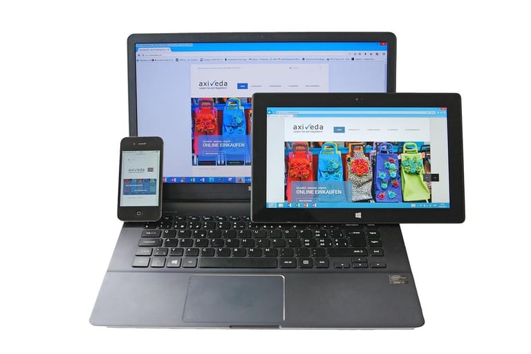
Responsive design, பல device/browser-க்கு fluid UX orientation. ஆனால் செயலில் பொதுவாக பல பிழைகள் user satisfaction மற்றும் performance-யைக் குறைக்கும். Breakpoint misuse, inconsistent layout, non-optimized images–all risk.
| Device | Screen Width (Pixel) | Suggested Breakpoint | Notes |
|---|---|---|---|
| Smart Phone (Portrait) | 320-480 | 480px | Basic mobile layout |
| Smart Phone (Landscape) | 481-767 | 768px | Wide content, large touch |
| Tablet | 768-1023 | 1024px | Tablet UX optimization |
| Desktop | 1024+ | 1200px | Full width UX |
Responsive design pitfalls–user retention & engagement drop if unchecked:
பொது பிழைகள்
- Insufficient Testing: All device/browser UX check செய்ய தவிர்த்தல்.
- Non-responsive Images: Fluid adaptation failure.
- Unreadable Typography: Incorrect font size/line spacing.
- Ignoring Mobile-first: Desktop orientation, mobile neglect.
- Wrong Breakpoint Setup: Device resolution mismatch.
- Small Touch Area: Narrow button/link – tough interaction.
இந்த பிழைகளை தவிர்ப்பது என்பது UX consistency, conversion rate, site performance-க்கு அடிப்படையாகும்.
சிறந்த Breakpoint அமைப்புகள்
Responsive breakpoint set-up optimal–device wise UX consistency best. Properly chosen breakpoints–site perfect, user experience premium. User device stats, screen resolution analytics–breakpoint determination. Content priority also affects breakpoint selection.
Fluid layout/grid use–breakpoints required down, code simplicity up. But certain devices–custom breakpoint arrangement required. Optimal grid–site UX constant throughout.
| Breakpoint Range | Device Type | Typical Usage |
|---|---|---|
| 320px − 480px | Smart Phone (Portrait) | Mobile navigation, Single column |
| 481px − 768px | Smart Phone (Landscape), Small Tablet | Advanced navigation, Dual column layout |
| 769px − 1024px | Tablet | Optimized menus, Triple column |
| 1025px and above | Desktop, Large screens | Full desktop UX, Multiple columns, Expandable nav |
Content readable-ஆக, UI touch-friendly/zoomable-ஆக, image fluid adaptation, button size user-centric–breakpoint structure focus.
Optimal Steps
- Device Screen Analysis: User base device screen stats.
- Content Priority: Mobile-ல் key content attention.
- Breakpoint Count Restriction: Avoid excess; 3–5 sufficient.
- Flexible Grid: Responsive adaptation.
- Media query clean-up: Avoid redundant code/syntax.
- Test & Refine: Iterative improvement–device/browser-wide test cycle.
Responsive design-ல் continuous audit–user feedback/analytics-ல் breakpoint optimization, UX perfection!
Responsive Design-இல் செயல்திறன் மேம்படுவது எப்படி?
Responsive breakpoint usability–device wise seamless attendance–performance boost/SEO advance/UX lead. Proper optimization–site speed, retention, conversion uplift.
| Optimization Field | Description | Technique |
|---|---|---|
| Image Optimization | Reduce file size, correct format. | Compress, WebP, Responsive sizing |
| CSS/JS Optimization | Minify, bundle, priority load | Minification, merging, Critical CSS loading |
| Caching | Enable browser/server cache | Browser caching, CDN, Server cache |
| Breakpoint Optimization | Correct breakpoint–avoid excess data | Clean media query, device content targeting |
Performance focus—image compression (WebP), CSS/JS minify/bundle, browser cache, CDN, HTTP requests–lazy loading–UX acceleration.
Performance Tips
- Image compression (WebP/optimized)
- Minify, bundle CSS/JS
- Enable browser caching
- Content Delivery via CDN
- Avoid redundant HTTP requests
- Lazy load (gecikmeli yükleme)
- Correct breakpoint test
Cache, CDN, lazy load–UX/Mobile retention–web traffic surge–conversion spike. Device-specific content/image loading–UX maximum without waste bandwidth/data.
Responsive breakpoint plan–device-wise non-essential content avoid–UX perfect, site speed peak.
வெற்றி Responsive Design பலன்கள்
Responsive web design success–device/browser agnostic seamless UX; multiple advantages. Consistent experience regardless of device–premium user engagement.
SEO boost—Google mobile-first, responsive site rank top. Single URL–site authority consolidated, organic reach increases. No need for different mobile URL–single domain, SEO strength.
| Benefit | Description | Effect |
|---|---|---|
| Better User Experience | Site perfect all devices | User happiness, loyalty |
| SEO Upgrade | Google prefers mobile-friendly | Traffic, search rank up |
| Cost Reduction | No need separate mobile site | Lower dev/maintenance costs |
| Conversion Increase | User-centric design–sales/forms | Higher revenue, leads |
Responsive design–one site/device/browser–update content once, manage resource/time easily!
Conversion–user satisfaction–interaction easiness, speed, info accessibility–business ROI up.
Benefits List
- Better UX
- SEO boost
- Cost savings
- High conversions
- Easy manage one URL
- Brand image uplift
Responsive Design-இல் கவனிக்க வேண்டியது
Responsive design–present day web success core. Device-wise (desktop/tablet/mobile) seamless UX deliver key. Breakpoint strategy, content readability, layout flexibility–fundamental. Flexible grid–percentage/viewport units for layout fluidity. Responsive media–image/video optimize–loading speed/user experience up.
| Component | Description | Best Practice |
|---|---|---|
| Grid System | Layout flexibility | Percentage/viewport units |
| Media Elements | Image/video optimize | srcset use, compression |
| Typography | Readability, scalable fonts | em/rem units |
| Navigation | Easy accessibility | Mobile-friendly menus (hamburger) |
Typography–responsive units–font size variation, line-height–device wise readable UI. em, rem responsiveness for scaling. Navigation–mobile intuitive (hamburger menu) layout. All combine–user-friendly effective responsive site.
Checklist
- Fluid grids implement
- Optimize media assets
- Responsive typography
- Mobile-friendly navigation
- Careful breakpoint planning
அடிக்கடி கேள்விகள் - Responsive Breakpoint
Responsive design-ல் breakpoint கள் முக்கியத்துவம்?
Responsive breakpoint-கள், web site layout-யும் content-யும் device screen-க்கு அழகாக match செய்ய உதவும். Layout/content optimal for phone/tablet/desktop–user experience perfect. Responsive breakpoint-கள் device/browser fluid display–user engagement up.
எப்போது வேறு responsive breakpoint strategy வேண்டும்?
User device diversity/content complexity–breakpoint custom plan. Mobile-first if majority users mobile. Complex site–more breakpoints, thorough layout refinement.
Flexible grid systems–responsive design-க்கு ஏன் முக்கியம்?
Fluid grid–content device-screen variation–automatic resize/layout–consistent design. Faster development, code economy, better UX assurance!
Media queries–Breakpoint-அமைக்கும் போது கூட என்ன கவனிக்க வேண்டும்?
User device analytics–right breakpoint pixel range selection. CSS media query syntax–clear, concise, no redundant code. UX audit–device-wise optimal display.
Responsive breakpoint design–பொது பிழைகள், அவற்றை எப்படி தவிர்க்க?
Common errors: insufficient breakpoints, complex layouts, non-optimized code. Start simple; expand as necessary. Clean CSS, image optimization, UX audit essential.
Breakpoint choose–user behavior எப்படி பங்கு வகிக்கிறது?
Content flow & UX core. Analyze user interaction, device preference, screen experience–breakpoint range adapt accordingly.
Web site responsive-ஆ இருக்கிறதா என எப்படி test செய்யலாம்?
Browser Developer Tools multi-device simulation. Online responsive testing suites–device/browser UX check. User feedback analysis–UX improvements.
Performance optimization–Responsive design-க்கு என்ன techniques பயன்படுத்த?
Image optimization, minify CSS/JS, browser cache, lazy loading, responsive image srcset, critical CSS load–site speed up!