 Afrikaans
 Azərbaycan
 Bosanski
 Čeština
 Dansk
Dansk Deutsch
 English
 Español
 Filipino
 Français
 Hrvatski
 Indonesia
 Italiano
 Magyar
 Melayu
 Nederlands
 Norsk
Norsk Oʻzbek
 Polski
 Português
 Română
 Slovenčina
 Slovenščina
 Suomi
Suomi Svenska
 Tiếng Việt
 Türkçe
 Ελληνικά
 Беларуская
 Български
 Русский
 Српски
 Українська
 עברית
עברית اردو
اردو العربية
 پښتو
پښتو فارسی
فارسی አማርኛ
አማርኛ मराठी
मराठी বাংলা
বাংলা தமிழ்
தமிழ் ไทย
ไทย မြန်မာ
 한국어
한국어 中文
中文 日本語
日本語
မိုဘိုင်းအတွက် တုံ့ပြန်နိုင်သော (responsive) ဒီဇိုင်းဆိုသည်မှာ ဝက်ဘ်ဆိုဒ်တစ်ခုသည် ဖုန်း၊ တက်ဘလက်၊ လက်ပ်တော့နှင့် ဒက်စ်တော့မသုံးသော အမျိုးမျိုးသော မျက်နှာပြင်အရွယ်အစားများတွင် ရှင်းရှင်းလင်းလင်းဖတ်နိုင်၊ အမြန်ပြင်ဆင်နိုင်၊ အသုံးပြုနိုင်အောင် အလိုအလျောက် ပုံစံပြောင်းနိုင်ခြင်းကို ဆိုလိုသည်။ SEO အတွက် အလွန်အရေးကြီးသည်၊ အကြောင်းက Google သည် ဝက်ဘ်စာမျက်နှာများကို ပထမဦးဆုံး မိုဘိုင်းဗားရှင်းအရအကဲဖြတ်သည်။ အသုံးပြုသူအနေနဲ့လည်း ဖတ်နိုင်သောစာသား၊ လွယ်လင့်တကူနှိပ်နိုင်သောဘထန်များ၊ အမြန်တင်လာသောစာမျက်နှာများသည် ဧည့်သည်ကို ဝက်ဘ်ဆိုဒ်တွင် နာရီမြင်ကွင်းပိုကြာစေသည်။ တုံ့ပြန်နိုင်သော ဒီဇိုင်းသည် မလှပတာအတွက်ရွေးချယ်မှုမဟုတ်ပါ၊ SEO အဆင့်၊ ပြောင်းလဲမှုနှုန်း၊ ဝက်ဘ်ဆိုဒ်ကနေ ထွက်သွားမှုနှုန်း (bounce rate)၊ အသုံးပြုသူကျေနပ်မှုအထိ တိုက်ရိုက်သက်ရောက်သော နည်းပညာစံနှုန်းတစ်ခုဖြစ်သည်။
၂၀၂၆ SEO စံနှုန်းများအရ မိုဘိုင်းအတွေ့အကြုံသည် နည်းပညာ SEO စစ်ဆေးစာရင်းတွင် ထိပ်ဆုံးနေရာယူသည်။ အသုံးပြုသူတစ်ဦးသည် သင့်ဝက်ဘ်ဆိုဒ်ကို ဖုန်းဖြင့်ဝင်သည်၊ မီနူးသည် မျက်နှာပြင်ပေါ်မတင်နိုင်၊ စာသားများအနောက်သို့ zoom မလုပ်ဘဲဖတ်နိုင်၊ ဝယ်ယူဖို့ဘထန်ကိုလည်း လက်ဖျားနဲ့လွယ်လင့်တကူမနှိပ်နိုင်ဘူးဆိုပါက ယင်းအသုံးပြုသူသည် အနည်းဆုံး စက္ကန့်အနည်းငယ်အတွင်း ပြန်ထွက်သွားနိုင်သည်။ Google သည် ယင်းအပြုအမူများကို တစ်သီးသန့် စီစဉ်မှုအဖြစ်မယူပါ။ သို့သော် မကောင်းသောအတွေ့အကြုံသည် သင့် SEO performance ကို တိုက်ရိုက်မဟုတ်ပါက တစ်ဆင့်သက်ရောက်မှု ကြီးမားသည် - interaction နည်း၊ conversion နည်း၊ share နည်း၊ brand trust နည်းပါးလာသည်။
Hostragons blog အတွက် ပြုလုပ်ထားသော ဤလမ်းညွှန်စာတမ်းတွင် မိုဘိုင်းအတွက် တုံ့ပြန်နိုင်သော ဒီဇိုင်း၏ SEO performance၊ အသုံးပြုသူကြာမြင့်စေမှု၊ Core Web Vitals metrics နှင့် ပြောင်းလဲမှုနှုန်းများအပေါ် သက်ရောက်မှုကို လက်တွေ့နမူနာများဖြင့် ဆန်းစစ်မည်။ ဝက်ဘ်ဆိုဒ်ကို တစ်ဆင့်ချင်းစီ စစ်ဆေးနည်း၊ မလုပ်သင့်သော နည်းပညာအမှားများ၊ hosting အထောက်အကူအပေါ် သက်သက်ရောက်မှုတို့ကိုပါ လေ့လာမည်။ ဝက်ဘ်ဆိုဒ်အသစ်တည်ဆောက်ရန်ဆို ဝက်ဘ်ဟော့စတင်းအထုပ်များ၊ domain ရွေးချယ်နေသည်ဆို ဒိုမိန်း စာရင်းစစ်ခြင်းနှင့် ဒိုမိန်း မှတ်ပုံတင်၊ လုံခြုံမှုအတွက် SSL လိုင်စင် စာမျက်နှာများကိုလည်း သဘာဝအတိုင်း ကြည့်နိုင်ပါသည်။
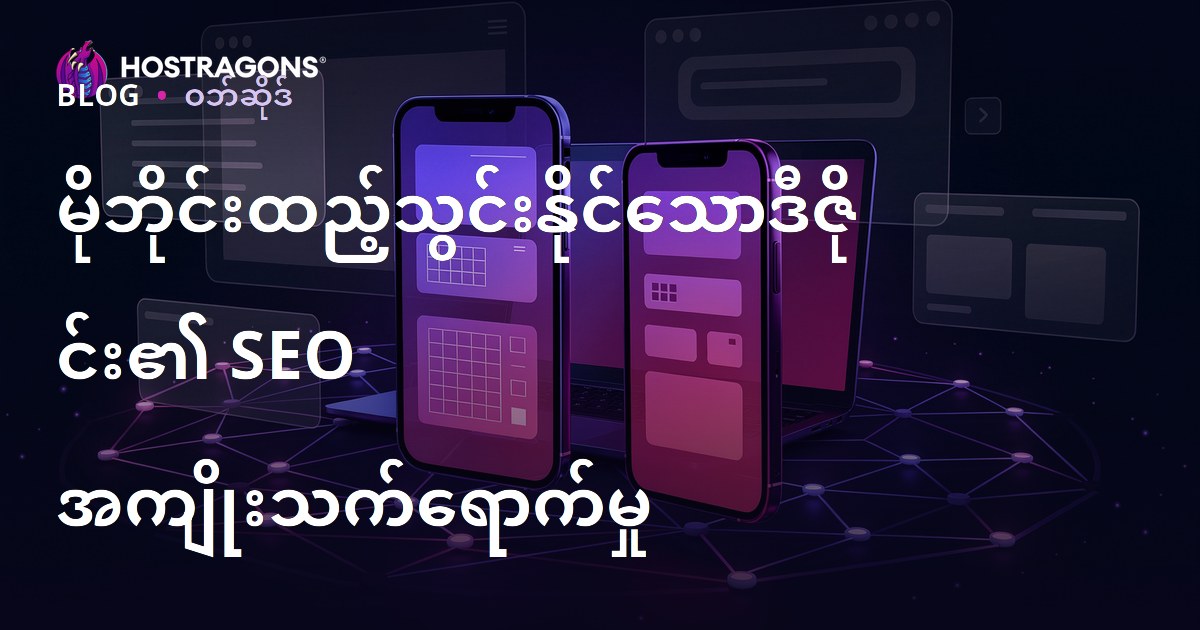
မိုဘိုင်းအတွက် တုံ့ပြန်နိုင်သော (Responsive) ဒီဇိုင်း ဆိုတာဘာလဲ?
မိုဘိုင်းအတွက် တုံ့ပြန်နိုင်သော (responsive) ဒီဇိုင်းဆိုသည်မှာ ဝက်ဘ်ဆိုဒ်သည် မျက်နှာပြင်အနံအကျယ်အလိုက် ပြန်လည်ပြင်ဆင်နိုင်ခြင်းဖြစ်သည်။ CSS media query၊ flexible grid၊ scalable images နှင့် fluid typography တို့ကြောင့် မတူညီသော devices တွင် အလိုအလျောက် layout ပြောင်းနိုင်သည်။ ဥပမာ desktop မှာ ထုတ်ကုန်စာရင်းသည် သုံး column ဖြစ်နိုင်သော်လည်း ဖုန်းမှာ တစ် column သို့ ပြောင်းနိုင်သည်။ မီနူးအကျယ်သည် hamburger menu သို့ ပြောင်းနိုင်သည်။ image size များသည် မျက်နှာပြင်မကျော်အောင် သာလွန်ပုံစံပြောင်းနိုင်သည်။
Responsive ဒီဇိုင်း၏ ရည်ရွယ်ချက်မှာ မတူညီသော devices တွင် တစ်စိတ်တစ်ပိုင်း content ကို mechanistically squeeze မလုပ်သင့်ပါ။ အဓိကအားဖြင့် အသုံးပြုသူသည် သူ့ရဲ့ device မှာ သူလိုချင်တဲ့အရာကို အမြန်ဆုံးရရှိနိုင်စေရန် ဖြစ်သည်။ ဥပမာ restaurant site တွင် မိုဘိုင်းအသုံးပြုသူအတွက် လမ်းညွှန်၊ ဖုန်းခေါ်ရန် button တွေကို အထင်ကြီးထားသင့်သည်။ e-commerce site အတွက် filter, cart, payment, product images တို့ကို လက်သုံးနိုင်အောင် optimize လုပ်သင့်သည်။ ကုမ္ပဏီ site တွင် form, contact info, service page တို့ကို ရှင်းရှင်းလင်းလင်းပြသသင့်သည်။
မိုဘိုင်းသင့်ကျ (mobile-friendly) နဲ့ responsive ဒီဇိုင်း တစ်ကွဲတစ်ခြားရှိလား?
နေ့စဉ်အသုံးအများဆုံးမှာ နှစ်ခုလုံးကို တစ်မျိုးတည်းအနေနဲ့ သုံးကြသည်။ သို့သော် အနည်းငယ်ကွဲပြားမှုရှိသည်။ မိုဘိုင်းသင့်ကျဆိုသည်မှာ မိုဘိုင်း device တွင် ကျင့်သုံးနိုင်မှုအခြေခံရှိသည်။ Responsive ဒီဇိုင်းဆိုသည်မှာ ယင်းကို modern နှင့် scalable နည်းပညာဖြင့် လုပ်ဆောင်နိုင်သည်။ အရင်တုန်းက m.site.com ဇယားအနေနဲ့ ခွဲခြားသုံးကြသည်။ ယခုအခါမှာတော့ တစ်ခုတည်းသော URL၊ တစ်ခုတည်းသော content၊ flexible design structure သည် SEO အတွက် ပိုမိုစီမံခန့်ခွဲလွယ်သည်။
၂၀၂၆ SEO အတွက် မိုဘိုင်းဒီဇိုင်း အရေးကြီးတာ ဘာလဲ?
Google သည် mobile-first indexing ကို နှစ်များစွာအရ သုံးနေသည်။ ယင်းသည် Google သည် သင့်စာမျက်နှာကို အကဲဖြတ်ရန် ပထမဦးဆုံး မိုဘိုင်း version ကိုသာ ကြည့်သည်။ Desktop version ကောင်းကောင်းရှိသော်လည်း မိုဘိုင်း version တွင် content မပြည့်၊ heading structure မမှန်၊ structured data မလုပ်၊ page speed များသည် SEO performance ကို ထိခိုက်စေနိုင်သည်။
၂၀၂၆ SEO မှာ keyword placement သာမက သုံးသပ်မှုများစွာ လုပ်သည် - page intent ကို ဖြည့်ဆည်းနိုင်သလား၊ content expertise, technical accessibility, user experience တို့ပါ ပါဝင်သည်။ မိုဘိုင်းအတွက် တုံ့ပြန်နိုင်သော ဒီဇိုင်းသည် အဆိုပါ အရာအားလုံးနှင့် ချိတ်ဆက်ပါသည်။ ကောင်းသော မိုဘိုင်း UX သည် content ဖတ်နိုင်မှု၊ link နှိပ်နိုင်မှု၊ form ဖြည့်နိုင်မှု၊ page navigation ကို ပိုမိုလွယ်ကူစေသည်။
SEO အပေါ် တိုက်ရိုက်/တစ်ဆင့် သက်ရောက်မှုများ
- Mobile crawlability တိုးတက်: Googlebot သည် mobile content ကို ပိုတိတိကျကျမြင်နိုင်သည်။
- Page experience တိုးတက်: Core Web Vitals metrics ပိုမိုကောင်းမွန်လာနိုင်သည်။
- Bounce rate လျော့: User သည် သင်လိုချင်သော အချက်အလက်ကို လွယ်ကူစွာ ရယူနိုင်သည်။
- Internal link performance တိုးတက်: menu/category/related content links ပိုမိုနှိပ်ကြသည်။
- Conversion rate တိုးတက်: Form, quote, search, purchase steps ပိုမိုလွယ်ကူသည်။
- Brand trust တိုးတက်: Professional mobile interface သည် ယုံကြည်မှု ပေးစေနိုင်သည်။
အသုံးပြုသူကြာမြင့်စေမှု (Retention) မိုဘိုင်းUX အပေါ် ဘယ်လိုသက်ရောက်သလဲ?
အသုံးပြုသူကြာမြင့်စေမှု (Retention) ဟုဆိုသည်မှာ ဝက်ဘ်ဆိုဒ်တစ်ခုတွင် သုံးသပ်သူတစ်ဦးသည် ဘယ်လောက်ကြာကြာ နေထိုင်သလဲ ဆိုသည်ကို ရည်ညွှန်းသည်။ SEO ရလဒ်အတွက် အဓိက ranking factor မဟုတ်သော်လည်း user satisfaction အတွက် ပြသနိုင်သော metric တစ်ခုဖြစ်သည်။ User သည် content ဖတ်နိုင်၊ headings တွင် လွယ်ကူစွာ navigation လုပ်နိုင်၊ related links နှိပ်နိုင်၊ page speed မြန်မြန်ရင် site တွင် နေထိုင်မှုအလားအလာ တိုးတက်သည်။
Mobile device ကိုအသုံးပြုသူသည် မိမိအမြန်ဆုံးလိုချင်သည်။ 4G/ congested Wi-Fi တွင် page speed ၅-၆ စက္ကန့်နောက်ကျ၊ images နောက်ကျ၊ buttons slide အလျားအလားရောက်သည်ဆိုရင် visitor ကို မကျေနပ်စေသည်။ ဥပမာ service page တွင် price table mobile မှာ မထည့်နိုင်ရင် user သည် ဖြစ်နိုင်ဆုံး back နှိပ်သွားနိုင်သည်။ Responsive design ကောင်းကောင်းမှာ user သည် short description ကိုဖတ်ပြီး၊ benefits ကိုလေ့လာ၊ FAQ section သို့လည်း ရောက်ပြီး၊ contact form ကိုလည်း ဖြည့်နိုင်သည်။ ဤ flow သည် retention နှင့် conversion နှစ်ခုလုံးကို တိုးတက်စေသည်။
လက်တွေ့နမူနာ Scenario
Software agency တစ်ခု၏ service page ကို ဥပမာယူပါ။ အဟောင်း design မှာ mobile visitors တစ်ယောက် average ၃၈ seconds နေသည်၊ contact form ကိုရောက်သူ ၂% ဖြစ်သည်။ Design အသစ်မှာ font size 16px+၊ main button ကို first screen မှာ ပြသ၊ images ကို WebP format ယူ၊ form fields လျှော့၊ page speed တိုးတက်စေသည်။ အဲ့ဒီ design ပြောင်းပြီးနောက် average retention 60-90 seconds သို့တိုး၊ form interaction တိုးတက်သည်။ Result သည် sector/trafic/content value အပေါ်မူတည်သော်လည်း mobile UX upgrade များသည် measurable impact ရနိုင်သည်။
Responsive Design, Core Web Vitals နှင့် Page Speed
Core Web Vitals ဆိုသည်မှာ Google သည် page experience ကို တိုင်းတာရန် အသုံးပြုသော performance metrics များဖြစ်သည်။ Responsive design သည် visual layout သာမက ဤ metrics များကိုလည်း သက်ရောက်သည်။ ၂၀၂၆ မှာ LCP, INP, CLS values မိုဘိုင်း SEO audit မှာ အထူးအလေးထားသင့်သည်။
LCP: Main Content မြန်မြန်ပေါ်လာသလား
LCP သည် page ၏ main content element ကို loading time တိုင်းတာသည်။ Mobile မှာ ချယ်ရီ hero images/ optimize မလုပ်သော slider/ heavy video background များသည် LCP value တိုးစေသည်။ Main image ကို WebP/AVIF format သုံး၊ dimension မှန်မှန်တင်၊ critical CSS ရှင်း၊ hosting infrastructure မြန်မြန်ကို အသုံးပြုသည် LCP ကို တိုးတက်စေသည်။ Hosting performance အရေးကြီးသည်။ Slow server မှာ UI ကောင်းကောင်း design လုပ်သော်လည်း မြန်မြန်မပေါ်နိုင်။ Performance hosting အတွက် မြင့်မားတဲ့ စွမ်းဆောင်ရည်ရှိသော hosting ကို စဥ်းစားနိုင်သည်။
INP: Interaction Response မြန်မြန်လား
INP သည် user interaction (click/tap/keyboard) ကို page response speed တိုင်းတာသည်။ Mobile menu click နောက်ကျ၊ product filter lag, payment button slow response လုပ်ရင် bad INP ဖြစ်သည်။ JS files မလိုအပ်တာလျှော့၊ third-party scripts control, theme plugins minimize လုပ်ခြင်းသည် INP value တိုးတက်စေသည်။
CLS: Layout Shift မဖြစ်စေဖို့
CLS သည် page loading မှာ text/button/image များ မမျှတစွာ ဆွဲရွှေ့သွားတာကို တိုင်းတာသည်။ Mobile မှာ ad space နောက်ကျလာ၊ image size မသတ်မှတ်ဆိုရင် user သည် wrong button ကိုနှိပ်နိုင်သည်။ Experience ညစ်ညစ်ညမ်းညမ်းဖြစ်စေသည်။ Image dimensions define၊ ad/iframe space pre-allocate၊ font loading organize လုပ်ခြင်းသည် CLS ကို လျော့စေသည်။
Mobil Uyumlu vs Mobil Uyumsuz Site အပြန်အလှန် နှိုင်းယှဉ်မှု
| Criteria | Mobil Uyumlu Site | Mobil Uyumsuz Site |
|---|---|---|
| Readability | Text ကို zoom မလုပ်ဘဲ ဖတ်နိုင်၊ headings clear hierarchy ဖြစ်သည်။ | User သည် zoom လုပ်ဖို့ လိုအပ်၊ lines overflow တက်သည်။ |
| SEO Effect | Mobile crawling/indexing/page experience ကောင်းမွန်သည်။ | Google သည် mobile version တွင် incomplete/broken content ရနိုင်သည်။ |
| Retention | User သည် content တွင် navigation လွယ်၊ links/forms ရောက်နိုင်သည်။ | Quick exit/low interaction ဖြစ်နိုင်သည်။ |
| Page Speed | Images/code structure ကို device အလိုက် optimize လုပ်နိုင်သည်။ | Heavy files တွေ mobile connection မှာ slow loading ဖြစ်သည်။ |
| Conversion | Buttons/cart/form/search functions မိုဘိုင်းတွင် touch-friendly ဖြစ်သည်။ | Form fill/purchase steps မလွယ်ကူ။ |
Mobile SEO အတွက် Responsive Design Checklist
Mobile design audit သည် designer တစ်ယောက်သာမက SEO specialist, developer, content editor, site owner တို့ပေါင်း၍ အကောင်းဆုံးရလဒ်ရနိုင်သည်။ အောက်ပါအဆင့်များသည် small business sites မှ e-commerce projects တစ်ထိ အသုံးပြုနိုင်သည်။
၁။ First Screen & Visible Area ကို စစ်ဆေးပါ
Mobile user သည် ပထမဆုံးမြင်သော area အရေးကြီးသည်။ အဲ့ဒီမှာ page ရယ်ဘာလဲ တိတိကျကျနားလည်နိုင်သင့်သည်။ Empty space/meaningless slider/unclear slogans မသုံးဘဲ short heading, benefit-focused description နှင့် CTA button တို့သုံးသင့်သည်။ Hosting service site တစ်ခုမှာ package type, key advantages, detail link တို့ first screen မှာ ထားသင့်သည်။
၂။ Font size & Line height ကို Optimize လုပ်ပါ
Mobile body text သည် ၁၆px အနည်းဆုံးဖြစ်သင့်၊ line height သည် reading comfort ပေးသင့်သည်။ Paragraphs များသည် များများကြီး mobile screen မှာ မလှပနိုင်။ ထို့ကြောင့် ၂-၄ sentence per paragraph, explanatory H2-H3 headings, bullet lists သုံးသင့်သည်။ ဤပုံစံသည် user နှင့် search engine နှစ်ခုလုံးအတွက် scan လုပ်လွယ်စေသည်။
၃။ Touch Targets ကို ပိုကြီးတိုးပါ
Mobile user သည် mouse မသုံးဘဲ finger အသုံးပြုသည်။ Buttons/menu links/filter/form fields တွေ ကို မနီးနီးထားသင့်။ Wrong click များများလာရင် user satisfaction လျော့သည်။ E-commerce site တွင် size select, add to cart, coupon code, payment button တို့ကို clearly separate လုပ်ပါ။
၄။ Images ကို Device အလိုက် Optimize လုပ်ပါ
Desktop အတွက် 2400px wide image ကို mobile device သို့ ဆင်းသည့်အခါ data waste ဖြစ်နိုင်သည်။ Responsive image techniques, srcset, lazy loading, WebP/AVIF formats သုံးခြင်းသည် mobile speed တိုးတက်စေသည်။ Blog post တွင် stock images မတင်ဘဲ topic explain လုပ်သော compressed & descriptive alt text images တွေ သုံးသင့်သည်။
၅။ Menu & Internal Link Structure ကို ရှင်းရှင်းလင်းလင်းပြုလုပ်ပါ
Mobile menu တွင် complex multi-level structure မသုံးသင့်။ Main categories, key products, contact & blog links တွေ ရှာလွယ်ရပါမည်။ Internal links တွေ mobile တွင် visible & clickable ဖြစ်သင့်သည်။ ဥပမာ site speed topic တွင် WordPress အရှိန် အာရုံစိုက်ခြင်း, security topic တွင် SSL လိုင်စင်သည် အကြောင်းအရာ link တို့ user journey ကို တိုးတက်စေသည်။
၆။ Forms ကို လျှော့ပါ
Mobile တွင် long forms တွေ conversion ကို down လုပ်သည်။ Unnecessary fields remove, phone/email keyboard type မှန်ပေး, error messages inline show လုပ်ပါ။ Quote form မှာ name, contact info, brief need သာတင်ပါ။ Details အတွက် next step မှာ လုပ်နိုင်သည်။
၇။ Pop-up & Ads ကို သတိထားသုံးပါ
Mobile screen တွင် aggressive pop-up သည် user ကို content မှ ကြားကွက်စေသည်။ Google သည် intrusive interstitials ကို negative သဘောထားနိုင်သည်။ Newsletter/signup/campaign သုံးလျှင် easily closeable, non-full screen, timing မှန်သော solution သုံးပါ။
Technical SEO မှာ Mobile Responsive အတွက် သတိထားစရာများ
Responsive design ကောင်းစေရန် backend technical structure လည်း သင့်တော်ရမည်။ Mobile & desktop version ကို same URL မှ serve လုပ်လျှင် canonical conflict နည်း၊ share signals တစ်ခုတည်း page မှာ စုစည်းနိုင်၊ content management လျှော့ပါးသည်။ သို့သော် implementation မမှန်လျှင် အားသာချက်ပျောက်နိုင်သည်။
- Viewport tag မှန်မှန် define လုပ်သင့်သည်။ Device width အလိုက် scale လုပ်နိုင်ရမည်။
- CSS/JS files တွေ Googlebot blocked မလုပ်သင့်။
- Mobile မှာ hidden content ကို UX အတွက် hide လုပ်သင့်၊ critical text ကို remove မလုပ်သင့်။
- Title/meta description/structured data တွေ mobile မှာလည်း quality တစ်ပြိုင်တည်းရှိရမည်။
- Canonical, hreflang, robots rules ကို check လုပ်ပါ။
- 404, redirect chain, mixed content errors ကို mobile crawling မှာလည်း test လုပ်ပါ။
Security သည် mobile experience ၏ အစိတ်အပိုင်းဖြစ်သည်။ HTTPS မသုံးသော site တွင် browser warning သည် form/payment page especially user trust ကို down လုပ်သည်။ SSL certificate သည် SEO သာမက user data, brand reputation အတွက်လည်း သက်သက်ရောက်သည်။ New project တွင် domain, hosting, SSL ကို အစပျိုးက plan လုပ်ခြင်းသည် long-term maintenance cost ကို သက်သာစေသည် - ဒိုမိန်း, ဟိုက်စ်တင်, SSL လိုင်စင်.
Content Design: Mobile မှာ SEO Content ဘယ်လိုရေးမလဲ?
Mobile responsive သည် code/design သာမက content delivery ကိုလည်း အကျုံးဝင်သည်။ Desktop မှာ reasonable ဖြစ်သော 12 line paragraph မှာ mobile မှာ text wall ဖြစ်နိုင်သည်။ User သည် page exit လုပ်နိုင်သည်။ ၂၀၂၆ SEO မှာ content သည် search intent ကို quick answer လုပ်၊ detail user အတွက် depth ပေးသင့်သည်။
First paragraph မှာ clear answer သေးသင့်သည်။ AI Overviews/featured snippets အတွက် visibility ပေးသည်။ ထို့နောက် definition, importance, steps, examples, table, FAQ section တွေဖြင့် topic ကို support လုပ်ပါ။ Mobile user သည် mostly scroll scan လုပ်သည်။ H2-H3 headings တွေ descriptive ဖြစ်သင့်၊ each section သည် single main idea ကို target လုပ်ပါ။
Mobile Content Practical Writing Rules
- First 100 words မှာ topic answer ပေးပါ။
- Every 250-350 words မှာ subheading တစ်ခုသုံးပါ။
- Long lists တွေကို split လုပ်ပါ။
- Technical terms ကို short example ဖြင့် explain လုပ်ပါ။
- CTA buttons ကို text flow မှာ naturally integrate လုပ်ပါ။
- Image alt text ကို keyword stuffing မလုပ်ဘဲ descriptive ပေးပါ။
Hosting Infrastructure ၏ Mobile SEO အပေါ် သက်ရောက်မှု
Responsive design ကောင်းကောင်းရှိသော်လည်း slow/unstable server သည် mobile performance ကို limitation လုပ်သည်။ Mobile users သည် variable connection quality တွေရှိသည်။ Server response time မြင့်လျှင် page ကို first byte မှာ delay ဖြစ်သည်။ User သည် content မမြင်မစကလည်း စောင့်နေသည်။ LCP များတွင် negative effect ဖြစ်နိုင်သည်။
Good hosting infrastructure သည် SSD/NVMe disks, latest PHP versions, LiteSpeed web server, caching support, scalable resources ပေးသင့်သည်။ Traffic spike တွင် resources မလုံလောက်လျှင် page loading slow down ဖြစ်နိုင်သည်။ Especially campaign/advertising/seasonal traffic တွင် strong infrastructure သည် conversion loss ကို prevent လုပ်နိုင်သည်။
WordPress site များအတွက် theme/plugin selection သည် hosting အလားတူ အရေးကြီးသည်။ Excess plugins, unoptimized page builders, heavy themes များသည် mobile မှာ severe load ဖြစ်သည်။ Hosting selection နှင့်အတူ cache/image compression/CDN/database cleaning ကို plan လုပ်ပါ။ Related guide အတွက် WordPress hosting နှင့် စွမ်းဆောင်ရည် အပိုင်းအစများ ကို recommend လုပ်နိုင်သည်။
Mobile Responsive အတည်ပြု (Testing) ဘယ်လိုလုပ်မလဲ?
Mobile responsiveness ကို measurement လုပ်ဖို့ မိမိဖုန်းတစ်လုံးနဲ့ ကြည့်တာသာမက device size/browser/connection speed များစွာ test လုပ်သင့်သည်။ အောက်ပါ process သည် regular SEO audit တွင် အသုံးပြုနိုင်သည်။
- Google Search Console မှာ mobile usability/page experience reports ကို check လုပ်ပါ။
- PageSpeed Insights မှာ mobile LCP/INP/CLS values ကို audit လုပ်ပါ။
- Chrome DevTools device simulator ဖြင့် screen sizes များစွာ try လုပ်ပါ။
- Real phone မှာ menu/form/cart/contact flow ကို test လုပ်ပါ။
- Analytics data မှာ mobile user retention/conversion/exit page ကို compare လုပ်ပါ။
- Top traffic 10 pages ကို individually analyze လုပ်ပါ။ Homepage တစ်ခုတည်းမစိတ်ထားပါ။
Mobile traffic အမြင့် pages တွင် small improvement များသည် big impact ပေးနိုင်သည်။ Blog post မှာ table of contents ထည့်ခြင်း၊ service page မှာ sticky contact button သုံးခြင်း၊ product page မှာ image gallery simplify လုပ်ခြင်းသည် user behavior ကို positive change လုပ်နိုင်သည်။
Common Responsive Design Errors
Mobile responsive ဖြစ်သည့်ပုံစံနဲ့ true mobile usability မတူပါ။ Sites များသည် first look မှာ phone fit ဖြစ်သော်လည်း real usage မှာ problems တက်နိုင်သည်။ အများဆုံးပြဿနာများမှာ -
- Desktop design ကို mobile သို့ just shrink လုပ်ခြင်း။
- Big images/auto-play video များ သုံးခြင်း။
- Buttons များကို နီးနီးထားခြင်း။
- Menu structure complex/clumsy ဖြစ်ခြင်း။
- Form fields မှာ correct keyboard type မသုံးခြင်း။
- Cookie notification/pop-up များ content ကို cover လုပ်ခြင်း။
- Mobile မှာ important content totally hide လုပ်ခြင်း။
- Single device testing သာလုပ်ခြင်း။
ဒီ errors များသည် regular testing/data observation ဖြင့် early stage မှာ detect လုပ်နိုင်သည်။ Design launch ပြီးသည့်နောက် user behavior, speed report, conversion metrics ကို monitor လုပ်ပြီး continuous improvement လုပ်သင့်သည်။
နိဂုံးချုပ်: Mobile UX သည် SEO ၏ အဓိက
Mobile responsive design သည် modern web site များအတွက် optional feature မဟုတ်ပါ၊ SEO နှင့် user experience ၏ main requirement ဖြစ်သည်။ Proper mobile design သည် faster loading, readable content, easy navigation, higher conversion rate ကို ရရှိစေသည်။ User သည် site တွင် smooth journey ရရှိသည့်အခါ retention တိုး၊ brand trust တိုး၊ search engines သည် page ကို အလွယ်တကူနားလည်နိုင်သည်။
Site redesign, new project launch, current mobile performance improvement တစ်ခုခုလုပ်မည်ဆိုလျှင် solid technical infrastructure မှစတင်ပါ။ Hostragons မှ domain, hosting, SSL တို့ကို plan လုပ်နိုင်သည်။ Design/speed/content optimization ကို step by step upgrade လုပ်နိုင်သည်။ Small but regular improvement များသည် mobile SEO တွင် long-term impact ပေးနိုင်သည်။
မေးလေ့မေးထ: FAQ
Mobile responsive design သည် SEO ranking ကို တိုက်ရိုက် အကျိုးသက်ရောက်မှု ရှိလား?
ရှိပါသည်။ Mobile responsive design သည် SEO performance ကို တိုက်ရိုက်သက်ရောက်စေသည်။ Google သည် pages ကို mobile version အရ အကဲဖြတ်သောကြောင့် readable/fast/bug-free mobile site တွေ advantage ရသည်။ Good mobile UX သည် user interaction/conversion rate တိုးတက်စေသည်။
Mobile responsive site သည် user retention ကို ဘယ်လိုတိုးတက်စေသလဲ?
Mobile responsive site မှာ text readable, menu simplified, buttons touch-friendly, page speed မြန်စေသည်။ User သည် needed info ကို effortlessly ရနိုင်သည့်အခါ site retention တိုးတက်၊ other content သို့ navigation လုပ်နိုင်၊ form/purchase action ကို complete လုပ်နိုင်သည်။
Responsive design အတွက် separate mobile site တည်ဆောက်ဖို့ လိုအပ်လား?
Modern projects များအတွက် separate mobile site မလိုအပ်ပါ။ Single URL responsive design သည် SEO management လွယ်ကူ၊ canonical/content duplication risk down လုပ်သည်။ Special application/large platform အတွက် separate mobile experience plan လုပ်နိုင်သော်လည်း SEO rules ကို သတိထားစီမံသင့်သည်။
Mobile site speed တိုးတက်အောင် ဘာတွေ လုပ်သင့်လဲ?
Most important improvements တွေမှာ WebP/AVIF images, unnecessary JS/CSS files reduction, caching, good hosting infrastructure, regular Core Web Vitals monitoring ဖြစ်သည်။ Especially LCP/INP/CLS values သည် mobile performance အတွက် critical metrics ဖြစ်သည်။
Mobile responsive testing ကို ဘယ်လောက်ကြာကြာ လုပ်သင့်လဲ?
Active sites တွင် minimum monthly, design/plugin update ပြီးသည့်အခါတော့ immediate testing လုပ်သင့်သည်။ E-commerce/high traffic site တွင် key category/product/blog/payment pages ကို frequent check လုပ်ပါ။ Search Console/PageSpeed Insights/real device tests တွေကို combination သုံးပါ။
