 Afrikaans
 Azərbaycan
 Bosanski
 Čeština
 Dansk
Dansk Deutsch
 English
 Español
 Filipino
 Français
 Hrvatski
 Indonesia
 Italiano
 Magyar
 Melayu
 Nederlands
 Norsk
Norsk Oʻzbek
 Polski
 Português
 Română
 Slovenčina
 Slovenščina
 Suomi
Suomi Svenska
 Tiếng Việt
 Türkçe
 Ελληνικά
 Беларуская
 Български
 Русский
 Српски
 Українська
 עברית
עברית اردو
اردو العربية
 پښتو
پښتو فارسی
فارسی አማርኛ
አማርኛ मराठी
मराठी বাংলা
বাংলা தமிழ்
தமிழ் ไทย
ไทย မြန်မာ
 한국어
한국어 中文
中文 日本語
日本語

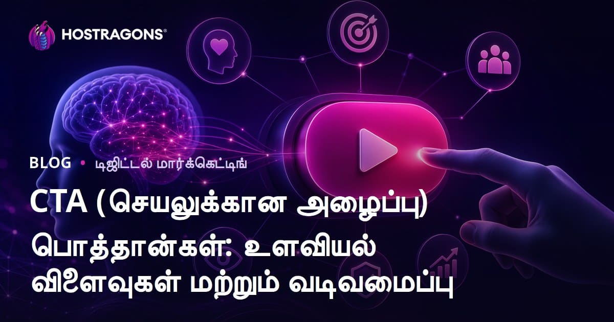
இது ஒரு வலை ஹோஸ்டிங் மற்றும் மார்க்கெட்டிங் கையேடு; வாடிக்கையாளர்களை ஈர்ப்பதில் முக்கியமான Call-to-Action (CTA) பட்டன்களின் ஆதாரம், மனநிலை தாக்கங்கள், சிக்கலற்ற வடிவமைப்பு முறைகள் குறித்தும் அலசுகிறது. CTA பட்டன்களின் செயல்திறனில் வடிவமைப்பின் பங்கு, ரங்க உபயோக புத்திசாலித்தனம், கவனிக்க வேண்டிய அம்சங்கள், பல வட்டார CTA வகைகளைக் கொடுக்கும் பகிர்வு, சிறந்த வடிவமைப்புக்கு 5 நிபுணத்துவ அம்சங்கள் மற்றும் வடிவமைப்பு கட்டளை–தோன்றும் ஆய்வுகள் உள்ளடக்கப்பட்டுள்ளன. மேலும், டெஸ்ட் & அனலிட்டிக்ஸ் மூலம் மாற்று வணிக வளர்ச்சி யுக்திகள், செம்மையான CTA பட்டன் எப்படி உருவாக்க வேண்டும் என்பதில் உங்களுக்குத் தெளிவான நடைமுறை புள்ளிகள் தரப்படுகின்றன.
CTA (Call-to-Action) பட்டன்களின் முக்கியத்துவம் என்ன?
Call-to-Action (CTA) பட்டன்கள், உங்கள் வலைத்தளத்திலும், மார்க்கெட்டிங் ப்ரஸ்யாக்களில் மிக முக்கிய பாத்திரம் வகிக்கின்றன. இவை, பயனர்களை தீர்மானிக்கப்பட்ட செயல்திறனுக்கு தூண்டி, மாற்று வாள் (conversion) சோர்வை குறைக்க உதவுகின்றன. CTA-வை கிளிக் செய்வது — ஒரு பொருள் வாங்குதல், சேவைக்கு பதிவு, ஒரு தளத்தை பார்வையிடுதல் அல்லது வெறும் தகவல் வாயிலாக உங்களை ஈர்க்கலாம். சந்தையை தூண்டுவதற்கு முக்கியமா CTA பட்டன்கள், எளிமையான வழிகாட்டியாக இருக்கும்; பயனர் என்ன செய்ய வேண்டும், எப்போது செய்ய வேண்டும் என தெளிவாக ஆணை தரும்.
வணிக நற்பயன்களுக்கு CTA அனிச்சயம் இல்லாமல் முக்கியமா கலந்திருக்கின்றது. சரியான வடிவமைப்பு மற்றும் பாஜா (பக்கம்) விழிப்புடன் இருந்த CTA, site traffic-ஐ அதிகப்படுத்த, பெயரறிய மற்றும் lead generation-ஐ துவக்க, சேல்ஸ்-ஐ கைப்பற்ற உதவும். இது, visitor-இன் கவனத்தை வார்த்தியில் பிடித்து, value proposition-ஐ சுருக்கமாக காட்டி, “நீங்களே இதை செய்யலாம்” என்று தூண்டவே செய்கிறது. முலாதாயாக, CTA இல்லாமல் digital marketing யோஜனையில் எந்த மூலுதுவும் இல்லை.
CTA பட்டன்களின் நன்மைகள்
- மாற்று வணிகம் அதிகமாகிறது.
- வலைப்பக்கத்தினது ஈடுபாடு அதிகரிக்கிறது.
- மார்க்கெட்டிங் குறிக்கோள்கள் சீக்கிரம் அடையமுடியும்.
- பயனர் அனுபவம் மேம்பாடு பெறுகிறது.
- பிராண்ட் அறிதல் வேலைசெய்கிறது.
- Lead Generation-ஐ மென்மையாக்கும்.
CTA-வை கவனிக்கும் முக்கியம் சாதாரண மார்க்கெட்டிங்கிலும், பயனர் பரிவர்த்தனையிலும் அமோகமாக தெரிகிறது. ஒரு நல்ல CTA பட்டன் பயனர்களுக்கு தேவையான தகவலை எளிதாக பெற்றுக்கொடுக்க, வழிகாட்டி, user satisfaction-ஐ மற்றும் site loyalty-ஐ உயர்த்தும்.
CTA பட்டன்கள் பலாதாயமாக நன்மை செய்யும் காரணங்கள்
| பாரம்பரிய விஷயம் | விளக்கம் | முக்கியத்துவம் |
|---|---|---|
| வடிவமைப்பு | ரங்குகள், அளவுகள், வடிவம் போன்ற அம்சங்கள் | பயனவர்கள் கவனத்தை ஈர்க்க, கிளிக் செய்ய தூண்டும் |
| வசதிகாட்டும் மெசேஜ் | சுருக்கமான வார்த்தைகள், தெளிவான ஆணை | என்ன செய்ய வேண்டும் என்று அழுத்தமாக வருடும் |
| பாஜா/விபரம் | பக்கம் இடம், visibility | இடையே CTA கண்டுபிடிக்கும்போது click செய்ய வசதியாகிறது |
| Value Proposition | பயனர்களுக்கு கிடைக்கும் நன்மை கொள்கை | Click செய்ய காரணம் அலங்காரம்கிறது |
CTA (Call-to-Action) பட்டன்கள், digital marketing-இன் ரத்தம். உங்கள் business mission & vision அடைய உதவும், பல செயல்திறனையும் user experience-ஐ கிளாஸ் தரத்தில் மேம்படுத்தும். CTA மீது கவனச்சீர்மை, message clarity, design, position — கையேடு, site அல்லது landing page-இல் எல்லோரும் தேவையே.
CTA பட்டன்களின் மனநிலை தாக்கங்கள்
CTA பட்டன்கள், பயனர்களை போக்கில்யாக அடுத்த நடவடிக்கைக்கு தூண்டும் வகையில் பிறந்தவை. இவை வடிவமைப்பு+இடச்சார்பு மட்டும் அல்ல, மானுடம் சார்ந்த மனநிலை உரம் தாண்டிப் பெரும்பயன் அளிக்கின்றன. பயனர்களின் subconscious trigger-ஐதான் conversion metrics-ஐ மாற்றும். CTA-வின் psychological aspect-ஐ புரிந்துகொள்வது, ஃமர்க்கெட்டிங் முயற்சி வெற்றியை உள்-நிலை பிழைமாறும்.
பயனர்கள், optical cues மற்றும் சுருக்கமான message-களுக்கு மிக வேகமாக அதிரடி செய்கிறார்கள். CTA, “இப்போது வாங்குக”, “மேலும் அறிய” என்றால், action-ஐத் தெளிவாக path-இயக்குகிறது, உள்ளே ஐயத்தைப் பூட்டி, click possibility-ஐ தரிக்கிறது. Button-இன் design, color, size, position ஆகியன, user decision-ஐ groot புள்ளியாக வலுவாக்கும்.
| மனநிலை புள்ளி | CTA-இல் இப்படிப்பு | காரணம்/உதாரணம் |
|---|---|---|
| அவசரம்/உடனடிப்பாடு | அடிப்படியாக action-ஐ தூண்டும் | “இப்போ நிகழ்க”, “வழக்கம் போனி” பாட்டும் |
| Social Proof | “மற்றவர்களும் இதை செய்து விட்டார்கள்” என காட்டும் | “500 பேர் பின்னுள்”, “பிரபல விருப்பம்” message |
| FOMO (Fear of Missing Out) | பயனர்களுக்கு புறத்து போன வாய்ப்பை நினைவூட்டும் | “வாய்ப்பை தவறாதீர்கள்”, “இப்போ பதிவு செய்யுங்கள்” |
| Reward Expectation | பயனர்களுக்கு output நல்லது என வாசல் விடுகிறது | “இப்போ Try பண்ணு”, “Discount Coupon பெறுங்கள்” |
Manaththuvam based CTA trigger-கள் மிக முக்கியம். Value லாக் இருப்பது click rate-ஐ அதிகப்படுத்தும். Brand image, reliability-ஐ மேலோட்டமாக visual design-இல் கொண்டு வர வேண்டும். CTA design/message-இல் psychological rules-ஐ integrate செய்வதால் conversion uplift உறுதி.
- Urgency: Limited time offers-இல் விறுவிறு click.
- Social Proof: Reviews, other users, follower count use பொது நம்பிக்கை தரும்.
- FOMO: Missed opportunity-ஐ visually mark-பண்ணுங்கள்.
- Clarity: Ambiguous term-ஐ தவிருங்கள், action-order direct-ஆ சொல்வது பாவனை.
- Trust: Professional, brand-safe design click rate boost.
- Value Driven: Practical benefit வழங்கும் CTA பெரும்பவை செய்கிறது.
CTA வாசலில் psychological triggers-ஐ கைவிரிப்பது, normal design-ஐ விட அதிக conversion-ஐ தரும். ஒரு கவனித்த design, user சிந்தனம்+உவமை trigger-ஐ கொண்டுவா.
வெற்றிகரமான CTA பட்டன் வடிவமைப்பிற்கான 5 முக்கிய அம்சங்கள்
கங்கள் CTA (Call-to-Action) பட்டன் கொண்ட design conversion-ஐ தூண்டும். இதற்கு key components, visual to verbal ஒருங்கிணைப்பு அதிகமாகுவது. Conversion uplift, UX-all-around click facilitation-ஐ தரும். எண்ணிக்கையில் செலவாத design, strategy அடக்கம் பெருமிதம்.
Effective CTA-உம், color, size, wording, placement, spacing, style ஆகியவை ஒவ்வொன்றும் fine-tuned ஆனால் நல்லது. கீழ்காணும் முக்கிய அம்சங்கள், வெற்றிகர CTA-க்கு roadmap-ஐ தரும்.
- Color Accent: Brand identity-க்கு பொருந்தும், dazzling color pick.
- Size: Content-இன் ratio, page visibility, clutter-இல் standout.
- Text Prompt: Short, clear, action words (ex: "Order Now", "Try Free").
- Placement: Conversion hotspots; scrolling visibility, mobile placement.
- Whitespace: Surround button with breathing space, visual spotlight.
- Shape/Style: Modern look, brand consistency, rounded edges for friendliness.
CTA design attributes impact analysis-ஐ கீழே பார்க்கலாம்:
| Design Feature | Description | User Impact |
|---|---|---|
| Colour | Brand feel, urgency, trust trigger | High contrast — click rate boost |
| Size | Visibility, finger/focus access | Appropriate size — easy tap/click |
| Text | Action, benefit, clarity | Direct, benefit-message — high conversion |
| Placement | Screen zone — scroll/focus | Strategic zone — more sightings, more clicks |
ஒவ்வொரு site, userbase unique; CTA-இன் performance validations மூலம் (A/B testing) பிடித்தது best worked combo-ஐ பயன்படுத்தலாம். CTA aesthetic alone இல்லாமல் accessibility, brand integrity-க்கு alignment உண்டும்.
CTA வகைகள் – ஒப்பீடு மற்றும் சிறப்பு
CTA பட்டன்கள், வலைத்தளத்திலும், mobile app-இலும் user decisions-ஐ shape-பண்ணுவதில் central role-இல் நிற்கின்றன. உங்கள் conversion GOAL & user habit-இன் யார்கும் CTA type-இன் adjust-ஆனும் uplift-ஐ பெறலாம். ஒவ்வொரு style-க்கும் pros/cons இருந்ததால், right selection critical.
- Text-based CTA: Plain direct words; “Learn More”, “Sign Up”.
- Visual CTA: Icons & graphics combo; more attention, memorability.
- Animated CTA: Moving, shaking elements (bounce/hop) — higher engagement.
- Social Media CTA: Share, follow, like — brand awareness.
- Email Signup CTA: Newsletter guidance.
- Purchase CTA: “Add to Cart”, “Purchase Now” — e-commerce buzz.
Each CTA style, own benefits/pitfalls. Text CTA clarity-யாக; visual CTA eye-catching-ஆக; animated CTA overuse downside possibility. Audience, business goal based selection is must.
| CTA வகை | நன்மைகள் | பாதகங்கள் | பயன்பாடு |
|---|---|---|---|
| Text-based | Quick, simple, immediate | Low visual weight | Blogs, info pages |
| Visual | More notice, memory value | Design work & cost | Landing, product pages |
| Animated | Engagement up, more clicks | May distract; UX drop | Campaign pages, games |
| Social Media CTA | Virality, brand recognition | Not suited for all pages | Blogs, product pages |
Best CTA type-ஐ constant A/B testing, analytics மூலம் fine-tune செய்ய வேண்டும். Color, size, placement combo-வும் click metric-ஐ drive செய்யும். Trial & error, data-driven CTA strategy conversion growth-ஐ உயரும்.
CTA design process – கட்டளைகள்
மிகச் செயல்திறன் கொண்ட CTA-ஐ உருவாக்க, value mapping, benefactive text creation, visual psychology sync, data-driven iteration — எல்லாம் முறையாக செயல்பட வேண்டும். ஒவ்வொரு conversion scenario-க்கும் CTA-க்கு template-ஐ fine-tune செய்ய வேண்டும்.
வெவ்வேறு user group-க்கு CTA text & design table
| Target Audience | Product/Service | CTA Message | Potential Impact |
|---|---|---|---|
| Young Adults | Online Course | “Enroll Now”, “Catch the Future!” | Urgency, optimism – more signups |
| Middle Age | Financial Advice | “Get Free Consultation” | Trust & entry ease |
| All Users | E-Commerce | “Add to Cart”, “Don’t Miss Discount!” | Purchase urgency |
| Tech Enthusiasts | Latest Smart Devices | “Preorder Now”, “Be First!” | Innovation, exclusivity |
CTA-ஐ planning-ல் main steps below:
- Goal Setting: Button-trigger outcome targeting.
- User Analysis: Demographic expectation mapping.
- Design Decision: Color, size, shape, wording, icon selection.
- Positioning: Page strategic zone alignment.
- Testing: Version-validation via data analytics.
Constant improvement cycle-ஐ நிறைவேற்றுவதால் CTA conversion-ஐ sustainable-ஆக உயர்த்தலாம்.
CTA வடிவமைப்பில் வண்ணத்தின் நடவடிக்கை

CTA-இனில் color selection critical. Correct color user attention, psychological urge & conversion uplift-ஐ possible. Color psychology & behavior metrics mix-ஆனால CTA-க்கு color strategy must.
Color Psychology – வண்ணத்தின் மனநிலை தாக்கங்கள்
வண்ண வெயில் – ஒவ்வொரு நிறமும் அமைப்புக்கு Mood set-பண்ணும். "Red" urgency, excitement, alert; "Blue" trust, peace, professionalism. CTA-க்கு mood, brand story, audience taste align-ஆன வரிசை செய்தல் அவசியம்.
Important colours & their effects table:
| Colour | Common Associations | Psychological Effects |
|---|---|---|
| Red | Energy, urgency, passion, alert | Attention grab, action, impulse |
| Blue | Trust, calm, professionalism | Reliability, relaxation |
| Green | Nature, health, growth, wealth | Calmness, environmental friendliness |
| Yellow | Joy, optimism, vitality, warning | Caution, cheerfulness, attention |
Colour meaning culture-by-culture vary செய்கிறது; audience cultural background check-ஆனல் conversion uplift செய்யலாம்.
வண்ணம் மற்றும் பயனர் click habit
Colour choice impact — CTR, conversion. Eye-catching contrast or accessibility friendly palette (color blindness) design-ஐ mix-ஆன நினைவு. Better accessibility — enough contrast, readable text — a must.
Colour tactics:
- Contrast Colour: CTA outshine background.
- Brand Consistency: Brand palette for trust.
- Cultural Check: Audience taste relevant usage.
- A/B Test: Multiple colour try for best results.
- Accessibility: Color-blind friendliness, legibility.
Mobile, desktop, tablet screen-இன் colour render-ஐ validate பண்ணும் எங்கும் check-ஆனல் conversion spike செய்யலாம்.
CTA button colour strategies are not random - careful planning, data-testing must for real conversion uplift.
CTA உருவாக்கும் போது கவனிக்க வேண்டிய விஷயங்கள்
CTA design டொர்களில், mere visual not enough; audience behaviour, proper message-shaping, UX tailoring - அம்சம் முக்கியம். Conversion driver CTA planning, thought process–இல் rushed shortcuts avoid செய்ய வேண்டும்.
CTA wording — concise, direct needed. Ambiguity (ex: “Click Here”) low conversion; direct benefit wording (“Download Free eBook”) high conversion boost.
| Element | Description | Priority |
|---|---|---|
| Audience | CTA whom direct targeting | High |
| Message | Clear, direct proposition | High |
| Design | Visual prominence, brand alignment | நடுத்தரம் |
| Placement | Strategic locational visibility | நடுத்தரம் |
Do's & Don'ts:
- Know Audience: Need analysis ahead.
- Be Direct: Clear call, no ambiguity.
- Show Value: Specific benefit highlight.
- Colour & Design Smartness: Psychology + brand palette synergy.
- Placement: Visibility, not buried.
- Mobile Friendly: Responsive, finger-accessible.
Regular test & analytics — different CTA design, wording, placement A/B trial — help best conversion. Conversion uplift = ever-improving CTA!
CTA பட்டன்களுக்கு டெஸ்ட் & அனலிடிக்ஸ் முறைகள்
CTA conversion lift – constant test & analytics must. Structure, test which CTA design, wording, position greatest uplift. Data-driven optimisation = conversion maximisation.
A/B testing – two or more CTA versions tried; better-performing one chosen (ex: Colour, text, size). Data says which combo wins.
- A/B Test: Trial two variants.
- Multivariate: Multiple element test same time.
- Heatmaps: User interaction visualisation.
- User Tests: Real user feedback.
- Metrics Watch: CTR, conversion %, bounce rate — constant tracking.
Periodical analysis — which CTA clicked more, which segment click better — helps future CTA design improvement. Market trend changes fast – so CTA must be dynamic.
CTA மூலம் மாற்று வணிக வளர்ச்சி யுக்திகள்
CTA button – website, marketing campaign-இன் conversion king. Proper CTA strategy, audience analysis, message clarity, UX optimised execution – yield conversion growth.
Conversion metric increase – analyse website analytics before placing CTA: Page-wise traffic, exit points, click metrics. This data = CTA message/placement tailoring.
Strategic Points:
- Audience needs analysis; message tailoring.
- Visual prominence CTA; stand out.
- A/B test wording, design, colour.
- Mobile responsive; seamless click mobile/desktop.
- Correct page placement; user-flow optimised.
- Urgency, opportunity displayed; click uplift.
- Constant monitoring & improvement.
CTA is not just good design; it is user trust-building, value delivery = conversion. Content quality, offer appeal, UX smoothness + CTA clickability – total win.
| CTA Button Type | Placement/Purpose | Impact | Sample Text |
|---|---|---|---|
| Buy Now | E-Commerce product page | Sales uplift | Add to Cart, Buy Now |
| Learn More | Blog or info page | User engagement uplift | See Details, More Info |
| Trial Start | SaaS, tools | Lead generation | Try Free, Start Now |
| Contact Us | Support page | Relationship building | Ask, Contact, Help? |
CTA புள்ளிகள் – பாடம் சார்ந்த ஸம்மரி
CTA button importance, psychological effects, design musts, summary. CTA design – conversion-direct driver. Colour, wording, size, placement impact user decision. Contrast colour use, urgency message delivery – click uplift. Mobile friendliness, device-specific check – key. CTA needs to work everywhere!
| Point | Description | Advice |
|---|---|---|
| Colour | Attention, brand fit | Contrast, brand palette smart use |
| Text | Clear, action, benefit | Order Now, Try Free, More Info – direct phrases |
| Size/Placement | Easy click, noticed | Strategic spot, mobile check |
| Psychology | Emotion trigger | Urgency, curiosity, advantage |
Continuous testing = CTA result uplift. A/B validation, user feedback, constant improvement. CTA success = ongoing improvement, not one-time design alone.
Steps for Uplift:
- Audience mapping; tailored CTA message.
- A/B colour/size/text try.
- Strategic page placement.
- Mobile responsive validation.
- User feedback-based improvement.
- Analytics-based constant tracking.
Effective CTA button = planned, creative, data-optimised process. These checklist ensure conversion uplift, marketing goal achievement. CTA success, action urge strength.
அடிக்கடி கேட்கப்படும் கேள்விகள்
வலைத்தளத்தில் CTA-க்கு முக்கியம் ஏன்? மற்ற அம்சங்கள் பகிர்வு செய்ய முடியாதா?
CTA button, visitor action conversion-இற்கும், sales uplift-இற்கும் direct impact-ஆ இருக்கும். Info elements mere read-only; CTA conversion driver. Marketing goal அட்டையில் CTA prominence must!
CTA button click-இற்கான psychological triggers என்ன?
Urgency, curiosity, social proof, reward expectation – CTA click-ஐ motivate செய்யும். "Order Now" urgency; "Try Free" reward. Colour, size, placement subconscious trigger.
CTA design பிழைகள் – தவிர்க்க வேண்டியவை?
Ambiguous messaging, invisible button, design clutter, no mobile-friendly. Solution: Clear action text, design standout, proper size, mobile check – must for conversion!
CTA button styles – எப்போது எது?
Purchase (Buy Now), Signup (Register Free), Download, Learn More, Contact– CTA buttons. Goal-based use: Sales? Buy Now; Leads? Signup; Info? Learn More.
CTA design steps – எப்படி செய்ய வேண்டும்?
Audience/profile analysis, wording & design alignment, strategic placing, mobile validation, A/B test; best performer use.
CTA colour selection – எல்லா நிறமும் same effect தருமா?
Red – urgency, excitement; Green – trust, natural; Blue – reliability, professionalism; Orange – energy. Audience/culture fit check, message fit smart pick.
CTA text – effective formulas, avoidable words?
CTA text must be short, actionable: "Order Now", "Try Free", "Download". Avoid vague ("Click Here"), aggressive/spam phrases unnecessary.
CTA performance measurement & improvement?
Google Analytics etc – CTA click rate (CTR), conversion analysis. A/B test different CTA designs; use high-performing variant for uplift.